Comments (7)
Good game. It's fun, though too short in my opinion. I know people already said this, but definitely work on an opening cutscene. The graphics aren't the greatest, but in my opinion, graphics are the least important part of a game.
Fun, but too short. The tiles looked good, and the collisions and engine were slick. However, the opening story was a turnoff, not because of the story itself, but... it just isn't smart to present the story like that. Make an opening cutscene.
Maybe, if you fix all of that and maybe a few more levels (the play-time feels kind of short for me) yes I will! :D
I like it better than the first version, but some things I still don't like much...
1.) When you stop running to the left he turns back to the right
2.) The background doesn't really look to great anymore, it doesn't look like it was made for a game
3.) Sound effects would be nice, but that's just my opinion
4.) Some minor tune-ups would also be nice, hence the story in the start would look better if it wasn't on a game info screen, and some additional effects would be nice (maybe an effect for when you go through a portal and a motion blur effect would be nice)
But overall it wasn't that bad, so 4/5 :D
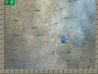
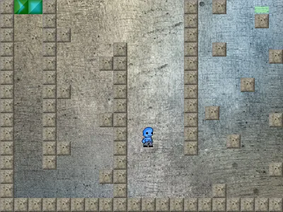
Harris in a Portal
Harris in a Portal is a game made for the Portal games comeptition.
#platformer
