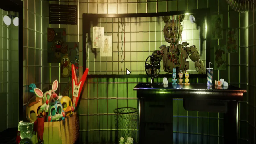
I know you guys voted for the Sister Location style, but it makes the office really small and squished. I’ve already started implementing the FNaC R style hybrid scrolling, as I feel it’s the best option I can go with rn.
Next up
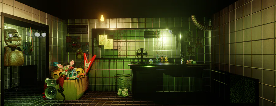
Just thought I'd share this, I redid the lighting in the map, and I think it looks 10 times better! New is first image, old is second.
New Feature Reveal
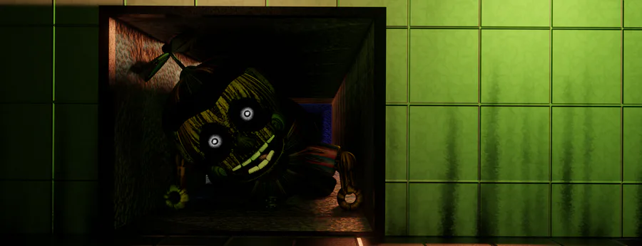
There's something in the vents
ICan'tSee.jpg
updated
After a few days of figuring out how to tackle the Sister Location scrolling, I think I've got it complete!
...
Oh yeah I forgot I said I'd upload a video of the menu :] (Everything here is subject to change)
Menu clip releasing soon.
art comission.





2 comments