Hey ya'll!
Hope you enjoyed that little game teaser for New Royals! It was a nice refresher into coding and a good change of pace. But now back to Angel's!
Before the delay, I was working on Angel's constantly. Once I realized with work, the holidays etc. I had to delay, I took a break. I realized I had gotten burnt out on game development. I took a while to focus on my comic and my personal life. This new job I'm at isn't stressful but it is very boring. But on the flip side, it means I spend all day waiting to get home, thinking about my code! So I'm very very happy with how things are. (And with spring here, I get to enjoy the sunshine. Taking life one step at a time, practicing self care!)
Development
Lately I've been head deep into Angel's code. Since coming back into it, I've decided to approach things from a fresh perspective. I'm not rushing myself to a deadline anymore, so I have time to reconsider things and make them more structurally sound. I've re-coded a lot of the game!
If something wasn't outright rewritten or restructured, it was looked over. I've been thinking very hard on how everything connects and what my coding practices are. Here's the main things I've done:
Code
Camera:
-Player object. Sad to say I've switched to Pixel Pope's state machine instead of Eternal's. This is purely because I'm more familiar with his system, and I want to have more control.
Collison has completely been redone, using the new function move_and_collide(); which was released last month. Pretty handy!
I've remade the Settings menu as well as a new camera. I've been fiddling with it and I might switch over to a premade asset, not sure yet! That said I've learned a LOT about cameras and screen resolutions. Can't even say how many hours I spent trying to do something only realize I only need to change up the view port. 🙈
Messing with the camera led me to make an important decision. If you've checked out New Royals, you might not be surprised to find that...

[img id: The Angel's Lullaby title screen. There's a painted glass circle that depicts the sun and moon. The screen is divided into 4 window panes. Notably, the screen is wider than Undertale's. id end]
The screen resolution has changed to 16:9! This is a big decision on my part. As said, I've been spending time thinking about my game structurally and that includes it's concepts. Angel's is intended to feel like a "next gen console release" prequel. The biggest example I can give is how the Legend Of Zelda series has changed over time. I want this game to feel like Minish Cap (Game Boy Advance) to A Link to the Past. (SNES).
Although, more specially, I want my game to feel like a modern release. This isn't to say I'm mimicking the Game Boy Advance exactly. I'm trying to recreate that feeling I had as a kid when I got to play a new console release. That feeling of "WOW! Look how different it all looks now!" And the excitement of what else could be different.
Text System

[img id: A cropped screenshot of the dialogue box. It has vines wrapped around it's sides. Text is spaced like in Undertale. It reads: "LMAO what do you want for dinner? My sweet kind dude? id end."]
I switched to this text system. With this I finally got word wrapping to work just right. The above uses both a word wrap line break and a manual one. See how the spacing fits the "* " line? Before I had to manually type in two spaces. Never again for me!
Honestly this was a feature I've been wanting/trying to implement forever. Not even exaggerating, I teared up when I saw it was working!
Game UI:
The new aspect ratio allows for more room to work with the UI. With this added space, I decided to continue the theme of verticality in the UI. Deltarune established a new visual style/navigation regarding menus than what Undertale had. I hope to continue this tradition, show casing a even more "modern" feel to it. My inspiration here with the added colors and shading to the UI elements is to mimic the level of detail you'd see in DS games.

[img id: A screenshot showing a Deltarune like menu screen, however everything is shown vertically instead of horizontally. id end.]
All of this is to say we're in wide screen mode baby! This is sadly not optional... as I use this space carefully when designing the game, resizing it wouldn't work.

[img id: the same menu, now with the POWER menu shown. We see a simple blue vertical character portrait on the left. On the right, a standard Deltarune stat menu. All stats are maxed out at 999, with the two additional stats being "Alliance" and "Rot," which equal to "You" and a single skull. On the left, the two (temporarily named) spells are "Fire" and "Stabby."]
For example, I would not be able to do this style of menu in the previous screen resolution. I mean, i could, but it wouldn't be laid out the same. >v>;
The Old Inventory, before updating the UI design:

[img id: A Deltarune style menu, with icons at the top of the screen in diamonds. We see 5 columns of 3 rows of boxes for the inventory. On the left, we see 4 tabs. "Item, Key, Seed, and Recipe." At the bottom, we have a description text read out: "Example description Text that is lengthy, lengthy. id end.]
The NEW inventory:*
(All new UI are mock ups and are not in-game yet.):

[Img id: The menu is reworked to be within a box. The UI is more slick and modern with room to spare. id end.]
The Battle System itself is on hold currently. I'm focusing on Overworld at the moment. This is in part because I'm giving Lasers a break, as well as to give me time to polish up the systems as I've already discussed.
While that's on pause, I decided to change up the layout for the battle as well. I realized quickly that changing the aspect ratio creates the issue of the Battle Box looking... tiny. So I realized I could increase the size of the UI and organize it in a way to create a "flow" for the eyes to move around the screen.


[img id: A Undertale and Deltarune hybrid battle system. There's a TP bar and 3 party members. However, the enemies are front facing and in color. id end.]
We can have up to 3 enemies on screen at once. It functions mostly like how Deltarune handles it's battle system, except with the new elements unique to Angel's.
Bottom left: This will be the active spell slot. Only one party member can use a spell during a turn -however, they'll also have unique ACTs like the Player does. I don't want the battle system to just be "use acts until you spare" but rather, you can use spells in addition to ACTs to vary the gameplay.
The player's SPELLs, like ACTs, will vary from fight to fight while the party members will have a rigid set of of spells with different gameplay mechanics each.
Bottom Right: Mercy stars! Now you can see at a glance how many enemies are able to be spared/have been spared already. (or alternatively, how many you have left to kill... The stars get replaced with X marks.)
Sprites:
Tilesets:

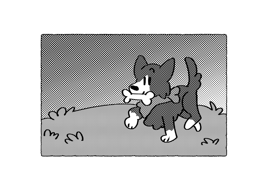
[img id: The Player, Dog, and the Knight stand by each other. They are on grass, with little hills of varying heights and colors to their sides. A river is above them. id end.]
I remade the main overworld tileset; I went for a slightly more pastel color pallet. This isn't done yet- I have some exciting things planned to make this more than just a simple "forest."
Character Redesigns:

[img id: The Angel's Lullaby Main Cast (minus Toriel). Top left to right: A mysterious sheep skull headed person stares back at the camera. The player character, wears a worn down royal cloak. Dog smiles at the camera, mid jump. Knight, at the center, smiles with their eyes closed. They have a new outfit that's a worn down belted shirt and broken down cape. Lastly there's Elis, a teenage royal who is pouting. Their face is covered by a white metal star crown. They are wearing a poofy sleeved shirt and a blue gems necklace.]
This is the most happy I've ever been with these character's designs!


[img ids: Two images. The knight and Elis with their new outfits. (described in the previous img id.) Knight stands on a hill, looking majestic with their hair and cape flowing in the wind. Meanwhile, Elis raises a hand up to make magic light particles in the air. Text reads: "The great, magical royal: Elis Hopes." id end.]
Thank you so much for reading! As mentioned before, I'm not giving myself a time limit as I really want to polish this game. Thank you for your patience, see you next month!


3 comments