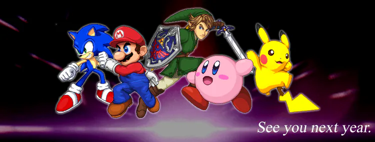
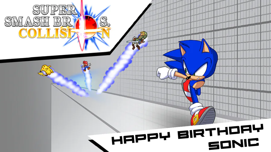
Hey guys, it´s been a while, it´s new year´s eve and we wanted to do something for you, as small as it can be.
Renders are a fundamental part in every smash game, here in Collision we took our time to make them as best as we can.
CONCEPTS
We always start with an idea, based on reference and looking to represent the character. This is usually a small sketch or drawing that can help us reach a set objective.
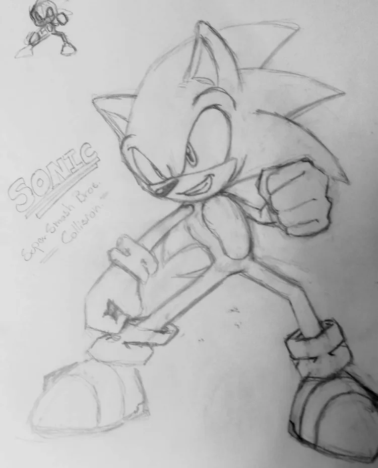
A STEP TOWARDS 3D
Once we get that idea set we move on to something more solid, so we turn to use 3D models of said character, if there is one. Lucky for us Sonic has many official high quality models.
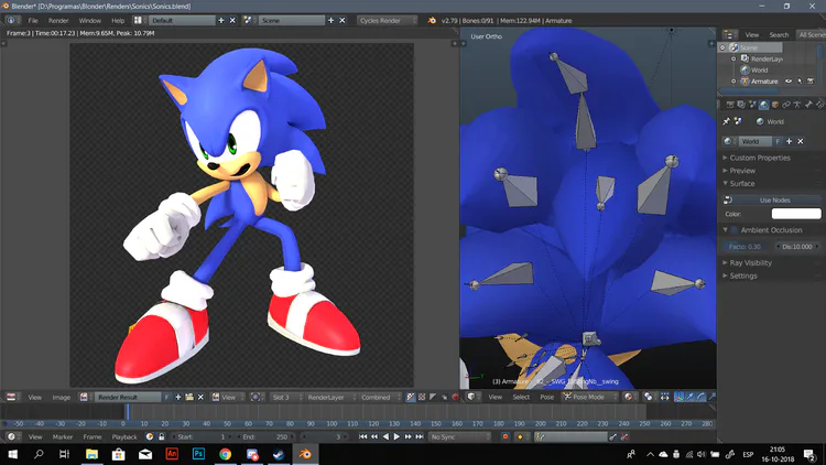
Now with our 3D render we go back to 2D to trace and edit whatever we need to change, such as facial expressions, more detail on the hands or other places.
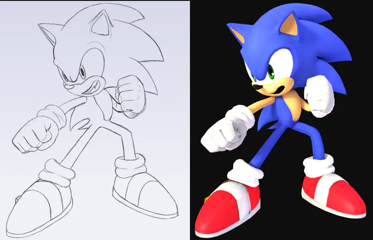
TURNING IT TO PIXEL ART
Now we have to pixelize it, on paint or any other software we want, we trace our drawing and make sure it looks how we want it, we usually follow the lights on the 3D render, adjusting some detail along the way. The 3D does not do all the work.
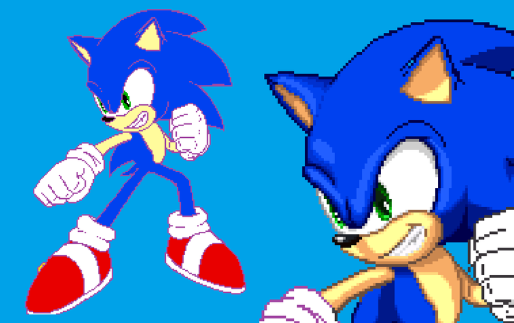
With some hard work we end up with some nice and proportional renders, but some things change with time.
POLISH
During the development process we thought the renders had... too many shadow tones, especially our pink friend. That´s why we decided to go for a different style with less tones that´s still looked good.

We are aiming for 3 to 4 shades with some antialiasing tones to make it more smooth, you can see right here how the renders look cleaner and nicer to look at.

====== Old Versions ============= Polish Version =====
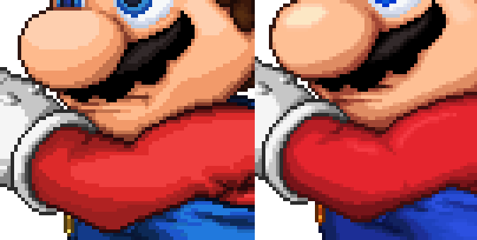
In this way we refine our style of making renders while keeping the look you are all use to. Cleaner and more visually apealing Renders.

1 comment