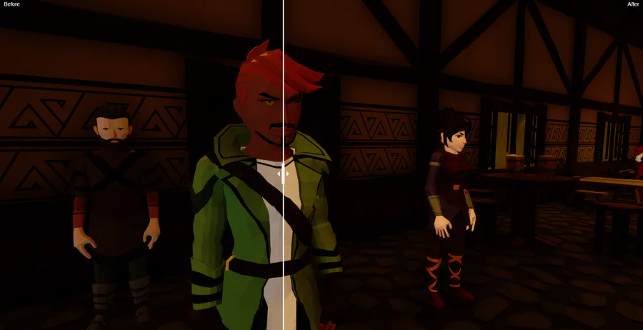
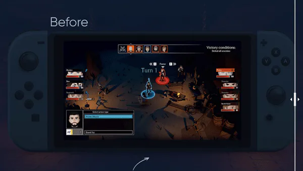
Hey folks! We've been testing some graphical tweaks based on player feedback and wanted to ask for your opinion.
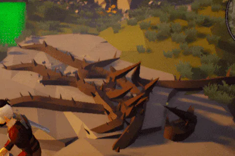
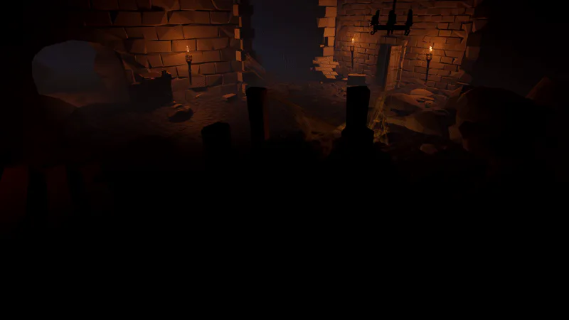
Here are two comparison shots with interactive slider which allow you to compare character lighting with the old shader ("before", drag the slider all the way to the right) vs the new one ("after", drag the slider all the way to the left).
Take a look and please let us know which look feels better for you using the vote tool and in the comments!

0 comments