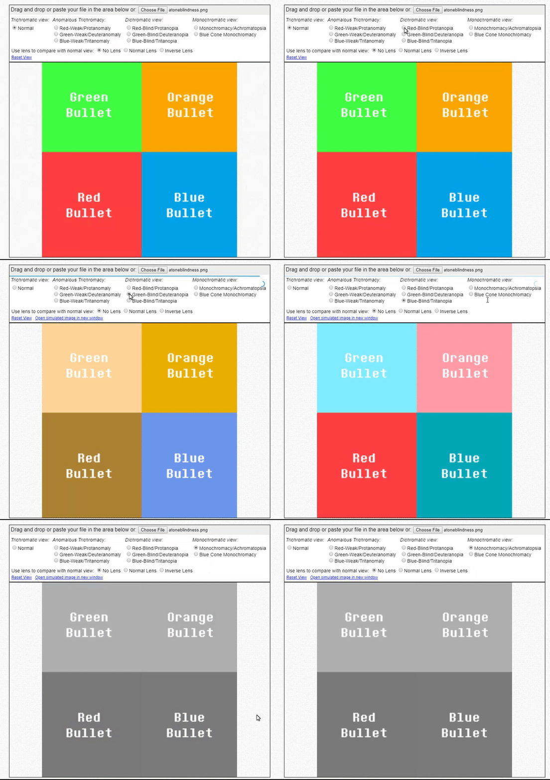
I'm back, and full of ideas. One of those ideas was to make accessibility a little more accessible, which is improving on the colorblind idea introduced earlier. As it turns out, the color red isn't exactly a good alternative, as it's too similar to orange to some people, which may confuse them given how green bullets are used in the game. It really didn't solve much.
One possible solution is to use a white plus symbol that is overlaid over the green bullets. Since most green bullets are normal bullets colored green, it's easy to determine healing bullets from harmful bullets by the blatantly obvious plus symbol that other bullets don't have.
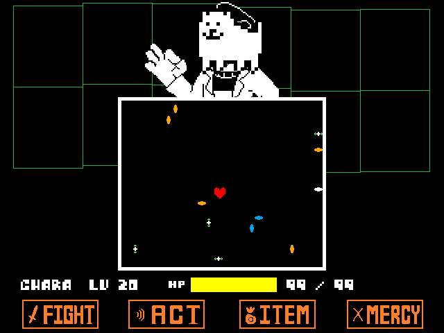

Lemme know what y'all think! I'll be finishing this new enemy that you can kinda see in one of the screenshots above. Until next time...
- Ryno








4 comments