It has been an entire year since I decided to make the move to replace all of the copyrighted The Wiggles characters with original (but similar) characters. I didn't announce it until a quite a while later, however.
While this move caused a massive delay on my projects, these games are going to turn out so much better than what I had planned for Phobia given the time it has taken, and I'm actually so glad for that. If Phobia: Long Hours had released with all the gameplay and story I first had planned for it, this series would be an absolute mess in my opinion. Nowadays, I have a very clear vision for it all and it's looking really awesome so far. Still super excited to share it all with you!
I also still have 0 regrets making this change, and it's something I believe I should have done years ago lol.
One of the biggest things I had to keep in mind was that while I still wanted the new characters to be creepy, I wanted them to look just a little more approachable than how The Wiggles’ puppets were designed (and especially how they looked in Phobia). I personally think I pulled this off very well and I’m very happy with it!
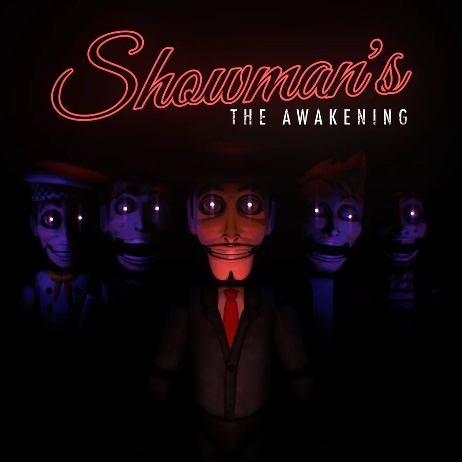
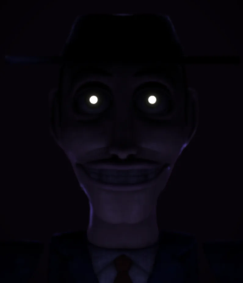
Showman: The replacement for Greg.
Showman was initially going to be a character inspired by Elvis Presley, as he was one of Greg Page's (Greg from The Wiggles) interests in music. This didn't get too far but it was a cool idea nonetheless.
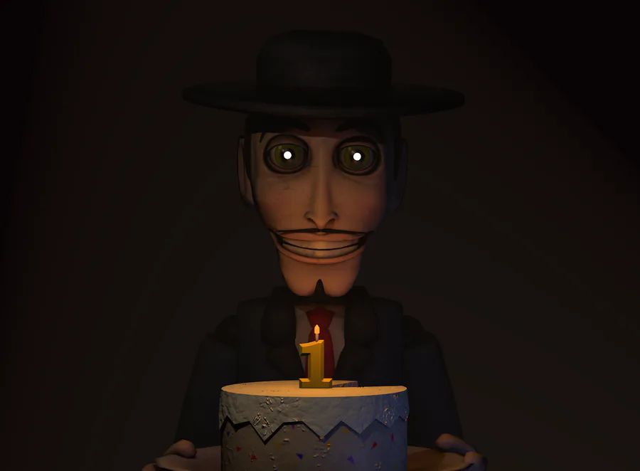
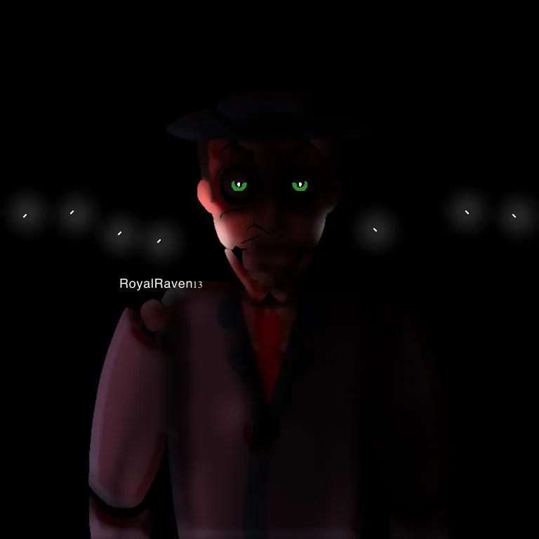
I decided to go with what @the_Wolfdog suggested, which was a character who wore a tuxedo and maybe a fedora/panama hat. I really liked the idea, considering the fitting yet off-putting and mysterious name, Showman. Frank Sinatra and The Thin Man from Little Nightmares 2 also had a minor influence on his final design to some degree.
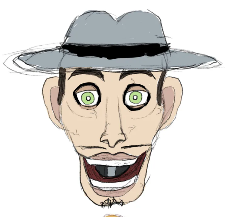
Originally his hat and jacket were going to be grey alongside a yellow tie. In his final design, I swapped it so he used blue, and Tony would more have a small hint of the yellow Greg had.
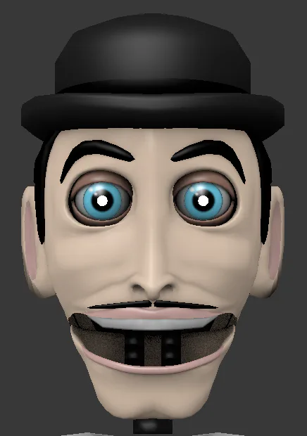
At one point, Showman was going to have a bowler hat, but I decided the panama hat was more fitting, as the shadows it would cast onto his face would easily make him feel more mysterious and threatening in the dark.
Getting Showman's design right wasn't hard. I had a pretty clear vision for him quite quickly, and his final design remains as one of my personal favorites!
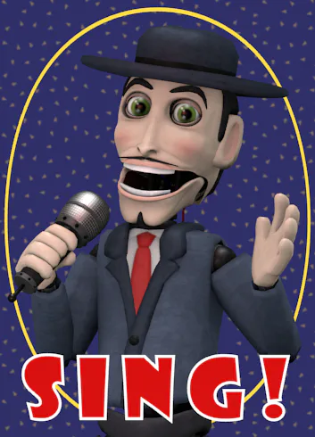
Johnny: The replacement for Murray
Johnny was perhaps the easiest character for me to design. At first, he was going to be a surfer and would wear a red Hawaiian shirt, but I decided to instead make him look like a simple young punk who'd probably drive a motorcycle. (He'd 100% still go surfing though).
He was the first one I started modeling, as I've always started with Murray's models back then, as Murray (and especially his puppet variant) is my favorite from The Wiggles.
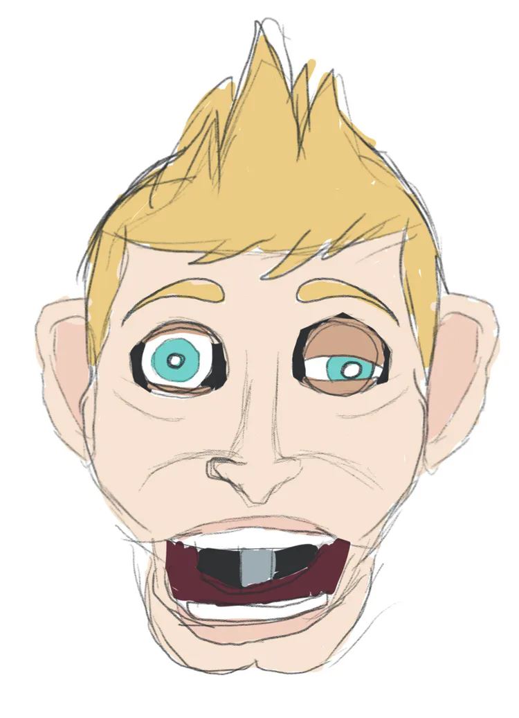
His hairstyle was a bit different at first, and it was eventually given to Harry (Jeff's replacement) as it felt a little fancier than what I was looking for to some degree.
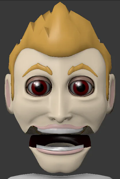
Other than that, I knew what he was going to look like almost right off the bat, and didn't really need any inspiration for his design!
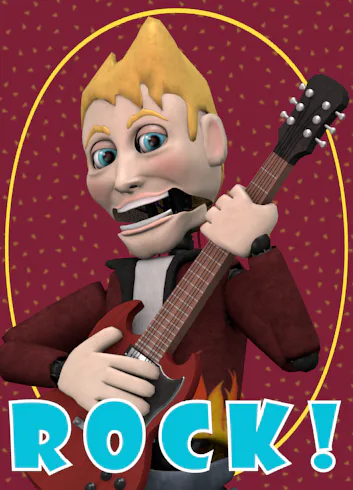
Harry: The replacement for Jeff
Aka, the character that took the absolute longest to figure the hell out lmfao.
Harry's design took a very long time for me and was undoubtedly the hardest one to come up with.
At first, I started with the idea that he could still be a sleep-oriented character like Jeff and could do something like tell stories to the kids. I thought this was fun, but that sounded too much like a character who would fit in his own little special area to me.
ha ha Harold and the purple crayon (i never realized that until later lol)
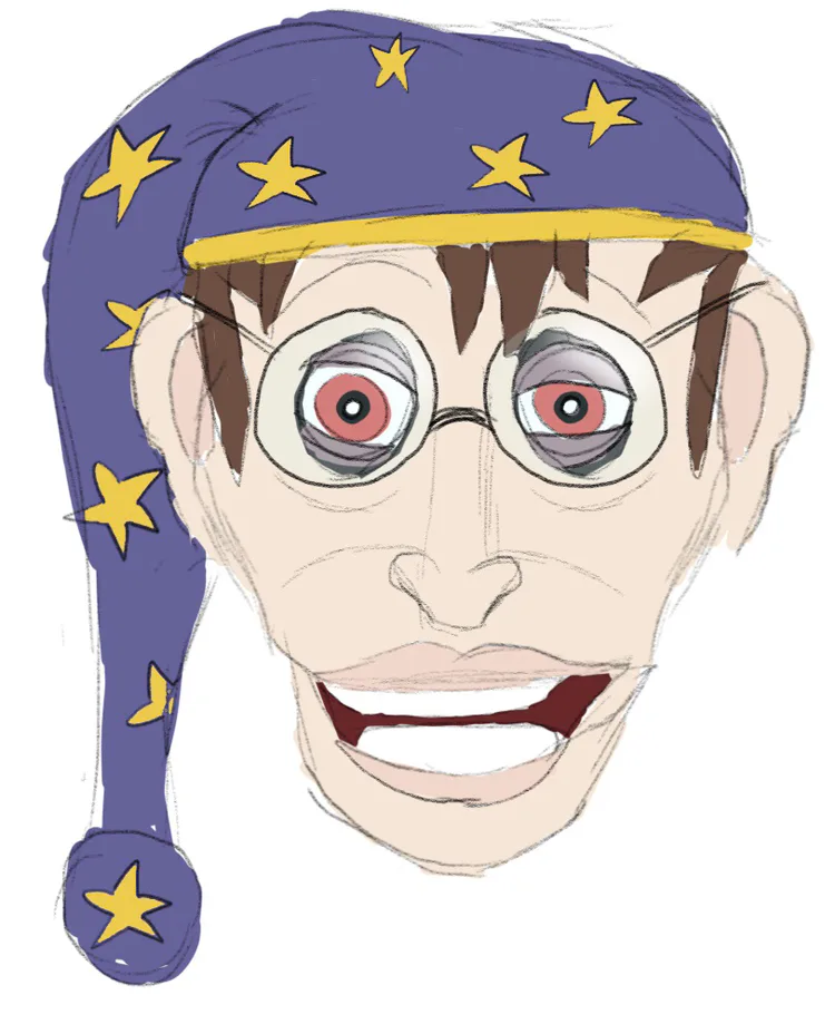
I was also against this idea since Jeff in Phobia never even did the whole sleeping thing (and was never planned to) lol. It was a fun nod, but not what I was looking for. Also, he just didn't fit in alongside Johnny and Showman, either.
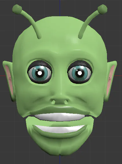
The second idea was to change him to a silly alien named Zapp, and while this was fun too, again, it didn't fit in, and again, it would work way better in its own little area. Also, its design was quite hideous, but it was so early in the modeling process that it likely would have looked better after some more work lol.
You can actually find him in the warehouse in SHOWMAN"S: The Awakening! His mask is very hidden, but it is there as a fun nod to this character's concept!
My next idea was to make Harry more of a 60s/70s British hippie, and this worked better, but I still wasn't too sure about it and decided to try something else.
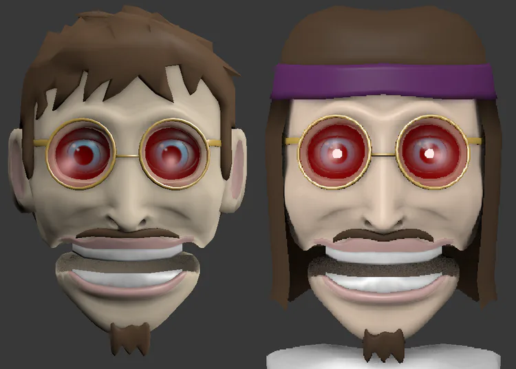
After that I also considered making Harry a surfer, since Johnny wasn't specifically a surfer anymore and that there was a The Wiggles song titled "Surfer Jeff". It was cool, but still felt a little too similar to Johnny to me personally.
Alas, I ended up going a very simple route with Harry, making him just another gentleman like Showman, and to my surprise, his design worked absolutely perfectly with the rest. Some have said he looks like a waiter, which wasn't exactly my intention, but it certainly fits him well. I gave him eyebrows since he just looked too much like the old Jeff puppet without them, and it was a minor addition that caused very drastic change.
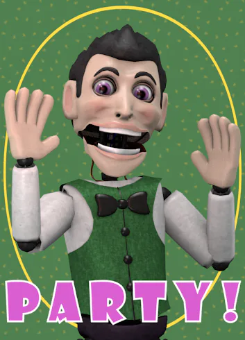
Tony: The replacement for Anthony
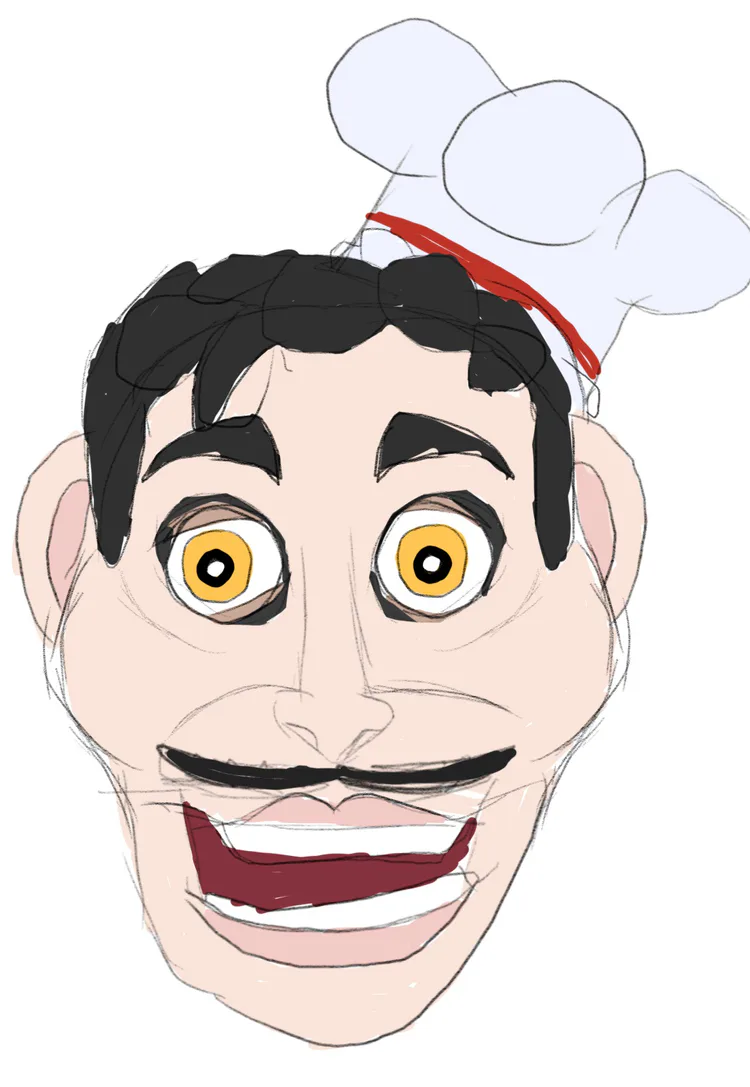
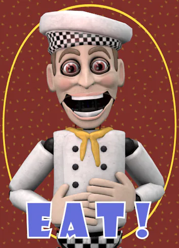
I started with Tony being a chef inspired by Pasqually from Chuck E Cheese, considering both Anthony liked food (and even was a chef sometimes), and that he was also a drummer. It was a fun double reference!
At first, he was going to have dark hair and a mustache, with a small chef hat on the side of his head. I liked it a lot, but it felt a little too close to Pasqually for me, and it also sort of had that same feeling of better belonging in his own place.
So, I decided to try what I had going with Harry, but with Tony. This really didn't get too far. The design was simple, but too simple for me to like.
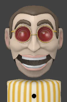
I decided to revisit the chef idea while applying the model's current hairstyle to it, and the Tony we all know and love (and don't want to stay inside the same room with) was made! He's the character I find the creepiest of them all, and I'm very glad he turned out that way because that was my intention!
Cap'n Cackle: The replacement for Captain Feathersword
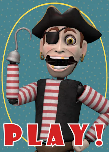
This one is actually kind of a funny story. I just thought, "yeah let's just change him into a slightly different pirate", and low and behold, it worked very nicely.
My second option was to make him a cowboy, and honestly, I kind of regret that since it would have been different and really cool, but things like that can always be saved for another time!
He NEEDED that very dangerous looking hook, okay?
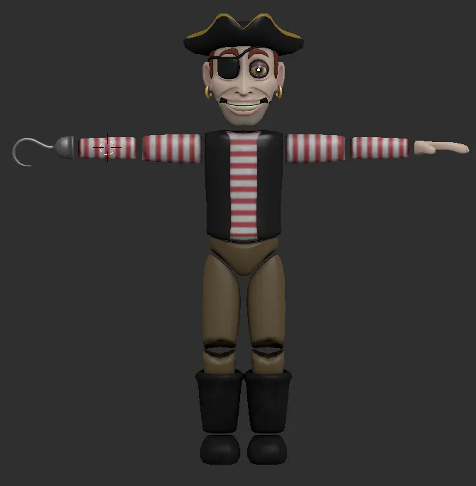
His final design was made so, so quickly, and I'm very happy with it. I decided to take Captain Feathersword's hat from Phobia: Long Hours since I just liked that one's design better. The reddish hair is actually a teeny tiny reference to Foxy!
The difference between his clean variant and the one you see in the warehouse is drastic in only the textures alone. He's also the most unique character I have ever put into a FNaF fangame yet, and I'm excited for you all to meet him...
Peggy: The replacement for Jimmy the Elf
Initially, the replacement for Jimmy was going to simply be an endoskeleton from the warehouse. One that is in better shape than most. This was what it was in Phobia when it was titled Brought to Life, so it worked alright.
A lot of people were surprised by hearing that Jimmy the Elf was getting replaced, but he is a character from The Wiggles, just from one vague Christmas song. The reason why he even was in the game goes as far back as December 2017, but that's a whole other rabbit hole and we're not here to talk about that lol.
There is a mask of an elf character hidden in the warehouse that looks like Jimmy, but it is, in fact, changed to be a different elf character lol.
As much as I liked the endo idea, something didn't feel right about it. It felt a little too bland for my liking, and I began searching for another option.
And behold! Peggy was created, being the first female animatronic in the series. At first, she had ginger hair and green eyes, but the design very much stayed the same when I started modeling her. It was a bit tricky trying to make her look more feminine, especially when I was using models that have exaggerated masculine facial features.
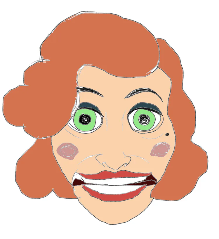
Peggy's name comes from Miss Peggy Lee, one of my favorite jazz singers, and her overall design was inspired by Marilyn Manroe. Her hair later changed to be dark brown (when she had legs!), but I liked it being blonde more.
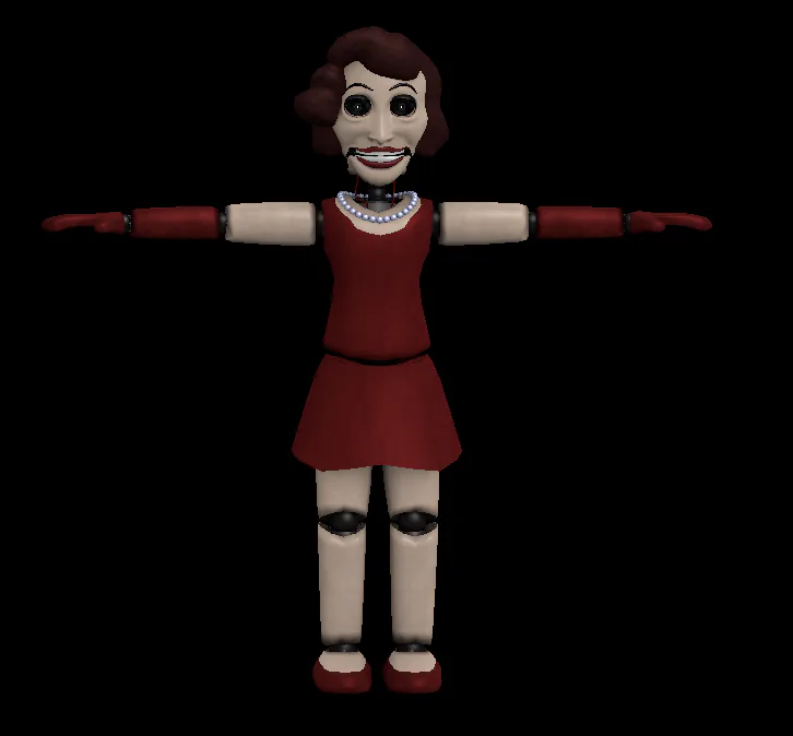
Later on, I decided to remove the legs simply because I had no idea how I was going to get her skirt to work right, and I certainly was NOT going to rig the skirt because that would be a nightmare to manage. You weren't going to see it anyway lol but yeah.
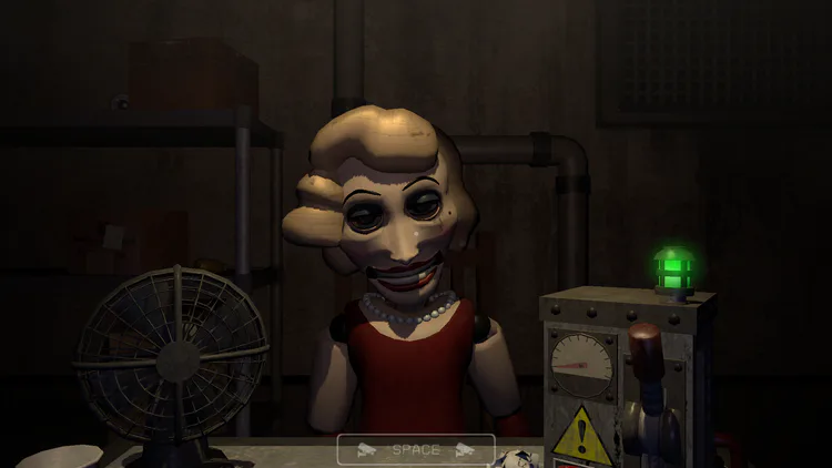
Then I came to a really nice conclusion for her character. She's an unfinished animatronic. Close to being finished, but never was, and unfortunately sat in the warehouse longer than any of the others...
She is easily the most intimidating character in The Awakening in my opinion (she's made me jump multiple times during testing), and is one of my top favorite additions to the game, she is also a pretty unique character as well.
And that's it! I put a lot of work into making these redesigns, and it was to a point where I actually cannot pick a favorite. I was REALLY nervous making that announcement last year, and seeing the positive reception to it all really made me feel good and encouraged to keep going. Thank you all so much!
I'm also so, so excited to give them upgraded, fancier, shinier designs for the sequel, and even the characters who are original in that game will also be getting some nice upgrades! Too excited for that. I have lots of ideas!
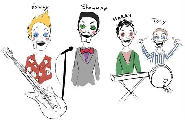
Sketch of the characters done by @the_Wolfdog, around the time when their designs were very early and super simple. You can see where some things stayed!






17 comments