This past week I've been working on improving the look of Hive Quest.
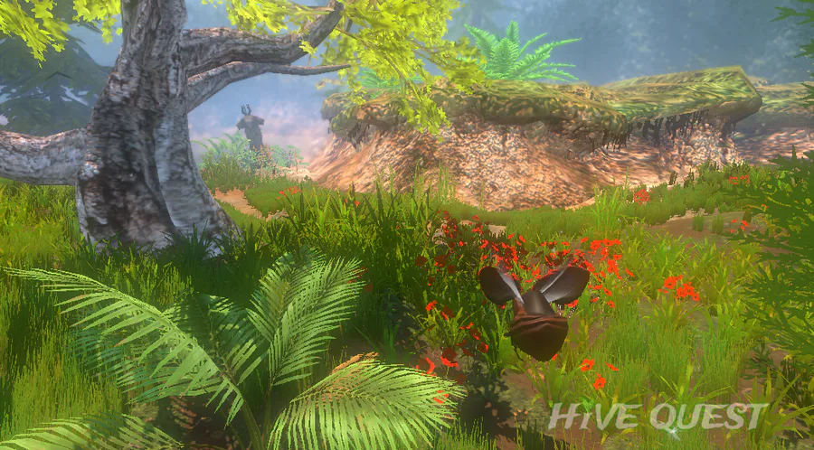
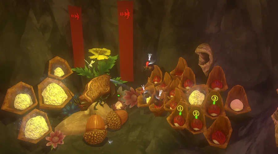
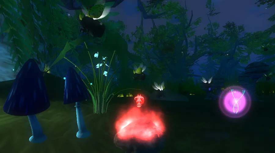
Without a doubt the most effective way to do this was converting the game from the old Gamma lighting, which made things look a little cartoony and simplistic, to Linear lighting, which makes things look more 'real' and allows for some cool post processing (camera effects).
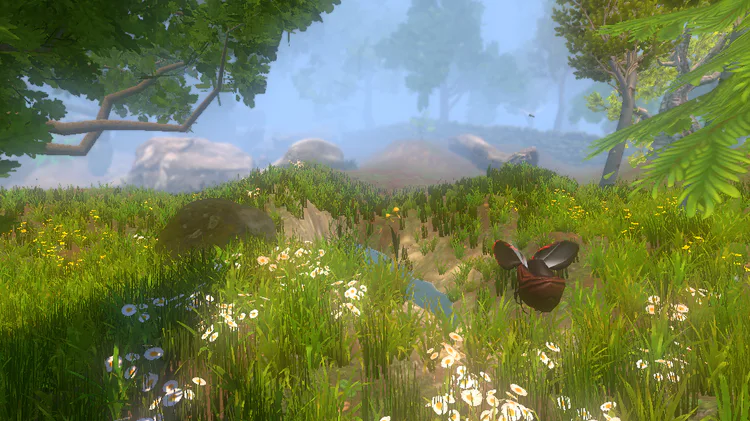
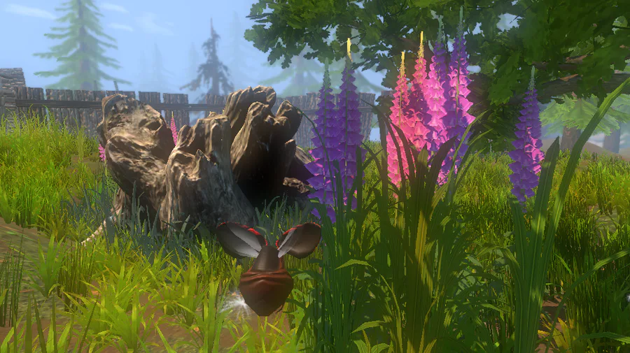
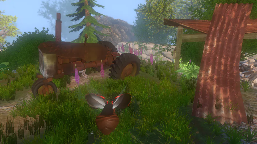
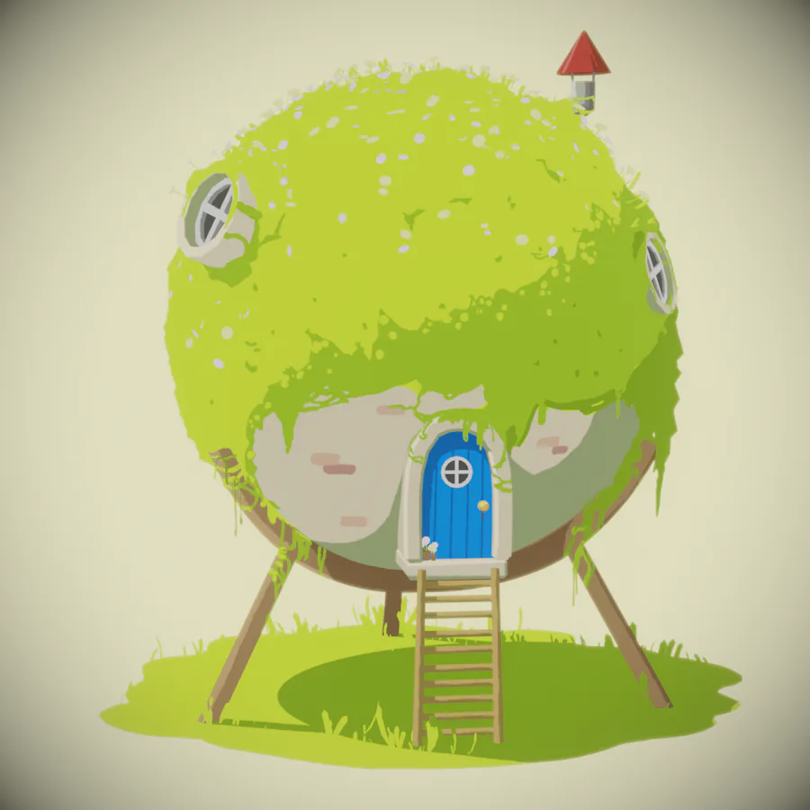
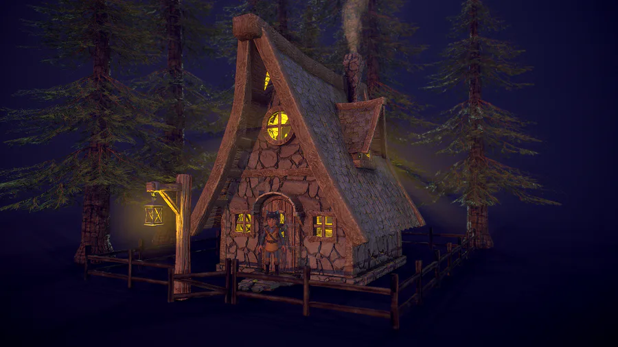
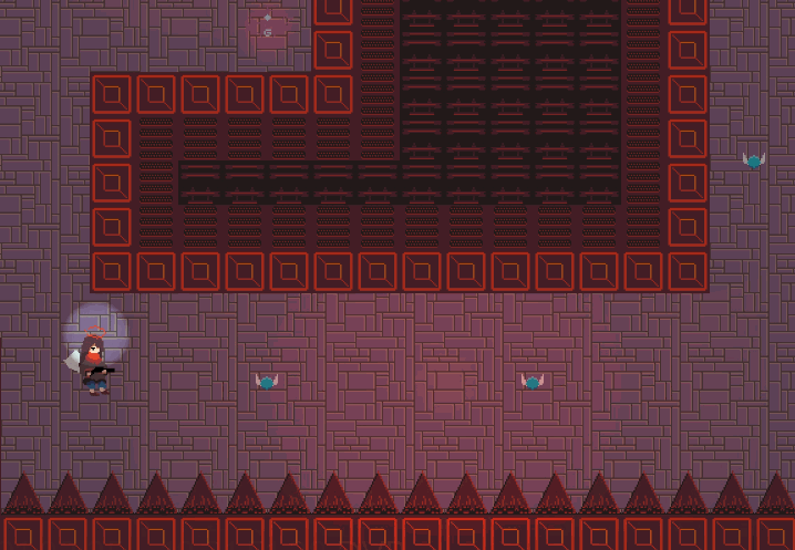
Here are some screenshots after the lighting changes - comparing these to earlier screenshots & devlogs you'll see the difference.
(continued....)
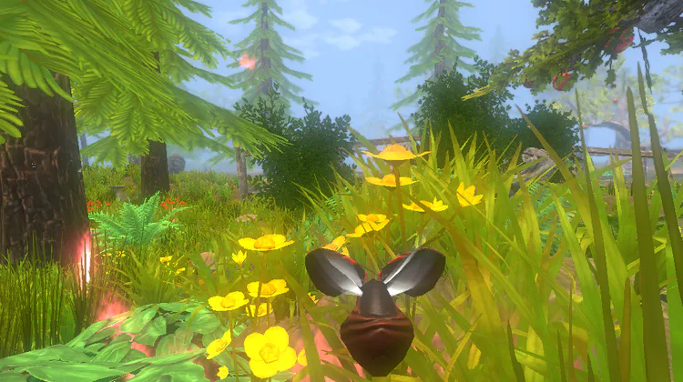

Personally, the gamma lighting did have its charms ( I liked its 'retro' look, especially as the game is partially inspired by the '90's classic 'Black & White') which is why I used it to begin with.
But, reading through the lines on all the player feedback I've received over the past few months, some people are not seeing it as 'retro' at all, but just as 'less than ideal' game graphics.
So I changed all the lighting over to linear lighting and top of the list right now is to make Hive Quest look as 'Wow!' as I can possibly make it :D
Scrrenshots imminent.
Rod
----
If you would like to support the development of Hive Quest please consider pledging a dollar on the Patreon page
----



0 comments