2 years ago

I'm gonna do it. Analyzing Left 4 Dead's art style, part 1, the basics.


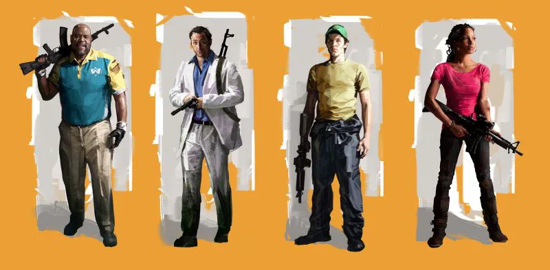
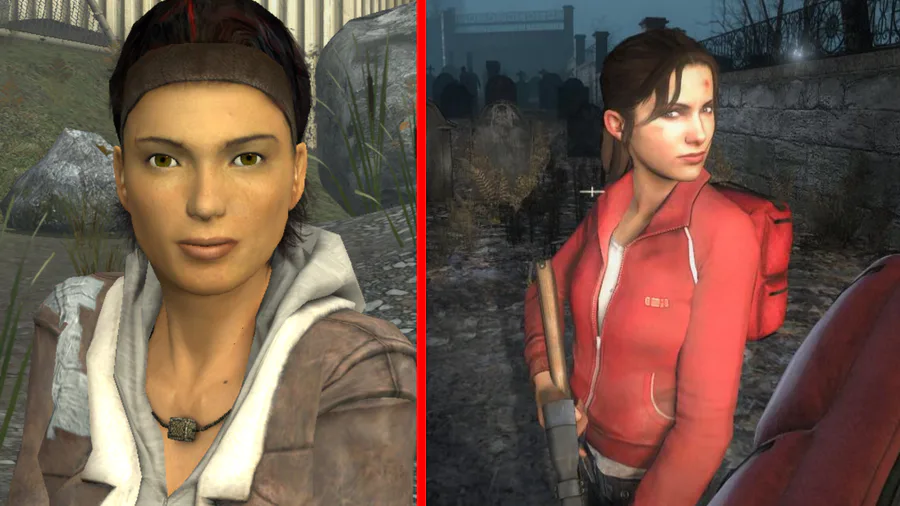
Firstly, I wouldn't exactly call L4D "photorealistic", sure it's pretty realistic but it's kinda simplified, where actual clothing detail (dust & stains etc.) are represented with brush strokes rather than texture, and that highlights are brighter while shadows are darker, look at the 3rd image for an example of L4D vs HL2.

There's no real word for this so I'll call it "Illustrative Realism".

Returning to the 3rd image, you can see that the colors in HL2 mix together way more (not that it's badly designed, it's a real pretty game) but L4D purposefuully gives the characters more saturated colors to stand out from the rather drab background.


2 comments

Loading...

Next up

Well, as my summer break wraps to a close I thought it'd be nice to wrap this fact tightly with a song, as I haven't made/published one in a while. For a few extra words, read the article. Otherwise, sit back and enjoy the music.

Recently created a new design for how to represent myself (without actually taking pictures and showing my very real and not-leaf face), so... new PFP!

In honor of 'Mothers Hating Spines Day', I decided to make a drawing of a mother hugging her son!

Made two header things for Assassination Sunday (A game @ThePyroCone is making)

"Leafy With A Cigarette"

Made a new, sleeker logo for Tyrannical Madness! Featuring it's a different font from TF2 and a ✨non misspelled name✨

Whipped up a quick Roxwell sketch to show off that I gave him a new hairstyle!

I had this random idea in my head for a BFDI fighting game so, I decided to whip up concept designs. Will this be an actual game? I dunno, maybe.

I made a logo for @ThePyroCone 's TacFortress 2

It's been three months, might as well make a new Pickle humanization (I've made so many I actually debated posting this but I also love how this looks soooo-)