


Next up

i feel a bit crazy brorijfkwefmnldllllllllllllllllllllllllllllllllllll
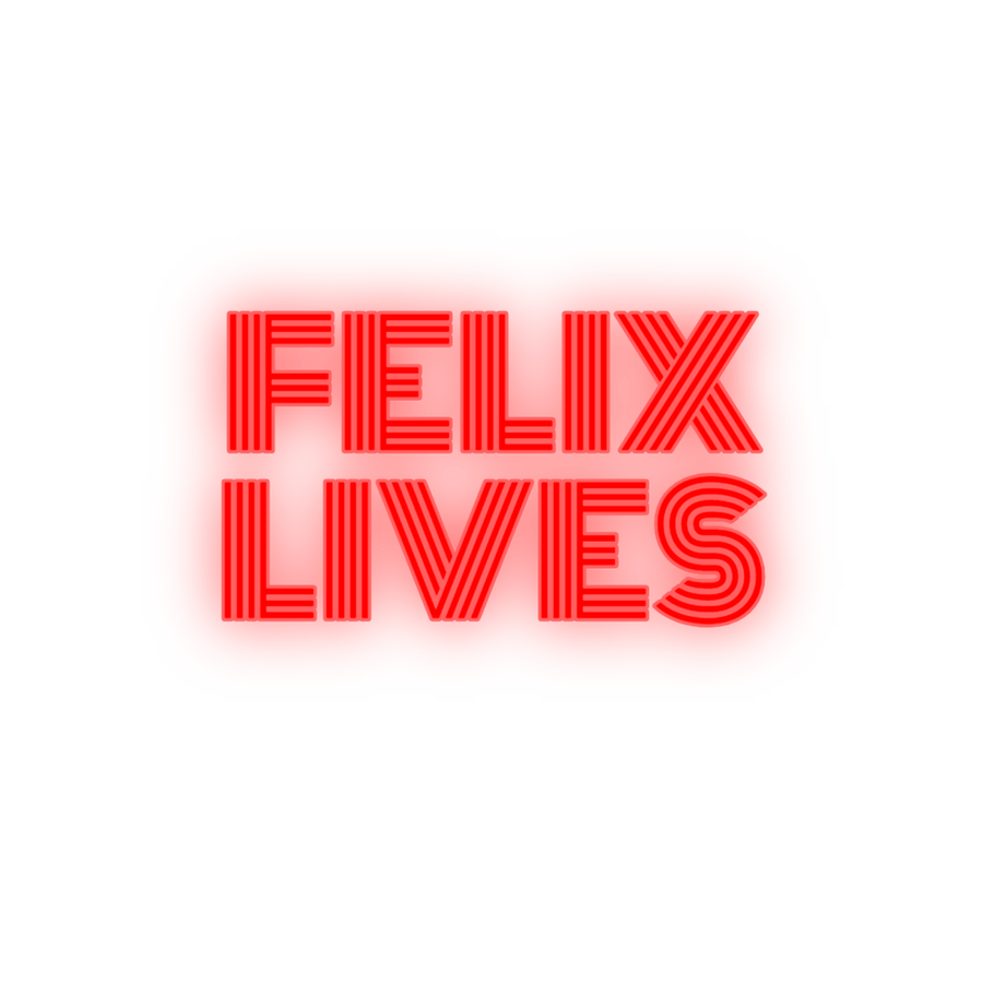
felix went missing about a week ago now there's a movement for him #felixlives

I hope Alfredo reads this :>
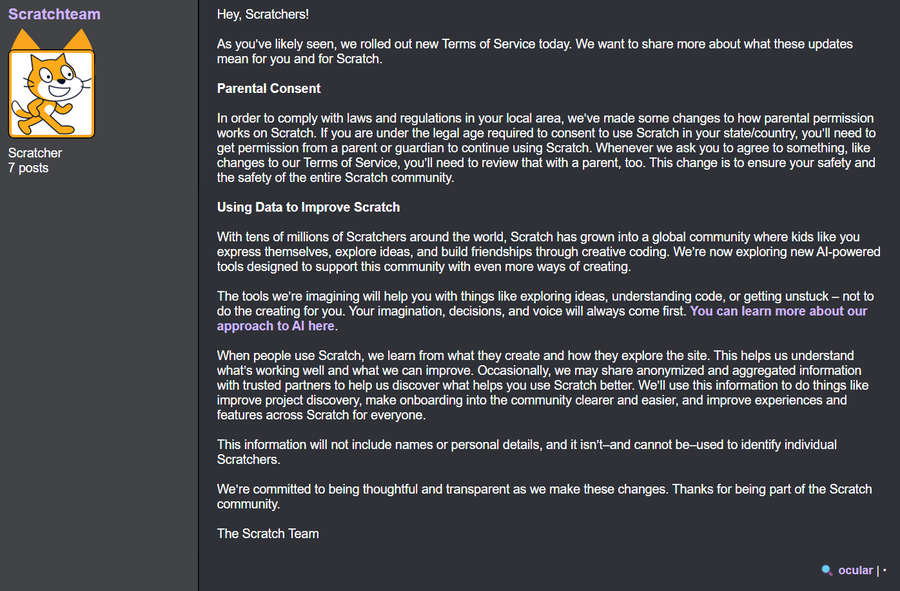

The Scratch Team has just recently updated their Terms of Service yesterday, letting you know they now have full permission to use your content to train AI models.
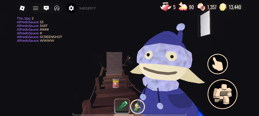
I just wanted to grind stardust😭😭😭

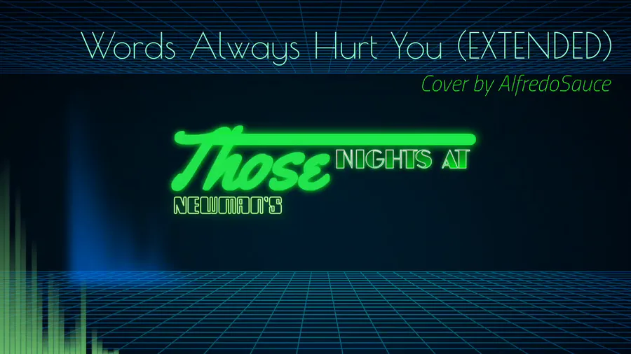
Teaser 1
thanks alfredo
fruits and stuff uhm uh-
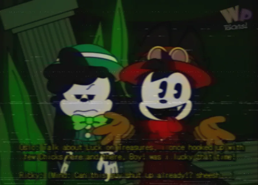

Ricky Rabbit's Seasonal Flavoritiez! Season 3 Episode 13 (Wet Dry roundabout)
dripped out
0 comments