Next up
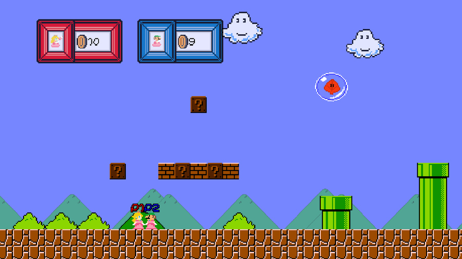
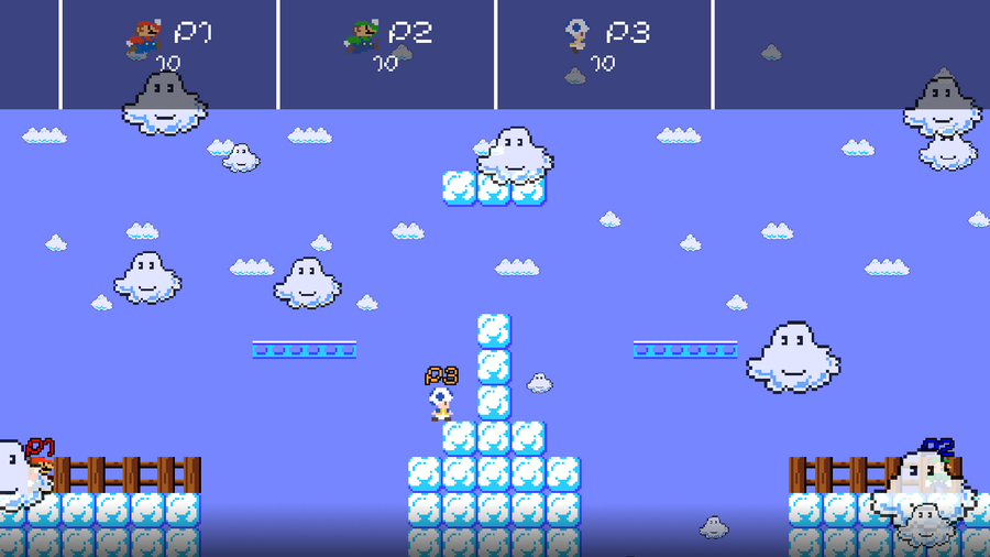
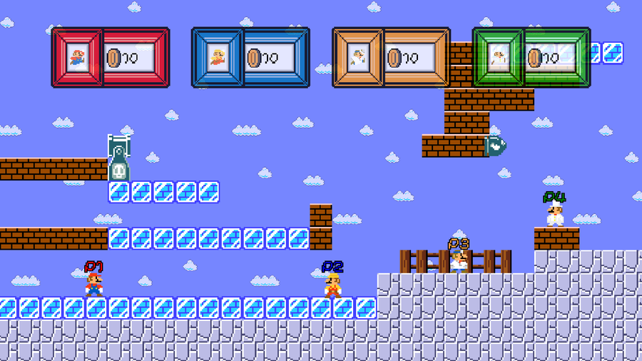
I made a new hud yesterday, but I forgot to post an update. Compare it to the old one. There were a few reasons for this, but the main one was that the old HUD was fundamentally flawed in how it was created, and it took up too much space.
new character; donkey kong
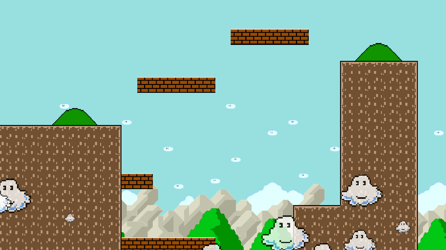
The fifteenth stage is based off a portion of a Super Mario World level. Pretty basic but it doesn't reuse any assets but the clouds and the bush (and brick blocks). This is the last stage I'll post, the rest are secrets.
Working on alternate costumes. Here's 4 for Luigi. (And 4 for Mario!)
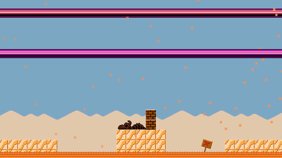
The fourteenth stage is a desert-themed stage taking place in... the desert. Quicksand pulls you down slowly and there are pipes and sand particles partially blocking your view.
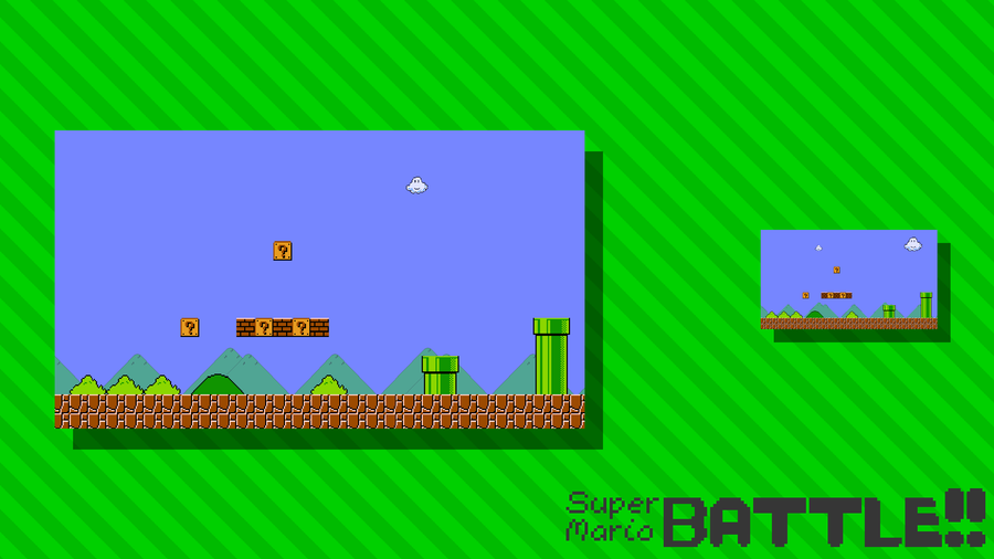
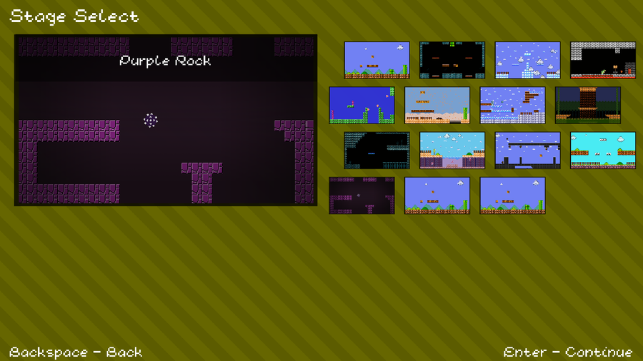
I decided i should optimize the stage select screen, as it takes the longest to load, since the portraits are so big for the stages. In this game, sprites are blown up to 3x their original size, so i figured i could shrink the portraits by 3. Comparison:
new logo this will probably be the last time i change it and i've been meaning to update it for a long time
The twelfth stage is pretty boring, not gonna lie. It has note blocks, and that's... pretty much it. It's also the first stage to reuse music from another.
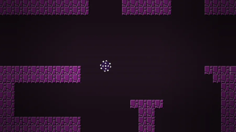
The thirteenth stage is based in a dark cave. Rocks fall from the top of the screen. This is the 2nd stage to reuse music.
Here's a comparison between the current stage select screen and the final stage select screen. I'll save you the counting; that's 36 stages. And, please, ignore the dummy slots.


0 comments