
ever wondered: ohhhhhhhhhhhhhhhhhhhhhhhhh how i draw a Maniac Mania? well worry not more none you no.
first of all: the program i used for drawing all of the sprites is Paint Tool SAI. the terms i'll be using and the thickness of everything is dependent on that program, meaning things might be different if you're using a different program.
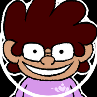
there are two stylistic differences between the two types of sprites seen in Maniac Mania. there's not really a name for the in-gameplay sprites seen, but there is for the menu: Info Poses.

Info Poses, factually enough, weren't originally intended for Maniac Mania. still, you'll have to pay attention to making the lineart width 2.3 pixels, while keeping the black 10 tints higher.
those are the basics, with the nitty gritty coming in later.

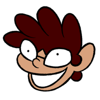
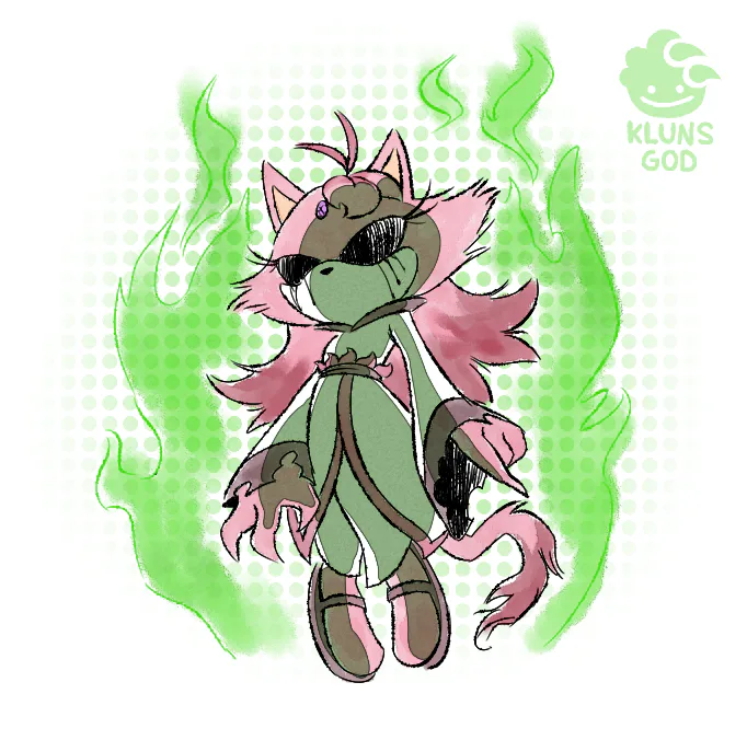
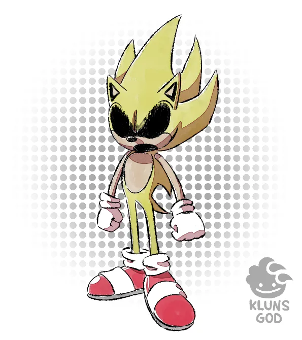
in-game sprites use 3 pixels of lineart width, with phantom markings being 55% in density and its spread texture set to 100. this helps give it that spooky withered feeling.
the Phantom Markings are also used on Withered Toy animatronics. another fun fact about the Withered Toys is that they don't have any shading applied to them, only Phantom Markings. indeed, any character with Phantom Markings applied on them don't have shading applied to them.
it's a 2-way road: give em shading, or apply the Phantom Markings.
Phantom Markings on Phantom characters are applied via straight, downward lines.
Phantom Markings on Withered Toy characters are applied via splotches across the body.

for shadows, notice where the light source is, and think of how the light would affect the character's dimensions as if it were a 3D model. only focus on the character being affected here; light doesn't bounce from the characters onto the props in this artstyle.
for the Dining Room (see picture above), the farther away they are from the camera, the less visible they are. and in such dark rooms, if the character is too baked in shadow, you can always cheat and only draw what's necessary. look at Withered Toy Mario
how about we go back to the menu and check how we do the characters inside the boxes?

this is an old template, but it does the job well.

Menu Heads. their pixel width are the same as the in-gameplay sprites. 3 pixels wide.
the heads on the menu all have a light source that's coming from the left side. think of it like a morning sun coming from the northeast.
apply these shadows to their extreme, you can disregard the rules of lighting a small bit if you want to stylistically make a part completely black.
the eyes never cast a shadow, they MUST ALWAYS be visible. their eyes must always be ready to stare down at you

the "Mini version of Character" is in reference to Sketchhog designs. they are simplified, with very basic shapes and stickfigures telling you what they are at a very basic angle.
imagine how, during your sketch phase, you start off with lines, circles, triangles, and cubes? that's the actual character.
good character design is able to simplify a character's design down into simple shapes. Sonic himself is essentially a circle with triangles. keep that in mind as you design a Mini/Sketchhog Version of someone.

now sometimes you have to change the painted scenery for a character. how does one go about doing that?
changing the scenery is difficult, seeing as i drew them using a brush with high Blending. the exact values used above aren't entirely accurate, but it's a close approximation if you want to nail things down.

you can try to paint over it, or (in this instance) draw an outline. if that's too difficult, you can also be Hannah Barbera and draw the scenery in the same bold colors as the characters.
now time for basic artist tips/artstyle stuff.

for Info Poses, silhouettes are important. i'm sure you've heard this a lot of times, but good character design is when your character can be recognized via its silhouette.

back to shading... as said before, pay attention to the light source and act as if the character is 3D.
if there's no clear light to pull reference from, look at the room itself and where the shadows are created.
move the RGB circle counter-clockwise and the box diagonally right. it makes the characters look more vibrant while they're on their way to kill you.

with level of detail, the only thing that's allowed to get overdetailed is blood. animatronic casing cracks like on the Withered Toys too, for some reason...
keep a balance of detail across the body. you wouldn't want smooth-bod Sonic while tears and scruff are everywhere else, wouldn't you?

tracing 3D models is an affront to the stylistic artstyle. don't ever do this.

the robot limbs are very rubberhosey. it won't make sense to give them stiff joints. the endoskeletons of these robots also don't make sense internally, so don't try and apply logic to a lot of this.

i hope these sets of images and text will help you understand the Maniac Mania style even more. and if you want to apply it yourself, hey good luck.
at the end of the day, this artstyle is a combination of several things: TheCyVap's original FNaS artstyle, Shigehisa Nakaue's Mario artwork, and how i drew back in the day.
unfortunately, Sonic's actual artstyle doesn't shine through, but perhaps it may one day. perhaps you'll be the one to innovate the FNaS art scene, this is just a guide towards the style of just one game.


15 comments