For May, work was done in improving the way that characters talk and express themselves, as well as optimizing game loading. Specifically, the dialogue box style was updated so that they cover less of the screen, easier to understand character expressions were added, and some tricks were used in order to better hide the transitioning between scenes.
New Dialogue Boxes
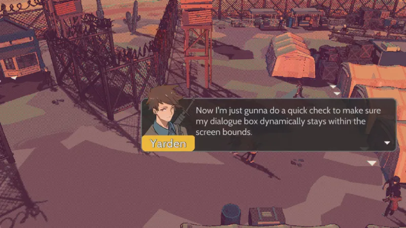
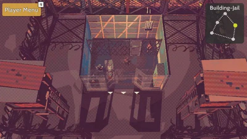
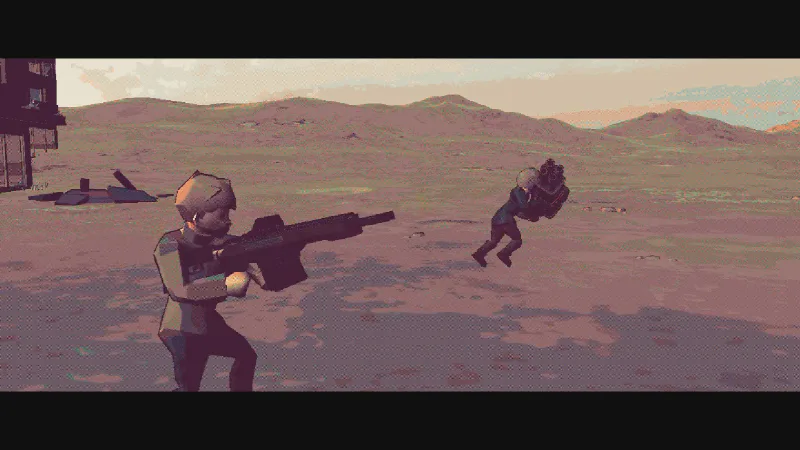
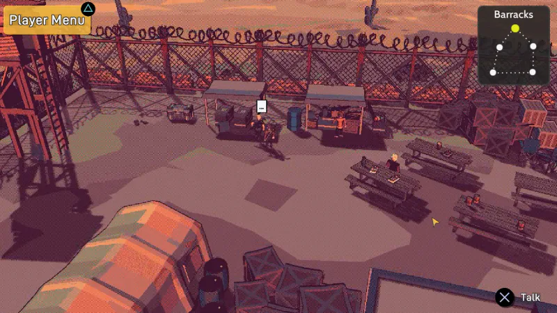
So I've recently played through the first Trails in the Sky arc and something I noticed, was that it was able to create a lot of dynamic cutscenes despite not having current-generation graphics. This made me think more about all of the JRPGs I've played when I was a kid and how they were able to tell stories using small dialogue boxes, so I started to convert my previous dialogue box style to the dialogue bubble style.
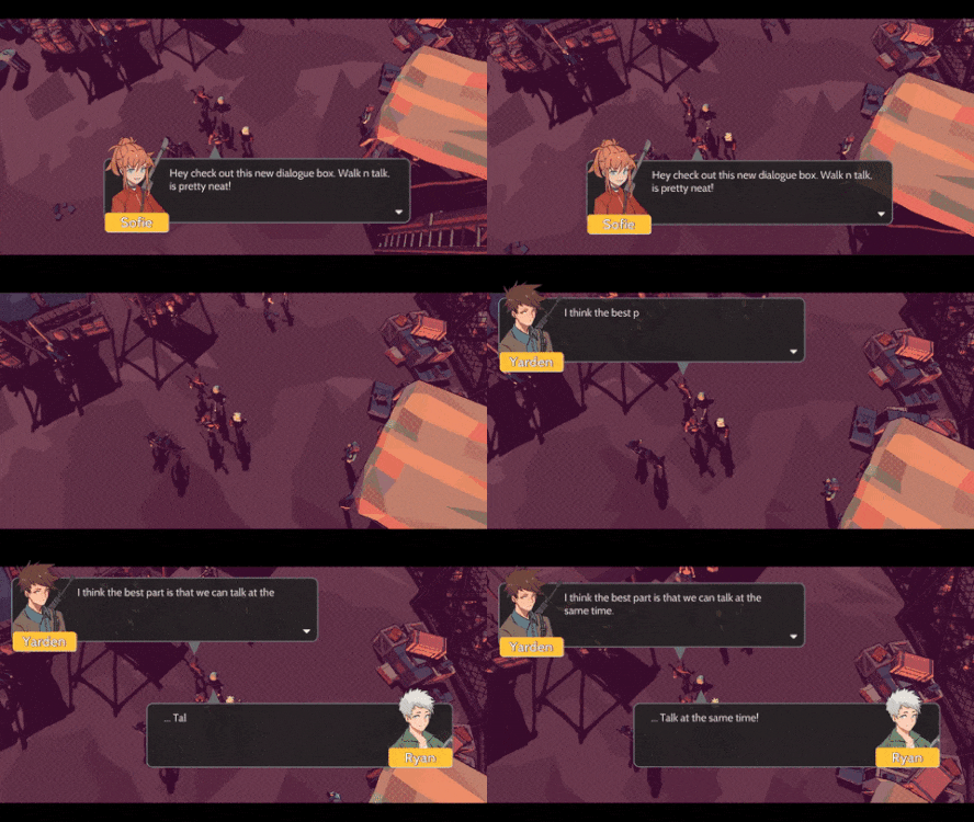
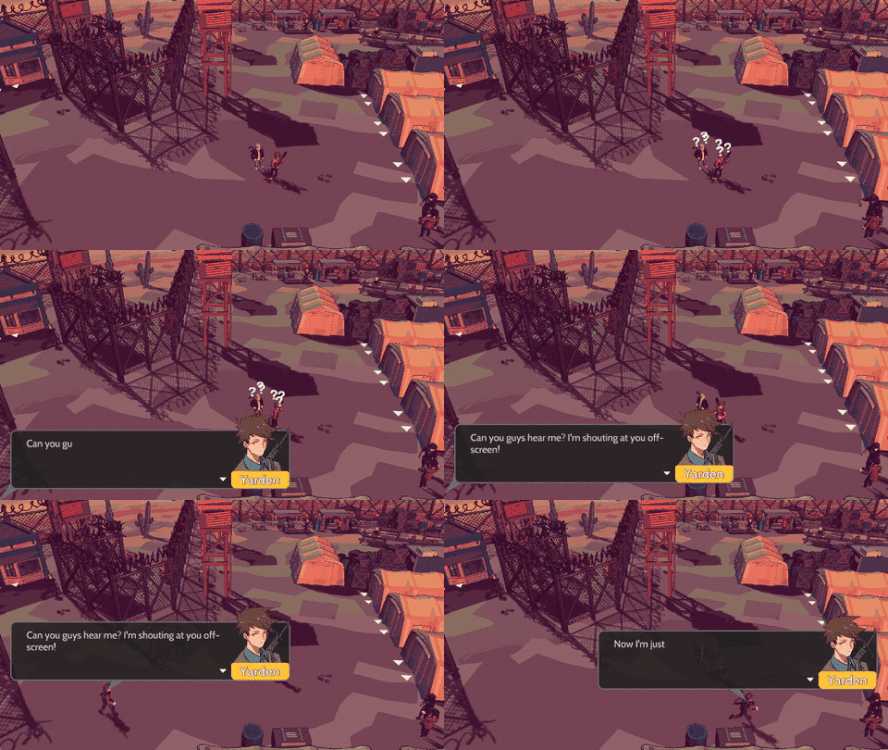
The major benefits you get with using the smaller dialogue boxes is that more of the screen is visible to you so you can easily see how characters react to what others are saying, movement can occur while people are talking, and as many people can talk at the same time as you want. The previous dialogue box would use big character portraits on either side of the screen, but this felt clunky since the entire scene would essentially be paused because you wouldn't be able to see anything other than the dialogue interaction.
Improved Loading
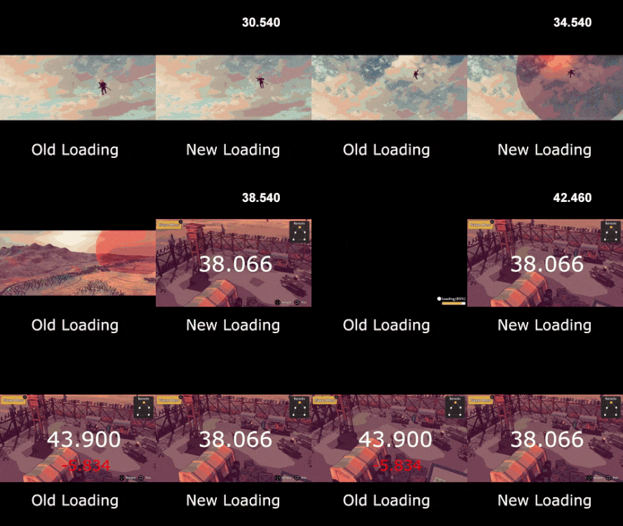
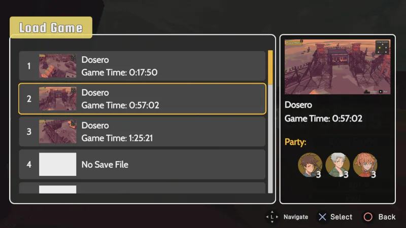
I wanted to do some optimization with the loading between scenes since it affects the game as a whole to make the experience feel much smoother. Previously it would load the next scene asynchronously up to 90%, then when the scene was ready to load the next scene, it would finish the next 10% and show a loading screen to transition. The issue with this is that there is a noticeable amount of time that comes from loading that last 10%.
To try and make the loading experience smoother, I've converted scenes to have all game objects inside of one container and initially set to inactive. So now instead of only loading 90% of the scene, it will load 100% of the scene so there's essentially two entire scenes active at the same time, except all of the components of the next scene are inactive (I tested it out and I don't see any performance issues, no matter how many inactive objects I have in the next scene). When the next scene is ready to be loaded, it will show some selected transition animation, where it will make the previous scene objects set to inactive, and the next scene objects to active. It unloads the previous scene asynchronously, then waits for the scene manager to give its completion callback where it will then show the visual transition into the next scene.
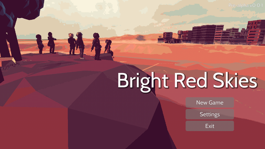
Here's a comparison of the performance of loading from the main menu to a cutscene, to a town scene where you can move around. (going at 2x speed and gif size too big so couldn't show the beginning).
Character Expressions
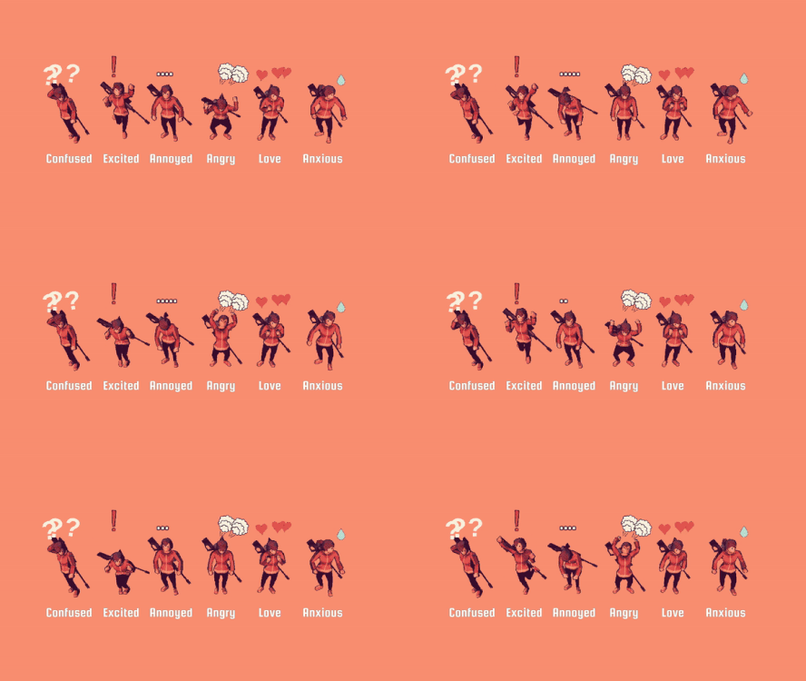
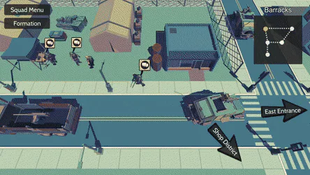
So a limitation of using low poly 3D assets is having expressive characters. So again, taking tips from old school RPGs, it becomes clear that there need to be emotion icons above the character's head when they feel certain emotions. Right now, the expressions that can be shown are: confused, excited, annoyed, angry, love, anxious. These can also be triggered in the middle of dialogue interactions and cutscene.
Behind the Scenes
This is a section of the devlog where I like to talk about the parts of the game that were improved but aren't necessarily big enough to have their own section. For May some of the extra things completed were:
Cleaned up a lot of unused code from systems that have been improved at some point.
Removed related Unity prefabs that used the removed code.
Going Forward
For May, there was a strong focus on improving gameplay elements that allow for a better environment to tell the story. For June, I want to do some more work on combat, improve my development QoL, and solidify the outline of the demo, so the stuff I want to be done include:
Combat defeat screen.
Use Unity graph node API to update the dialogue tool.
Complete layout of scenes and sequence of the demo.
If you have any suggestions or want to give your opinion on the game, follow me on social media, I listen and respond to all comments :D
Discord: https://discordapp.com/invite/vD8XYkn
Twitter: https://twitter.com/mark_viola
0 comments