a follow-up to the second mock.
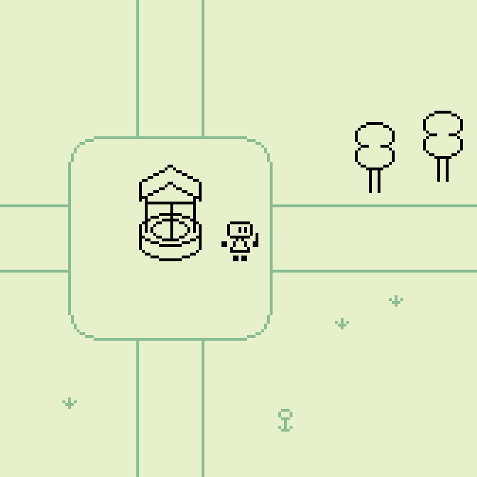
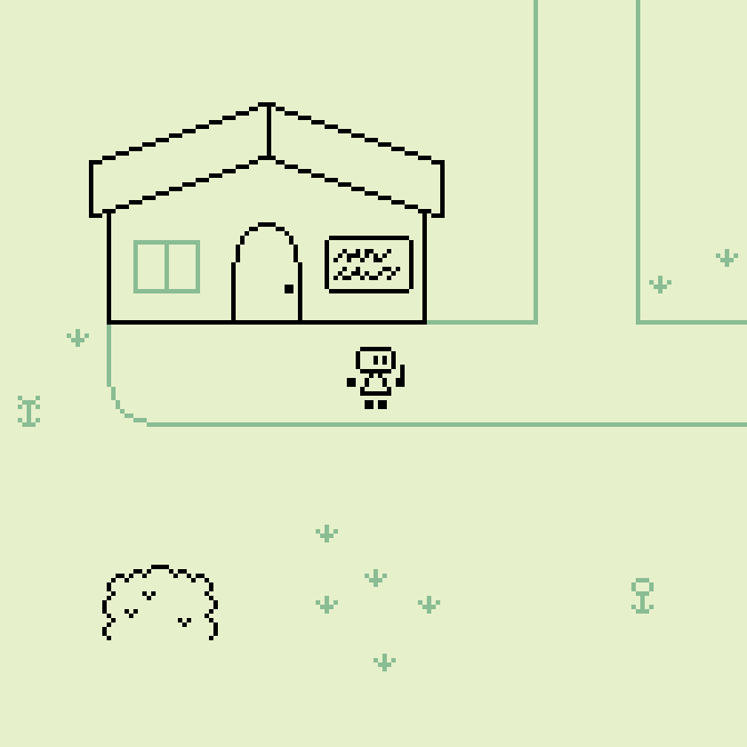
this time it's a top-down scene (rather than side-on)
Made in Pixelorama. #ArtWeeklies · themes:
⭕️ Scene: Town
❌ Fanart: Pokémon (by The Pokémon Company)
❌ Random: Attack
#ArtWeeklies optional limitation:
⭕️ Use a monochromatic palette of 4 colors (or less) for your submission(s)!
screen size: 168×168px
tile size: 24×24px
colors: same as in the second mock
i just confirmed why i use vector art for my game visuals
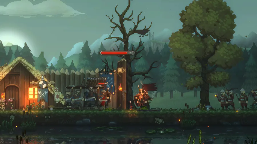
oh boy, these pixel arts look blurry when shown in thumbnail size 
this is a problem with all pixel art: unless it's shown in increments of 100% zoom, either the edges of the pixels get blurry (with bilinear filtering) or the pixels are unevenly sized (with nearest neighbour).
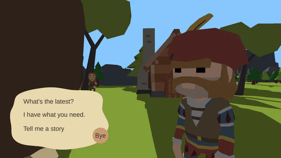
if you compare with the second mock — which i exported for Game Jolt in the exact same resolution (672×672px) — you notice that it does not look blurry. vector art just scales much better than pixel art — even when rendered to a pixel image like for this post.
scaling in 100% increments is easily enforced by putting the picture in the middle of the window and filling the rest with black, but then there's empty space that people complain about all the same.
using vector art is a great way to avoid the problems with pixel art scaling. but i also use it because i can just make more satisfying shapes with it 



2 comments