Screenshot Saturday!
I have posted many times during screenshot saturday although this will be the first news posting labeled “Screenshot Saturday” so let’s start off with #1 shall we :D
As usual I have been so busy with additions, changes and new feature implementations for JBS I had to take some time to write out a nice post including everything!
In short here is a list of the changes:
Talking animations
Pre-battle images
Mining Feature
Fishing Feature
Intro keys section re-worked
Pause feature
Alignment & Menu sync
New Journal graphic
Death animation for enemies upgraded
Kitchen altered
light fog for stg1
caldon walks around in parts of dreams
3 new maps to stg 3
Stage 3 boss beginning to work on
HP bar displays under enemy when inflicted with certain state (WIP)
Antidotes and potions in visible containers stg 1
Journal entries updates more frequently for main and side missions
Abbot now has a better graphic!
Game room completed with 2-3 included mini games available to play in room only
Save confirmation added
Area 1 re-design
Nurse guides through stage 3
intro splash
Saving/Loading scene revamp
piano playing in game room
lava run mini-game
skip intro included
Now let’s go over some of them and show what’s been going on ^_^
Talking Animations
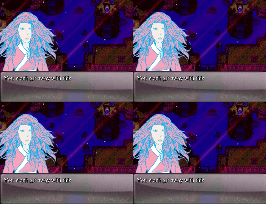
I went ahead and put in talking animations for the in game dialogue as I felt like static images of faces was not what I was going for, at first I was just going to add different emotions but then I realized even with different emotions the characters were still too static. With the new images I will receive from my artist shortly I will posts some images of the talking animations in game, for now I only included placeholders such as this:
Pre-Battle Images
I really love japanese video games and one thing that stuck out to me during oldschool japanese games and even newer ones was intense battle scenes. Something that I thought would be very nice for my game is something I see done a lot in japanese games, character images of the hero and enemy slide across the screen either at the beginning of battle or during battle giving it a bit more flare.
I feel like my battle scene is a tad bit too plain so I wanted to spice things up, Shyla’s character image will now slide in from her side of the screen momentarily and then fade. If the enemy is a boss, it will most likely have the same effect, other then that, small fry don’t get that much attention heh.
Unfortunately I don’t have the new character images as of yet so what is displayed are just placeholders, at this time I don’t wish to share the images with the placeholders due to not really liking how it looks myself but I should have some displayable pictures sometime soon.
Intro Keys Section Re-Worked
At the beginning of the game you are shown instructions on how to play the game, a display of the keys shows momentarily and then fades. Before it was pretty much a plain section and of course I didn’t like how plain it looked so I added a few things, still to be done is adding in the new keys and re-working the key layout itself but here’s an image of the environment change for that scene:
http://www.youtube.com/watch?feature=player_embedded&v=PnDBw-hWxv8
Lava Run Mini-Game
Even though my game is a cinematic game I really wanted to stray away from the long 15 min cut scenes, we all know that only Final Fantasy games can get away with cut scenes that long XD
Now even with that said I won’t be taking away from the story in any fashion but I will merely display the story in shorter cut scenes and hopefully more entertaining in between levels and mini-games.
I really wanted to catch peoples attention at the beginning of the game and although I loved the intro how it was, I felt the cut-scene was much too long, so I actually took out the second section of the intro and added in the new lava run mini-game. This mini-game should def. spark some interest in the player right away, easing you into the upcoming cut-scene. Here’s a video displaying a bit of the mini-game:
http://www.youtube.com/watch?feature=player_embedded&v=xqP1wmF7_Uw
Skip Intro
Not everyone will be up to sitting and watching the cut-scenes even though some may not be that long, in my game there are no continues, when you die it’s game over. So for the beginning of the game I understand the lava run mini-game may not be something you’ll be great at on the first go (unless your a BOSS!) so I put in an option to skip the short intro scene for the people who want to get straight to the mini-game. NOTE You can always load the last autosave file as it should load on the mini-game just fine, your choice.
Alignment & Menu Sync
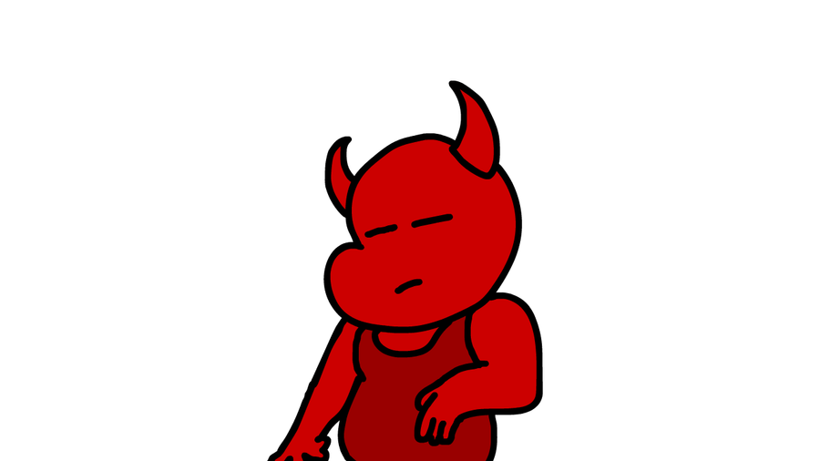
As you have probably seen as of recently I posted a few shots of the new in game menu and how it changes with your spirit aligment, if your spirit is in good standing it shows green, foresty layout but if your spirit is in a bad standing (dark) then it will show a demon layout. I have not shared the demon layout as it’s still a work in progress but you can check out those images from the last news post or the images section.
New Journal Graphic
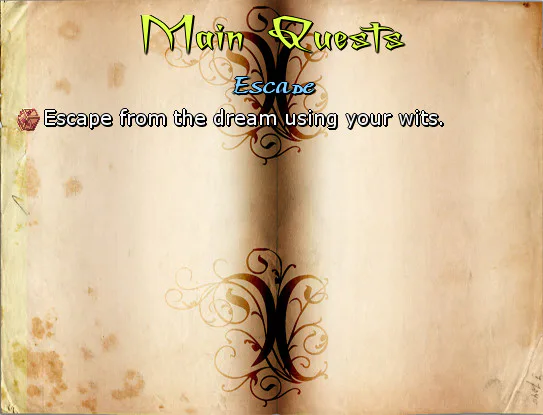
The last menu graphic was… well let’s be honest, it was ok but to me was merely a placeholder until I found something more appealing. Low and behold I ended up making a better image, take a look below:
Journal Entries Updates More Frequently
Before the journal updates only came once per stage but I have gone through and added in new entrees that will appear during your adventures. New main quests and side quests have been added and will help you navigate through the stages if you happen to get stuck.
Death Animation for Enemies Upgraded
The old animation for the enemies death was the enemy would fall to the floor or merely fade out, I felt like it was too simple so now when an enemy dies they stretch upwards and fade as if they were sent to the heavens without warning!
Kitchen Altered & Fishing Feature
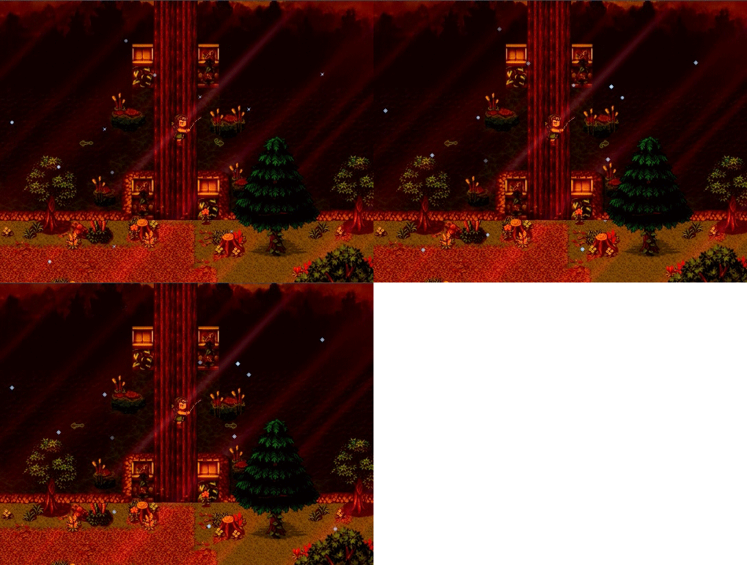
I changed the kitchen a bit due to adding in the new fishing feature which now makes you go out and actually fish for your fish XD I took out the fish basket and the water bucket where you would normally fill up your water bottle, oh now let’s see if you can find the proper place to gather water :P Shouldn’t be too hard (still in the kitchen).
For the fishing mini-game, you have to smash on the ACTION key enough times or else the fish will get away! Although I am sure you have seen this already, if not here’s a quick shot of the fishing feature:
Stage 3 Light Fog and Caldon
I decided to add in a light fog to Stage 3, giving it that much more of an eerie, dreamlike feeling, there’s not really much to show for that but you will see it once the new beta comes out. I also added in Caldon walking around in a few stages, walk up to him and see what he has to say!
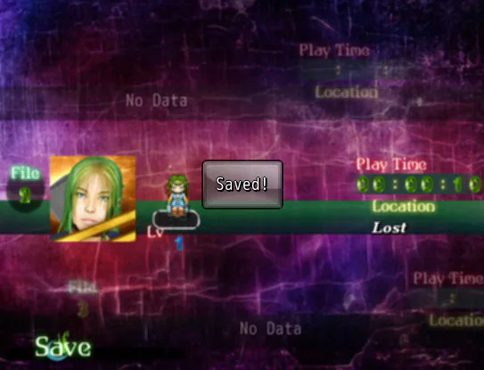
Saving/Loading Scene Revamp
The saving scene got a nice revamp although it’s another test, most likely it’s not the final version but I am liking where it is heading so far:
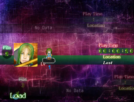
I also added in a verification notification that says “Saved!” once your game is completely saved,
it seems some people were not sure if the game actually saved in the previous builds because the save scene would close without any notification saying it saved. Hopefully this helps people to know “YOUR SAFE! IT’S SAVED!” XD
Mining Feature
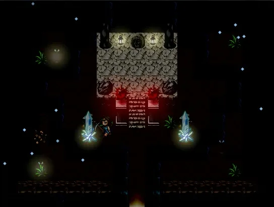
The last thing I will cover is the new Mining Feature, you now need to venture around and gather power stones in order to power electronics in Shyla’s home or in other areas of the game. This feature adds more versatility to the actions performed in the game, below you will see an image of Shyla hacking away at the only minerals in stage 2!
The other minor things I didn’t feel were needed to cover but as you can see there has been a lot going on and a lot changing, if I might say so myself things are shaping up really well. I hope all of you love the new changes and get to play the latest build soon! Until then…
Stay tuned!! RAAWWWWRRRRRRR XDD



0 comments