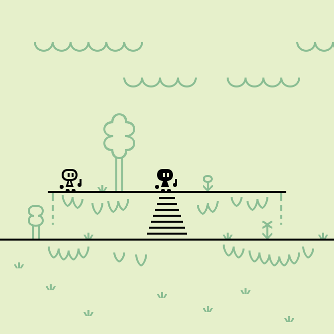
follow-up to the first mock. the big changes are:
bigger tiles for player movement based on tapping the target tile (rather than pressing left/right/jump buttons like in the original game)
colors with better contrast, especially between foreground color and background color
no status display, because it would be on the black screen borders (letterbox/pillarbox) and look different in portrait mode and in landscape mode, so i want to plan the status display with separate drawings
Made in Inkscape. #ArtWeeklies · themes:
⭕️ Scene: Forest
❌ Fanart: Castle Crashers (by The Behemoth)
❌ Random: Weapon(s)
screen size: 168×168dp
tile size: 24×24dp
control points snap: 1dp
beziér handle snap: ⅙dp
colors:
screen: oklch(93.75% 0.05 120)
background: oklch(75% 0.08 150)
foreground: oklch(6.25% 0.1 180)



2 comments