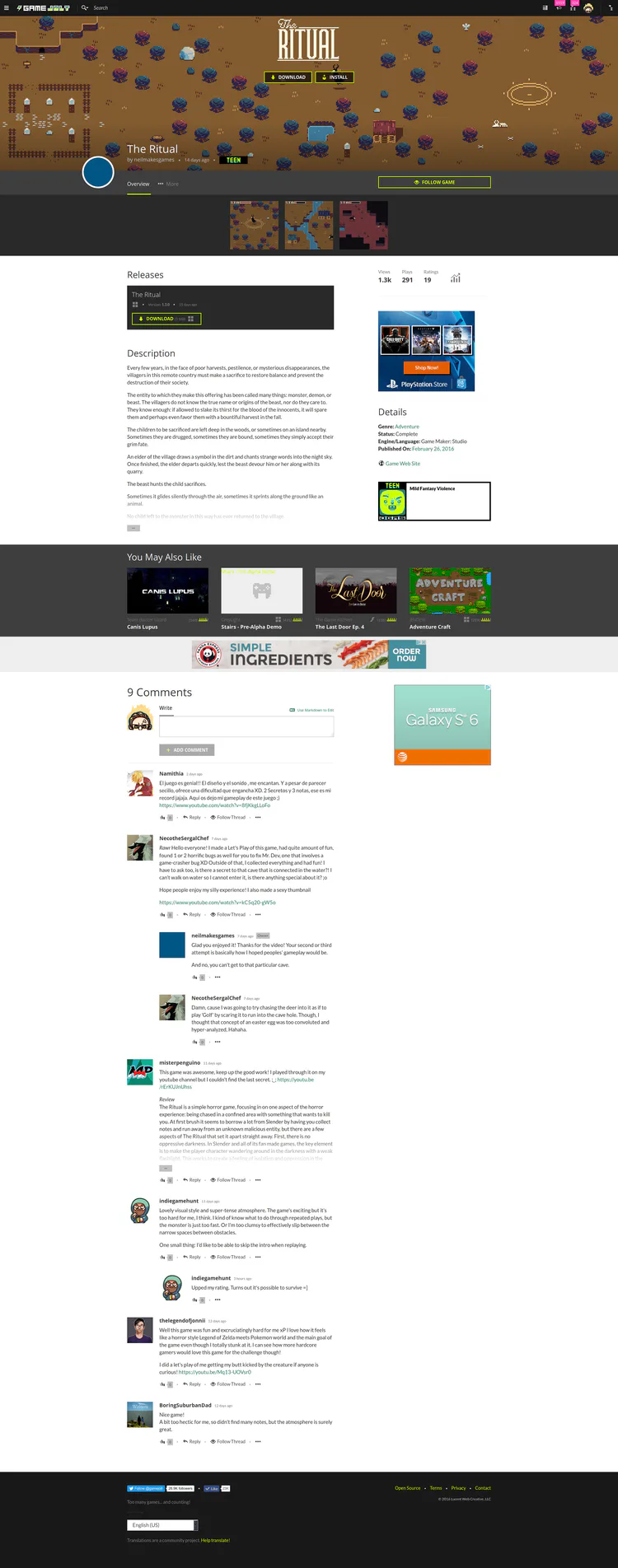
Decided to muck around with some ideas on how to improve games pages! There's been a lot of good feedback and suggestions, and I wanted to see if I could address some of it.
So, here's what I'm going for with this one. Would love to hear your feedback after you've digested it all. I'll describe all the changes below, so read that first as well.

Visual Noise
The current design has been described as more "crammed" than the old one. I think some of this is related to the large banner bar with all the stuff in it such as "title, developer, add to playlist, follow, navigation, rating widget, follower counts, etc". It's a lot of visual information to take in at once, and all those bits of information compete for your eyes to focus on them since they're all given about the same weight.

Instead of that, I'm going to try to split those components across the page a bit better. This way your brain hopefully isn't trying to make sense of so much visual noise the first time you hit the page and can digest it in time.
Quick Play/Download
There are a few ways that I see people coming to game pages.
While browsing the site they may land on a page. When that's the case, I believe they want to get some information on the game before downloading/playing it: view images/trailers, read description, view some comments, etc.
Because they follow it and really enjoy coming back to view news and discuss the game with others in the comments. (this is becoming increasingly common for in-development games)
Because they viewed a let's play of the game, or a friend told them to play the game. In these cases they have already decided they want to play the game. They want to play it fast.
The game pages don't cater very well to the last type of traffic, which we get a lot of through let's plays. Rather than changing the whole page around, I'd like to offer some quick action buttons on top of the game header. If there is one package for their OS to play, it'll play/download/install immediately. If there are multiple, it will scroll them down to ask them which one they want.
Better "Above-the-Fold"
In keeping with the styling of fireside posts and forum topics, I tried doing something similar for game pages. Mainly, to show the developers avatar at the top (for a quick link into more of their stuff), and utilizing the game header spacing to show the title/developer information. This actually moves more content up on the page so you have less scrolling to access the packages and details of the game.
You can see the difference this makes in the height:

Following
Game following has gotten ridiculously important. It's almost the primary way to say "I like this game" now. There tends to be more follows on games than ratings in many cases. Because of that (and because there are many games that are in-development), I'd like to make that the primary action you take on game pages besides "play".
Still a work-in-progress...
It's still very much a work-in-progress. For example, here are the things still missing:
No follower count
No way to see the current rating of the game
No ability to even rate a game
No add to playlist button
I'd also like to get some sharing stuff implemented (share to a friend on GJ, share to fb/twitter, get sharable link in client)
You can view the current code changes for what I have so far in this PR/branch: https://github.com/gamejolt/gamejolt/pull/37/files
Thoughts?