Hi!
This week there’s been a bunch of work done in terms of more dialogue and story related stuff for the new scenes. At this moment, almost half the total amount of scenes have been created and scripted! The momentum is good, and development is on track.
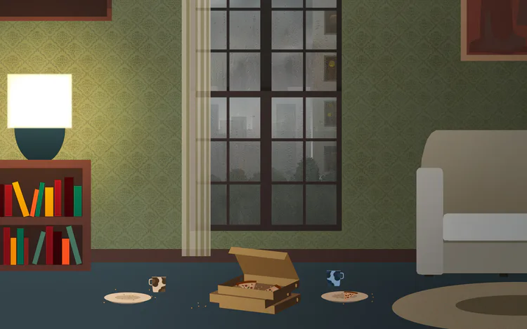
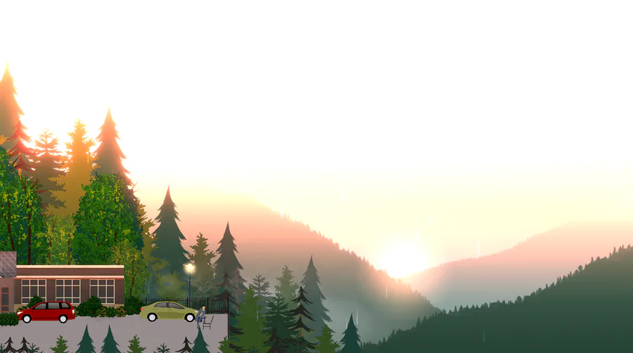
It’s hard to talk a lot about all those things without spoiling the story, but luckily there’s a bit of good art stuff to share this week as well. I’ve been trying to make improvements to the art, and have been experimenting with adding gradients and patterns to the walls for the interior scenes. Here’s an example. I’m especially happy with how the frosty window and the rainy scene outside it turned out, it gives a really cozy feeling to the interiors - especially with the lamp, pizzas and coffees!
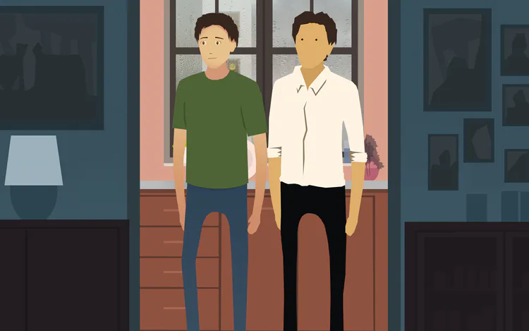
I also attempted to improve the character art for the game, with mixed results. Inspired by the character art style in Broken Age, I tried creating more detailed faces for the characters. Through polls on instagram and twitter, I realized that majority prefer the original character art style. What do you think? New style is on the left (green shirt) old on the right (white shirt) The question is about the faces and the art style (not the clothing)
See you next week!
-Armaan

3 comments