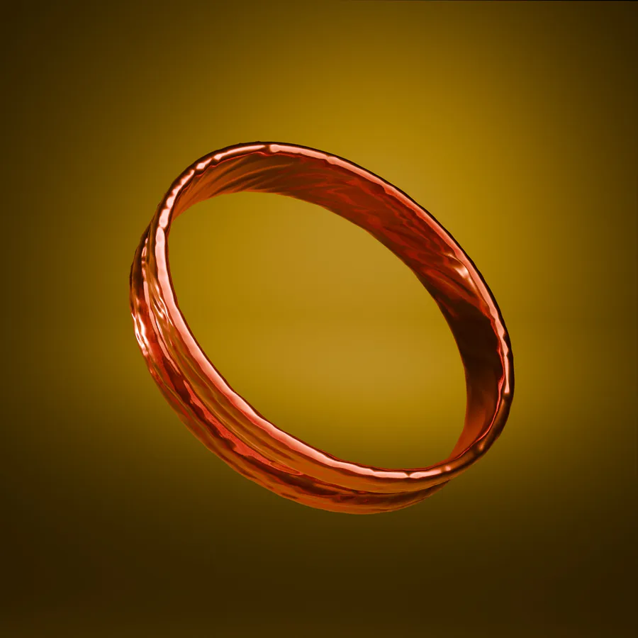
Yeee i know that sounds cringe but it does look beautiful tho
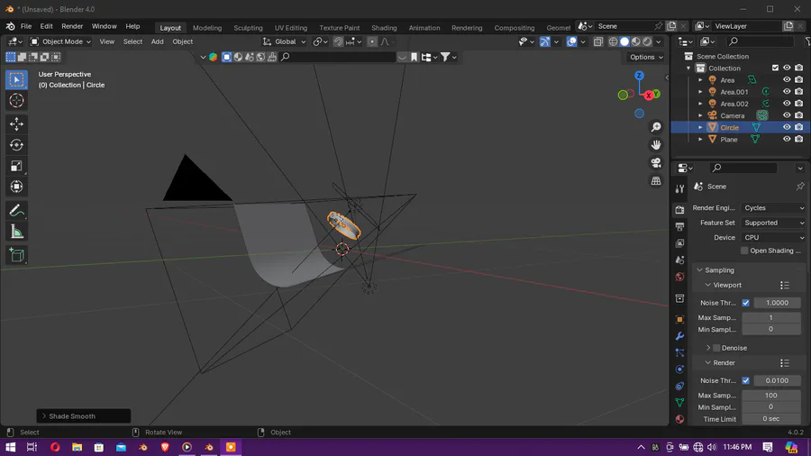
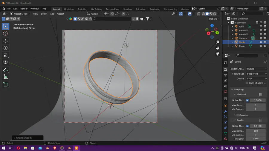
Surprisingly it was easy to make the ring (until i had to sculpt in the bumps) but still didn't get the result i wanted so i added a bump node to the shader (ye i was that precise 0-0 )
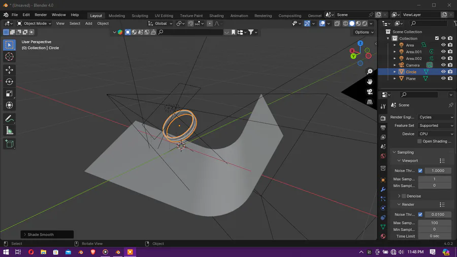
Then...the background (0u0)
would you believe it's actually black? (0u0') yee the lighting was crazy even though i used three light sources.
But anyways tell me what you think about it
1 year ago
Next up
PROFESSIONALS!!!!
I need your help.
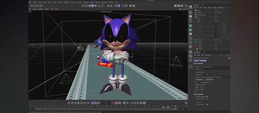
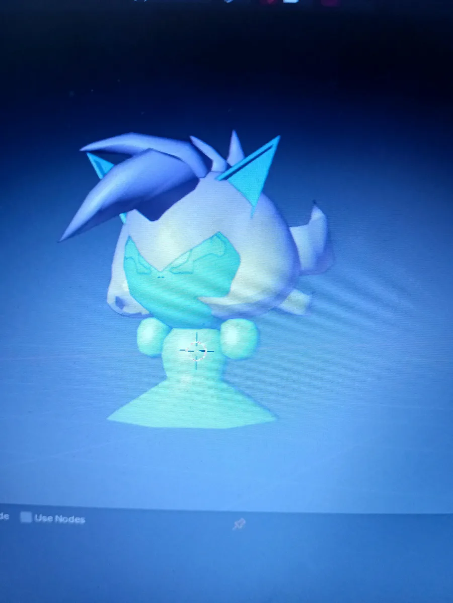
How do I make such and also morph into different states of a charater in blender????? 🧐
I really need this information.
How's the animation and voice acting?
Gf's voice not mine
Sneak...
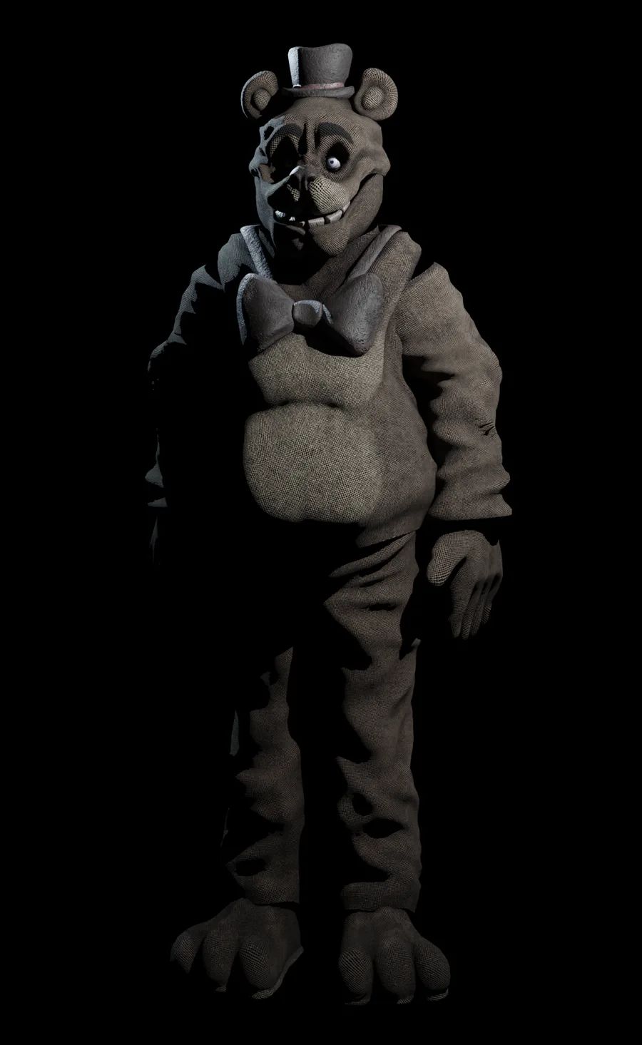
Bear
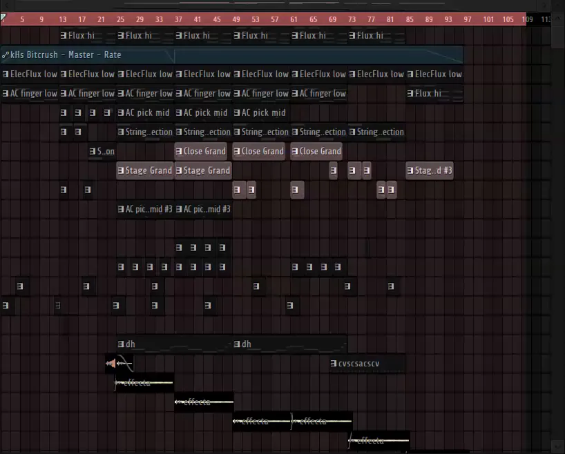
been a while since i actually made music. rate it (in the comments)
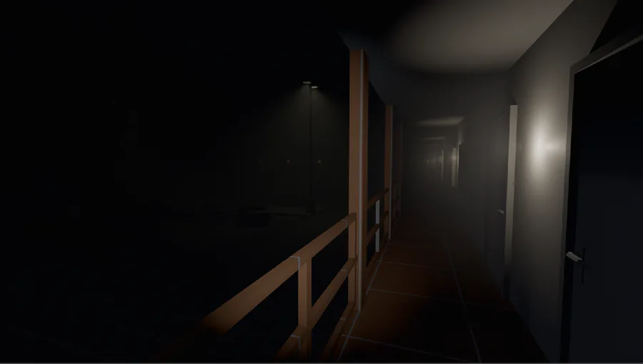
Some wip work on original game, blocking the enviroment and testing the overall vibe and mechanics. Know nothing of C# but im eager to learn
...Peak
Will slightly animate it 🌚
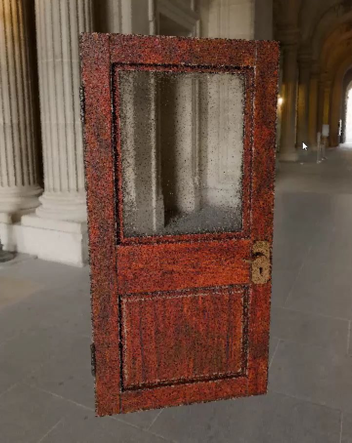
Busy making this door in #Blender for my game "What Was Found at Ravenhill"
todays special






8 comments