Game
COLD CASE


4 months ago

About the main menu:


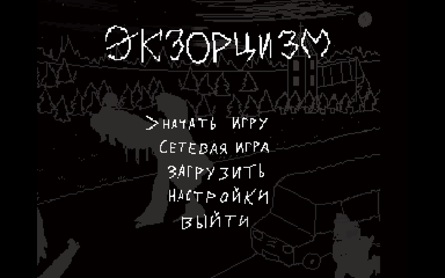
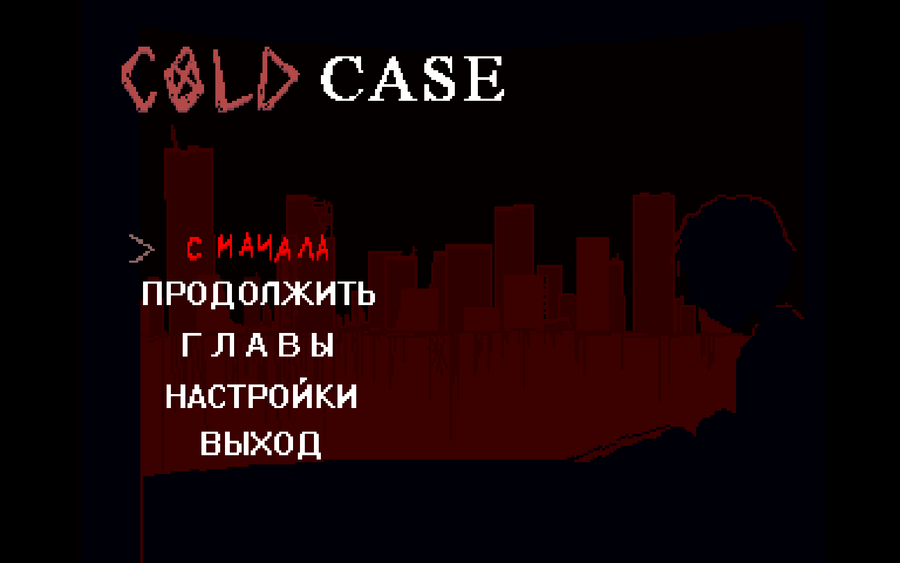
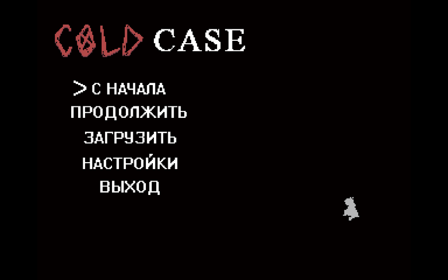
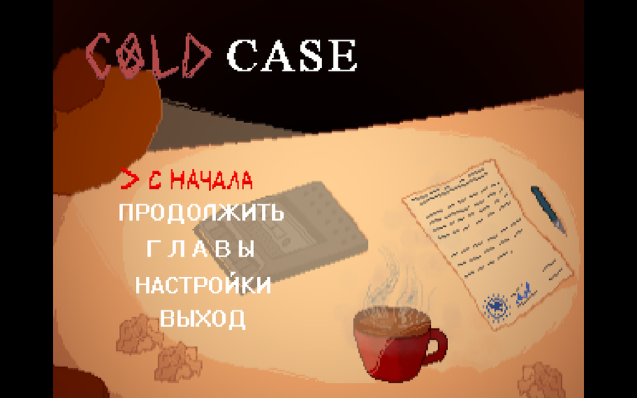
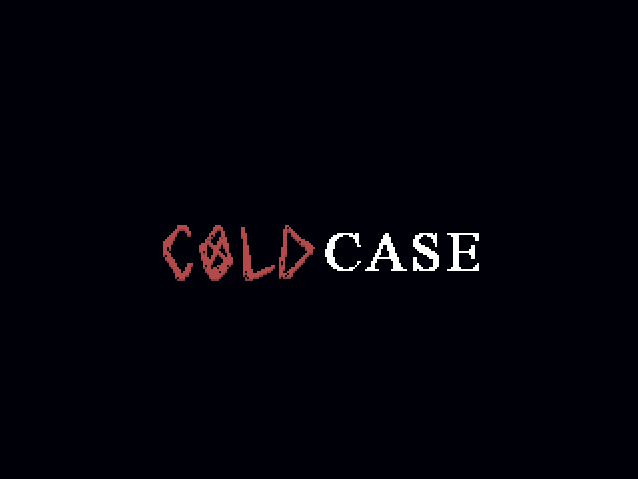
When the game was in its early stages, I experimented with different main menu designs. They were deliberately dark, as the plot at the time revolved entirely around an exorcism. The last image shows the final design, which I think is pretty good, but it may be a temporary solution.

From the very beginning, I had the idea of ​​making the main menu background resemble a slideshow. However, I decided to change the concept. Now the menu will track your progress in the game and adapt to the moment (for example, like the Half-Life 2 main menu, which changes the background depending on the sections of the game you've completed).

Fun fact: there used to be a multiplayer section, but I removed it.


0 comments

Loading...

Next up

What do you think about the new logo design?

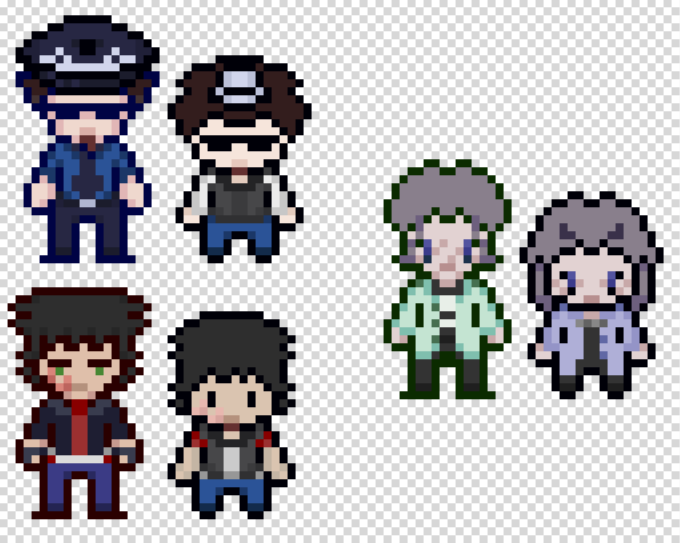
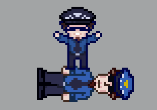
Speaking of sprites, this is what the old versions looked like, even smaller and pot-bellied. At the moment I am more than happy with their appearance, but who knows, maybe they will change again someday.

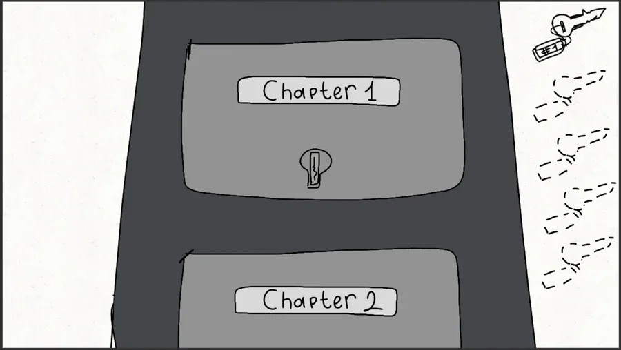
I have already posted about how I would like to see the chapters/missions selection screen, but I have a better idea, I think it will suit more.

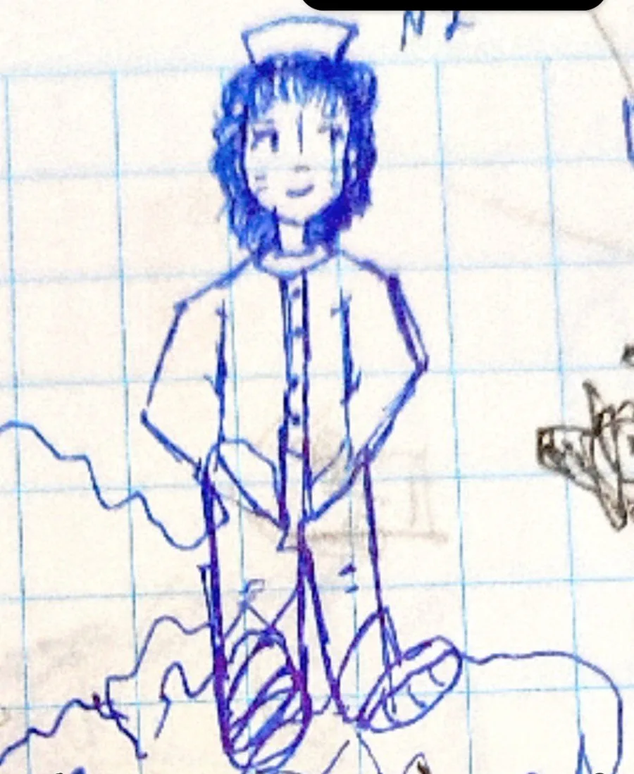
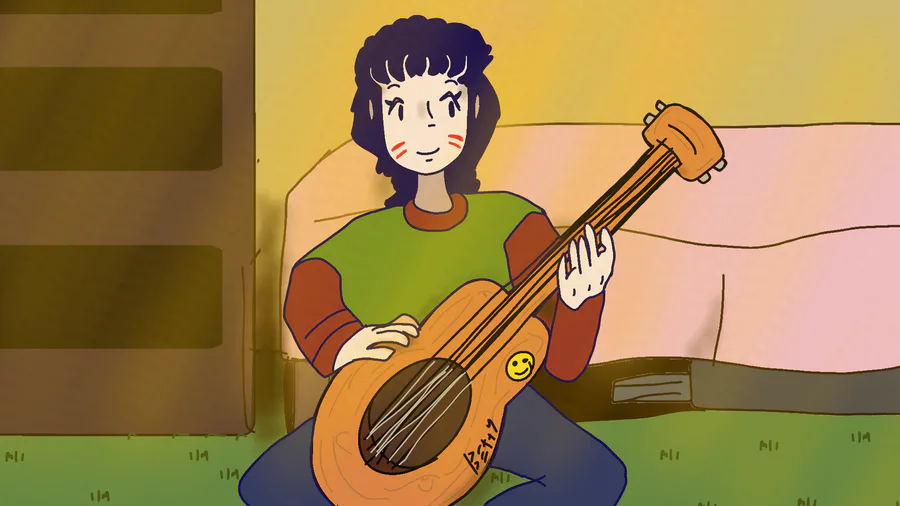
My drawings

Yesterday I was working on a small thing and made a mistake that limited the character to walking diagonally, which worked well for the stairs.

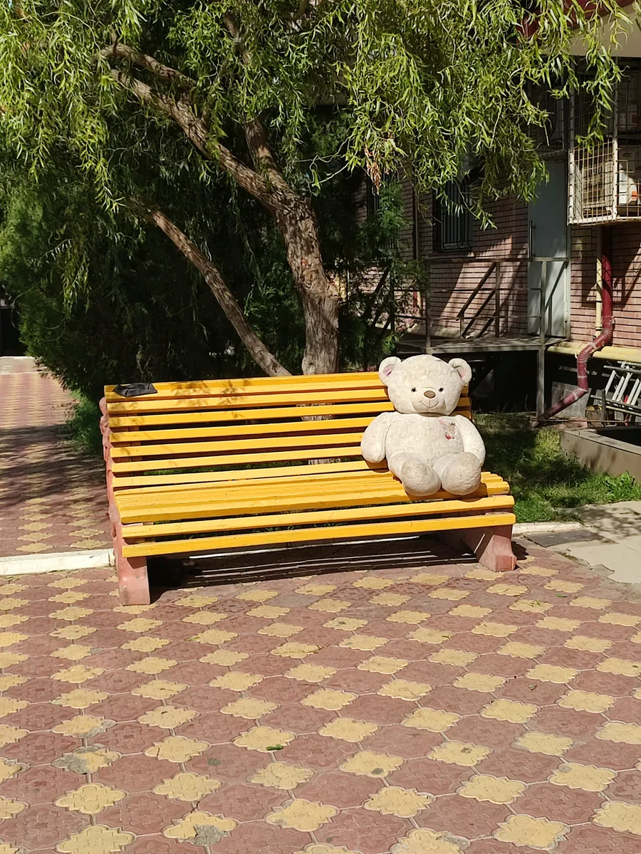
Sometimes there are interesting things on the bench in the yard.

My short animation

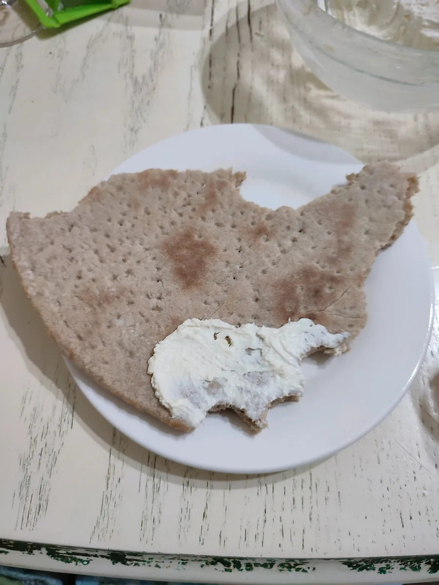
i ate the usa

No matter how elaborate the new sprite was, by means of an honest vote, the irresistible Goliath was defeated. Farewell for a long time, although I will find a use for you in another game.

so, I made my new OC, what do you think?