
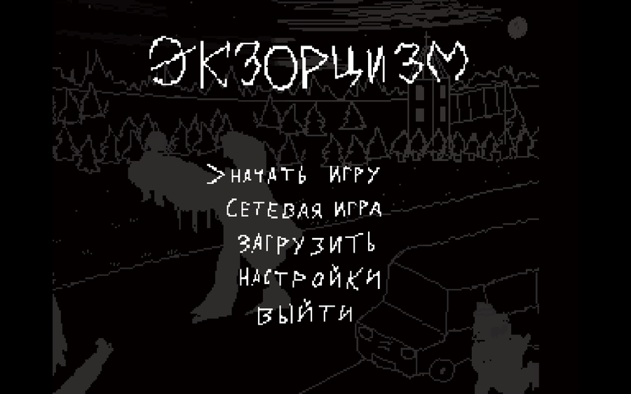
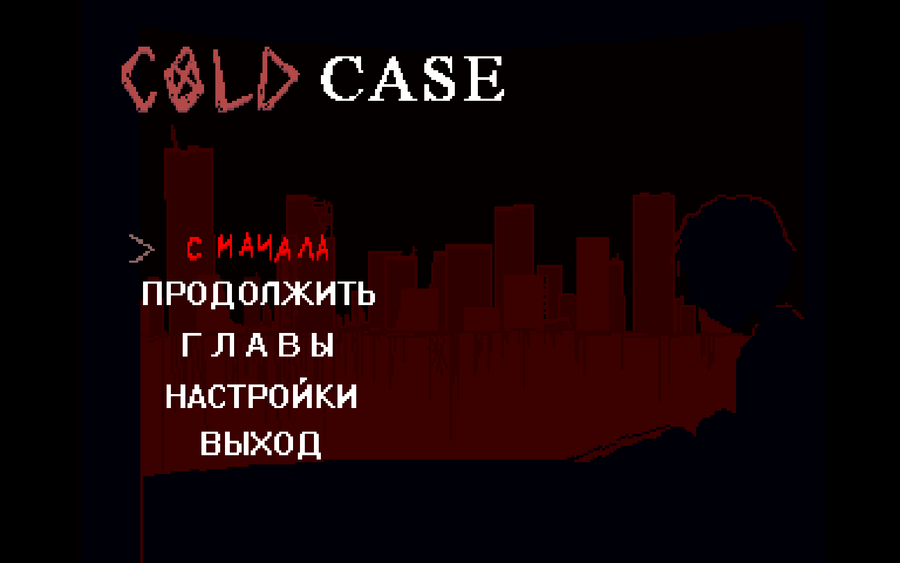

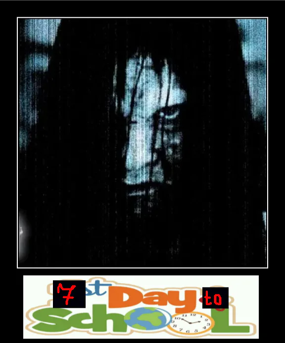
 : When the game was in its early stages, I experimented with different main menu designs. They were deliberately dark, as the plot at the time revolved entirely around an exorcism. The last image shows the final design, which I think is pretty good, but it may be a temporary solution.
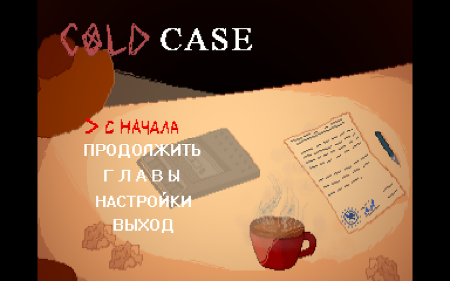
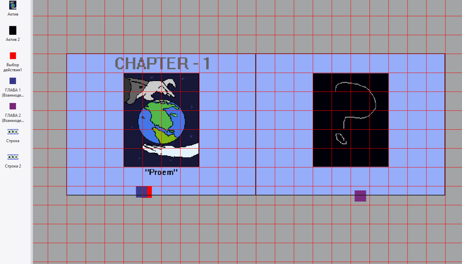
From the very beginning, I had the idea of making the main menu background resemble a slideshow. However, I decided to change the concept. Now the menu will track your progress in the game and adapt to the moment (for example, like the Half-Life 2 main menu, which changes the background depending on the sections of the game you've completed).
 Fun fact: there used to be a multiplayer section, but I removed it.
 : Когда игра была в начальной стадии, я экспериментировал с разными вариантами главного меню. Они были нарочито мрачными, поскольку сюжет тогда целиком строился вокруг экзорцизма. На последней картинке показан последний дизайн, который, на мой взгляд, неплох, но, возможно, это временный вариант.
С самого начала у меня была идея сделать фон главного меню похожим на слайд-шоу. Однако я решил изменить концепцию. Теперь меню будет учитывать ваш прогресс в игре и подстраиваться под нужный момент (например, как в главном меню Half-Life 2, которое меняет фон в зависимости от пройденных частей игры)
Забавный факт: ранее там был раздел сетевой игры, но я убрал его


0 comments