For April, work was done to improve the combat in terms of gameplay and workflow. Specifically, a new combat map was created, the map size was increased, and two new workflow tools were created to increase the efficiency of map creation.
Simulation Map
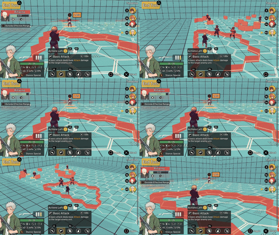
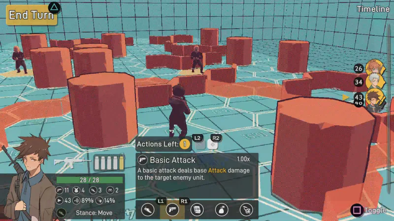
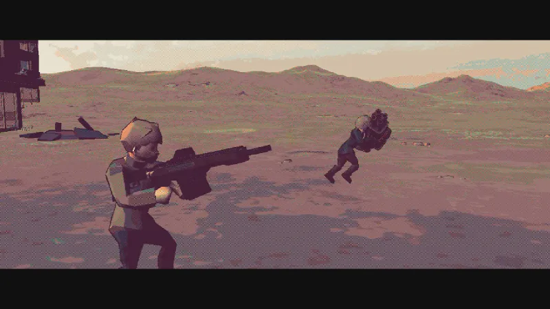
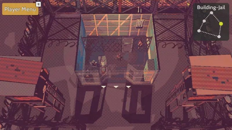
I wanted to create another combat map for the game, so now there's a simulation map. This was created because this allows people to duel one another in a controlled environment that makes some sense in a semi-futuristic apocalyptic world. There are plans to include a tournament arch in the story so something like this needs to be introduced.
The Bigger The Better
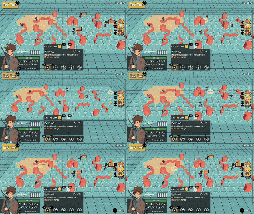
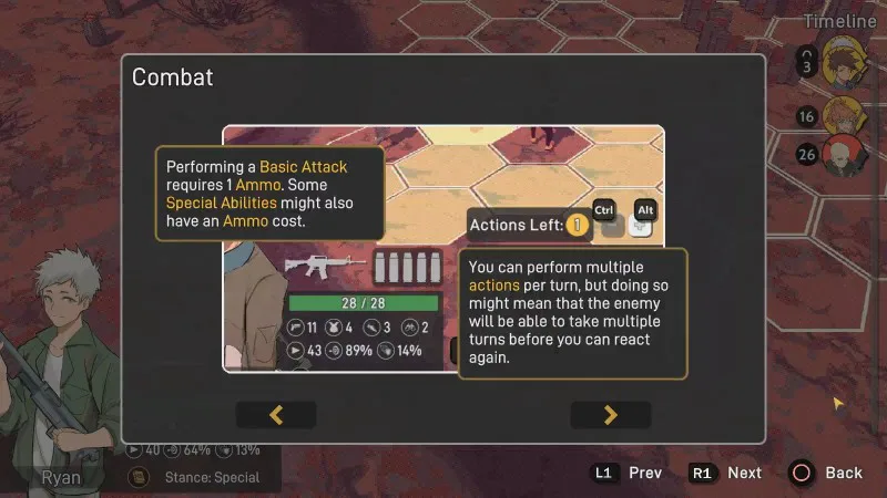
Over the course of Bright Red Skies' development, the map size was something that has been changed multiple times. It's a tactical RPG so positioning needs to be something that's important, but with a smaller map, the amount of opportunities you can give yourself isn't very high. Since flanking is a mechanic that gives you an actual stats boost, by having a bigger map, flanking and positioning becomes a more strategic action to consider. With this said, the map has now been doubled from 10x10 to 20x10!
The Mapmaker
With a bigger map comes the tedium of custom map creation, for specific event encounters and bosses. The previous workflow was for me to take a piece of paper with the map printed on, and draw out where I wanted each piece of cover to be placed. Then I would need to convert that drawing to a string representation of where each piece of cover should appear on the map. After doing it for one 20x10 map, it became clear that this wasn't scalable, so I created a Unity tool that is making life a lot easier.
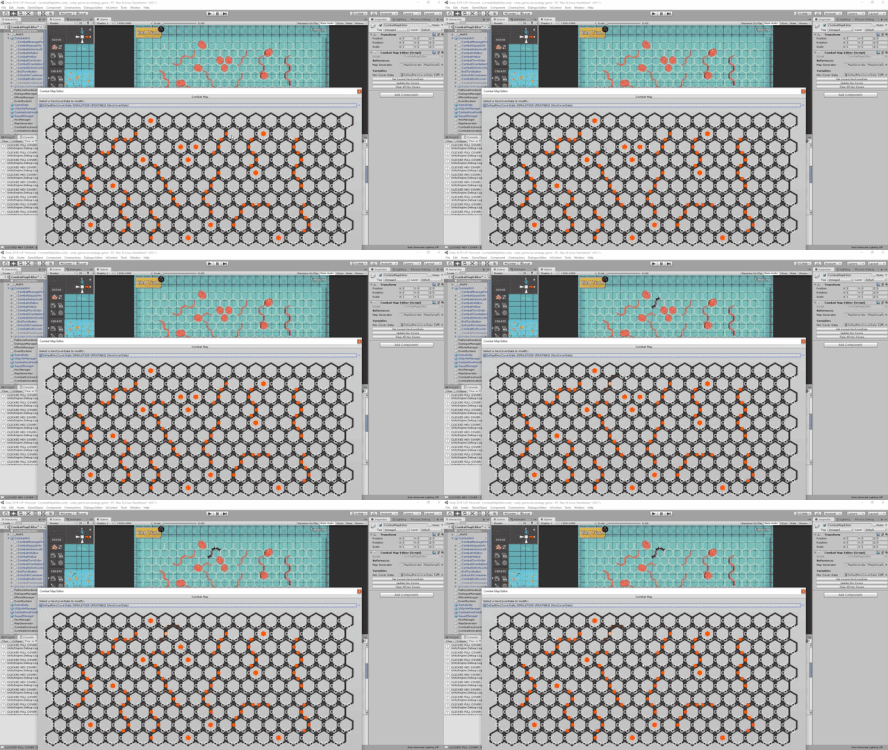
This map tool makes prototyping map layouts significantly easier and faster. I can now make changes using the tool and have it automatically apply changes into the scene so I visually see how it looks like and figure out if it's something I want or not. It scales with however many cover objects the game will have, so I see this paying dividends in the future.
Combat Visuals Tool
After making the map editor tool, I started to think about what other things I could do to increase my workflow. Then I thought about my process in creating and editing how a map visually looks. Previously, I would create the base map scene and look at how it looks like in the inspector window, hit play, and then play through the turns to see how it looks like at different angles. The problem here is that it takes 3-5 mins to check how all of the angles look like, I'd also need to keep track of any changes to the props or lighting I made since Unity doesn't save changes made during runtime.
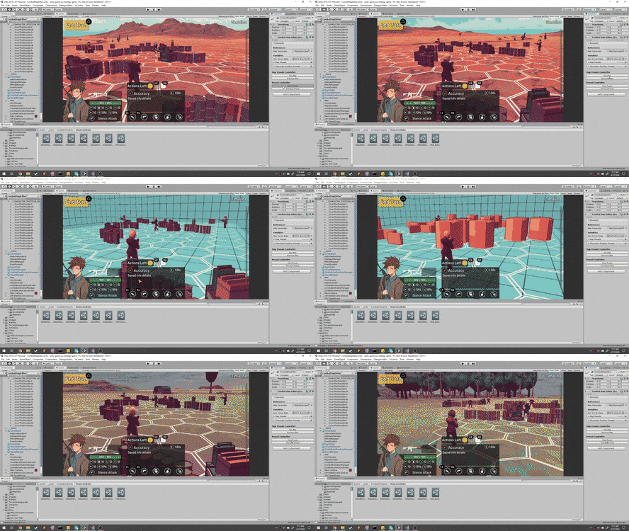
To improve this workflow of checking the angles and editing how the scene looks like, I created functionality in the inspector where it allows me to toggle between different angle presets and the different map layouts. Now I can easily toggle through every combination of angle and map layout to see if the lighting is off or if there's a bunch of dead space that needs to be filled. Also, since this is all done without running the game, all of the changes actually stick.
Behind the Scenes
This is a section of the devlog where I like to talk about the parts of the game that were improved but aren't necessarily big enough to have their own section. For April some of the extra things completed were:
Improved performance in the combat scene.
Refactored code related to scene data loading.
Going Forward
For April, I didn't expect to be creating tools for combat map creation and helping the visuals but I can see it paying off a lot in the future, so no regrets there. But for May, there are a bunch of things related to transitions and cutscenes that I want to get done:
Refactor scene transitions.
Improve how the small-scale cutscenes are handled.
Transition from intro cutscene, to small-scale town cutscene, to controlling character.
If you have any suggestions or want to give your opinion on the game, follow me on social media, I listen and respond to all comments :D
Discord: https://discordapp.com/invite/vD8XYkn
Twitter: https://twitter.com/mark_viola
0 comments