Ideally, I think an educational game has two kinds of knowledge a player needs to learn. There is the content knowledge, which is the educational content the game is intended to teach, and there is the game knowledge, which is what the player must first learn in order to play the game.
While the content knowledge is the most important one, players can’t get very far without understanding how to interact with the system and how to progress.
During most of its development, I haven’t thought about user experience much so far. The earlier versions (v0.3 and before) had very few visuals to communicate what was going on and what actions are available to the player. It’s difficult to know what you can or can’t click on; there was no feedback to the player on what is happening.
In more recent versions, I’ve tried to have every change in either the state of the game or the available actions also come with some kind of visual change. A few examples include:
Highlighting tokens when you mouse over them and updating the cursor
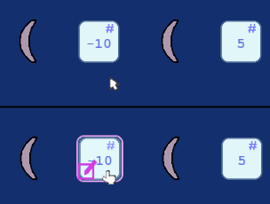
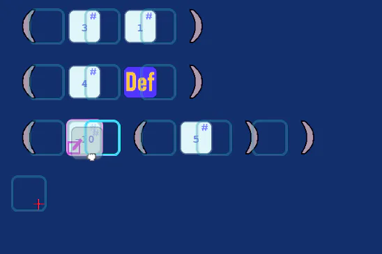
When moving a token, a faded box appears over all spots you could move it to. The pointing hand also becomes a closed fist, indicating a click and drag motion.
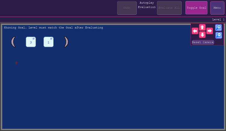
Understanding how to progress also isn’t that obvious. I am hoping that added a frame around the goal along with some text when you’re viewing it will make it more obvious.
I'm hoping these and other changes make the game easier to understand.



0 comments