3 months ago

Ayyy 6,530 likes!!! woooo
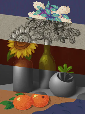
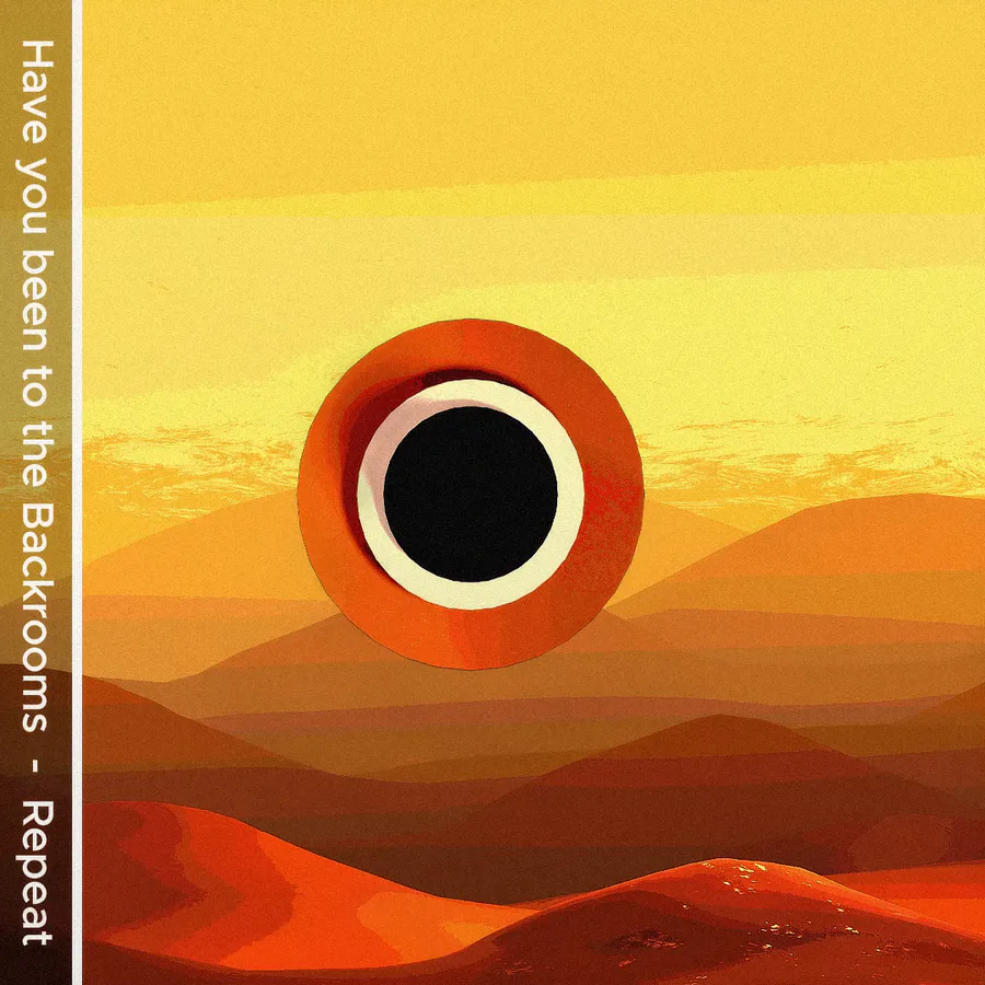
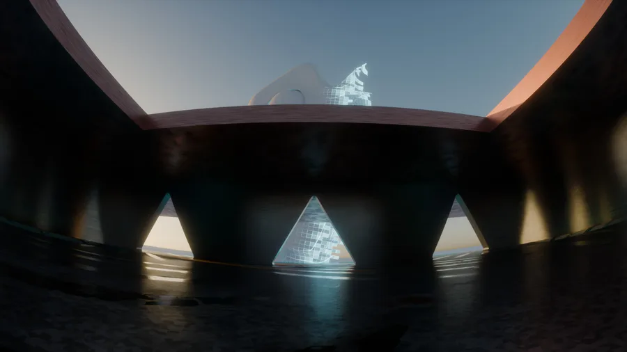
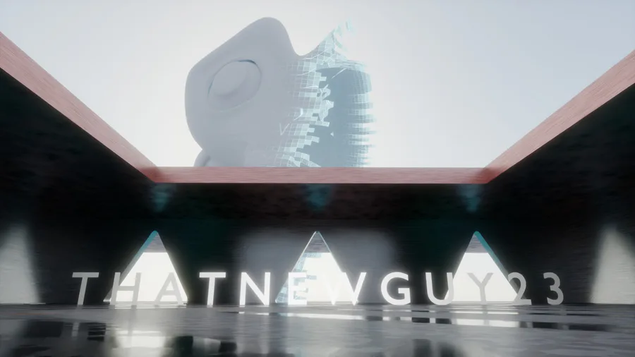
But anyways since my last animation seemed like crap, i decided to work on something that feels a bit liminal. But tell me what you think


  3 votes Voting finished


2 comments

Loading...

Next up

Now tell me....does it look normal? Cuz the dude that said i should make it, told me it didn't look good (mainly cuz it was supposed to look exactly like a product with soo much fluff that i could kill my laptop

I mean...it looks kinda good... I just wish i could make realistic water (low-rez though)

And yes the umbrella render in the last pic was made to look boring alright (UuU)

A cup...and then cups :) obviously the cup looks better. Am i right?

Pokédoodle 104 - Cubone

: https://gamejolt.com/p/i-went-ahead-and-made-a-palette-with-all-…

Reminder: The colour selection and palette are both based on the Pokemon Yellow sprites.

: Clip Studio Paint

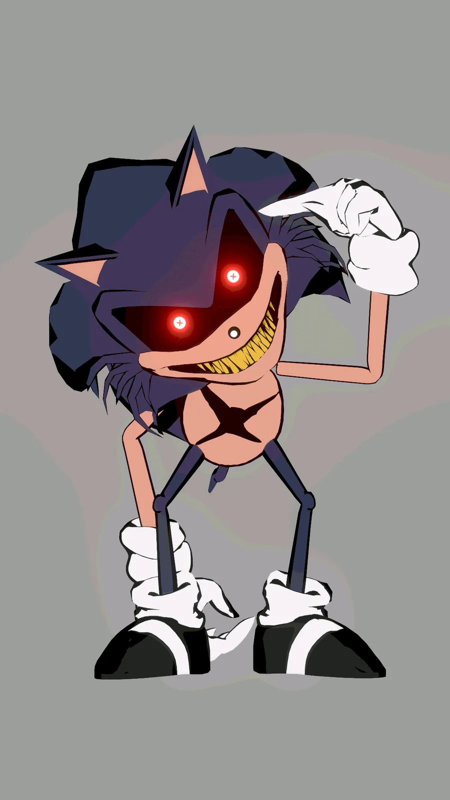
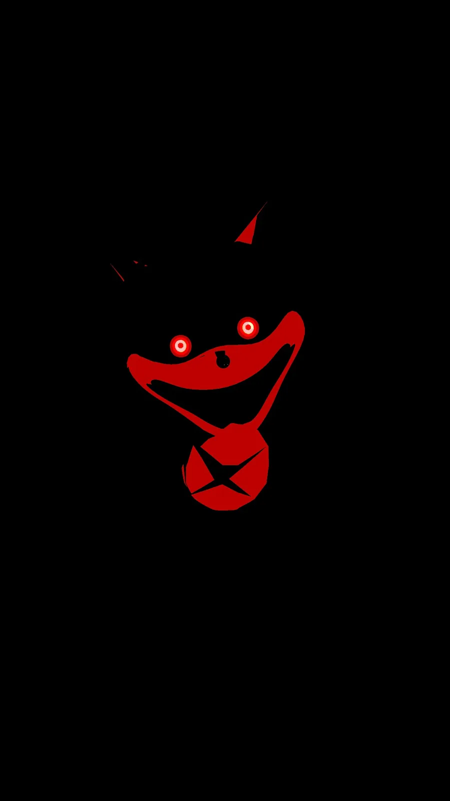
Picture a dude standing in the shadows watching you...

Watching...

And watching...

And watching

5.0v3 PNM

And a funny icon mockup

Oh yeah i forgot to share this a while back Was just kinda lazy But i was learning how to make smart textures...yeah i know it still needs work

Same goes for the poor quality, i feel i need to dail down the depth of field

Thanks @Forbidden2 Cool dude

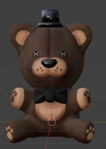
Testing my game engine and the work in progress renderer (Opal rendering, a rewrite of eevee)

don- don't ask why he's here.

Made an edit a long time ago A shame i deleted my tiktok account How good is it?