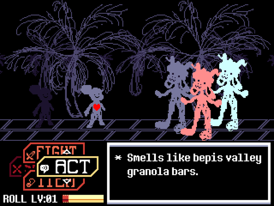
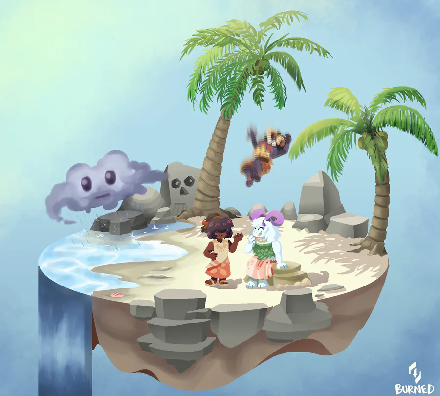
Have some quick-ish concept art! Subject to change of course, but I like the familiarity, efficiency, and simplicity here.
I wanted to do something different with the buttons so I could have more room for the bg. I was inspired by the M&L games. I wanted something compact, and that was the first thing I thought of, so the battle buttons are stacked and you rotate between them in a similar manner!
Now you may notice that the diagonal tiles serving as the "floor" in the battle screen look familiar. You may think it was inspired by Bits 'n Pieces, but it was technically the other way around! I use these tiles for sample sprites too, and when I first used them when showing blaize.mayes my Jerry sprite, he liked the look and made similar tiles for the Ruins bg.
Also I love how derpy Rex and Roll look here.





4 comments