One thing that we always like to do in the later stages of a project, is compare how the scenes are looking now, to how they were looking before.
It’s really nice to see the evolution of a particular scene or scenes, or how some things end up being scrapped because they didn’t work as they were supposed to.
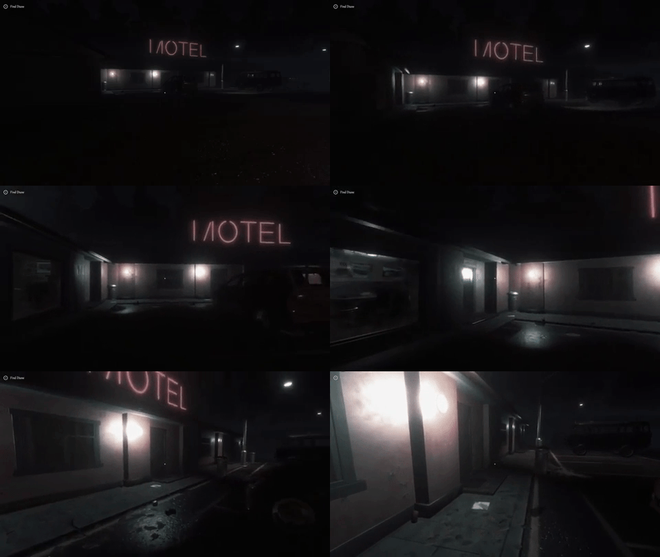
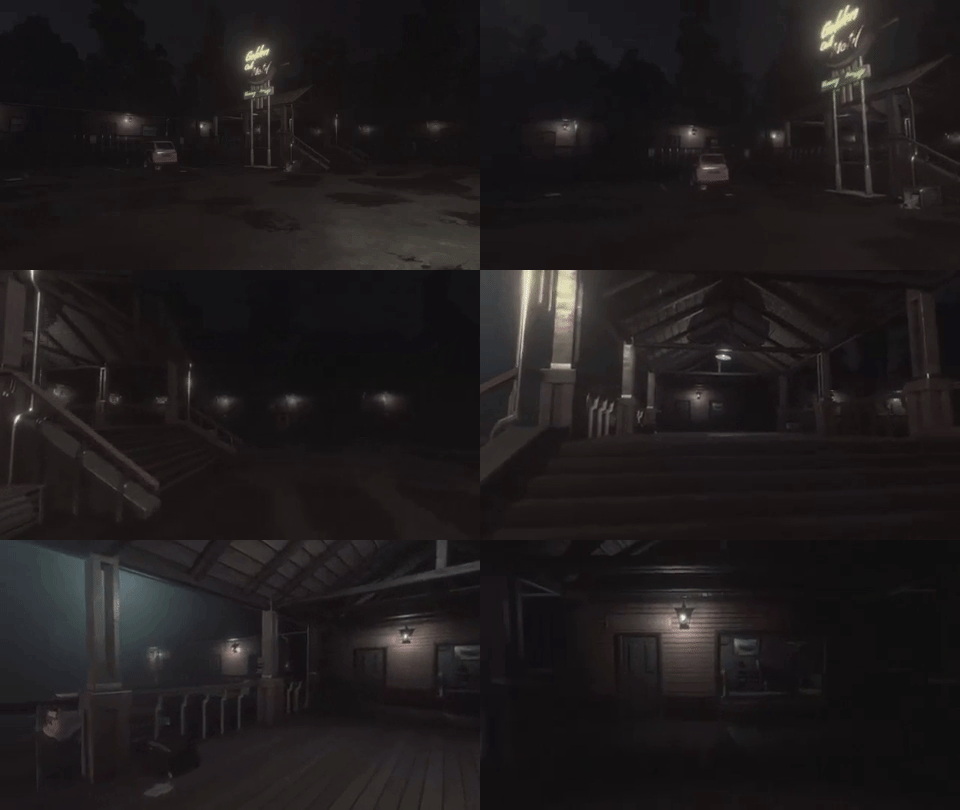
The biggest change in a scene was in the first level, the motel.
It’s the first scene in the game, and it was also the first scene that we built in the game. The thing is, the quality of the other levels escalated a lot, and after a while, we weren’t happy with how the motel was looking. And it was the first level, the first contact that the player has with the game.
We thought about improving the textures, the props etc, but eventually we decided to do a new motel from scratch.
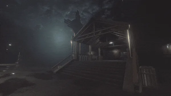
So we got from this:
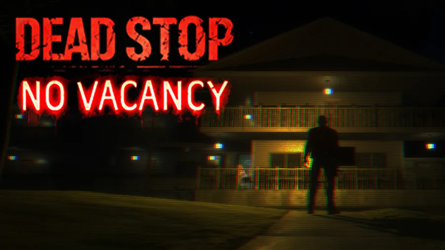
to this:
The first motel was more basic. It looks like a roadside motel, but it’s not very memorable.
The second motel has a large parking lot, a cool entrance and a much more rustic look.
Further in the game, the player reaches a diner. The diner didn’t suffer drastic changes like the motel, but you can see how it looked before and how it looks now:
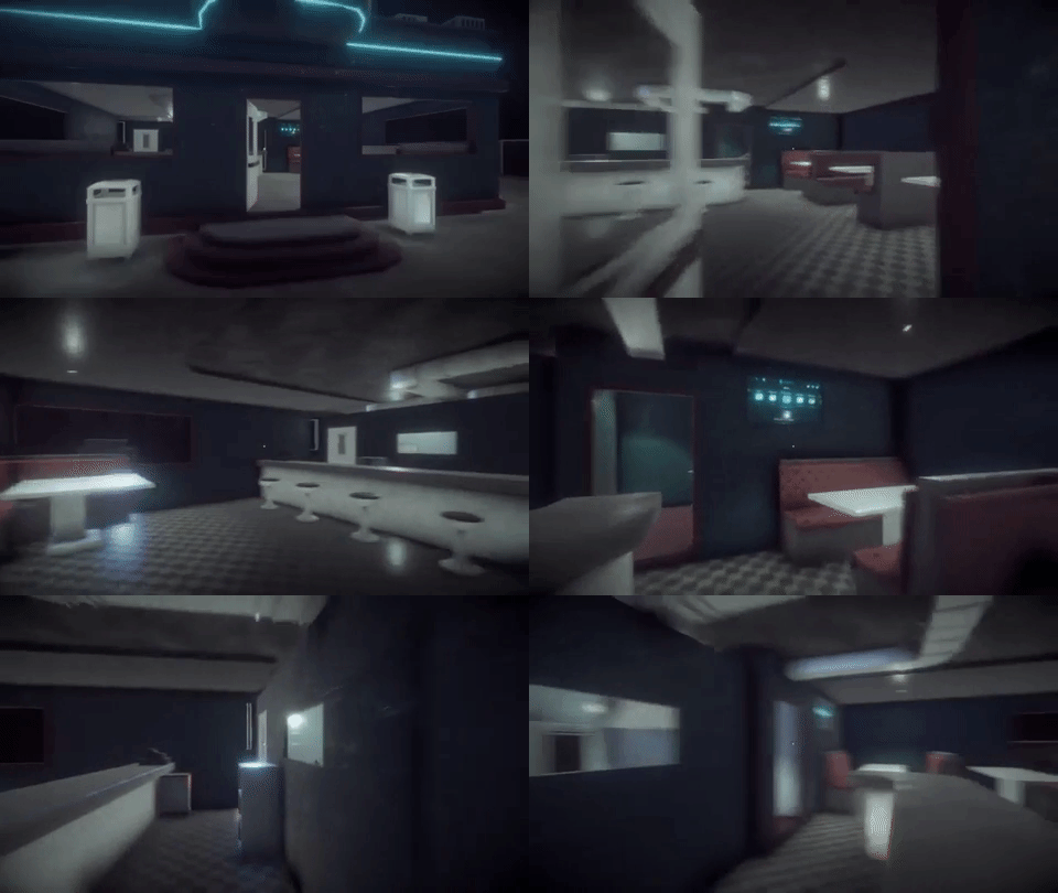
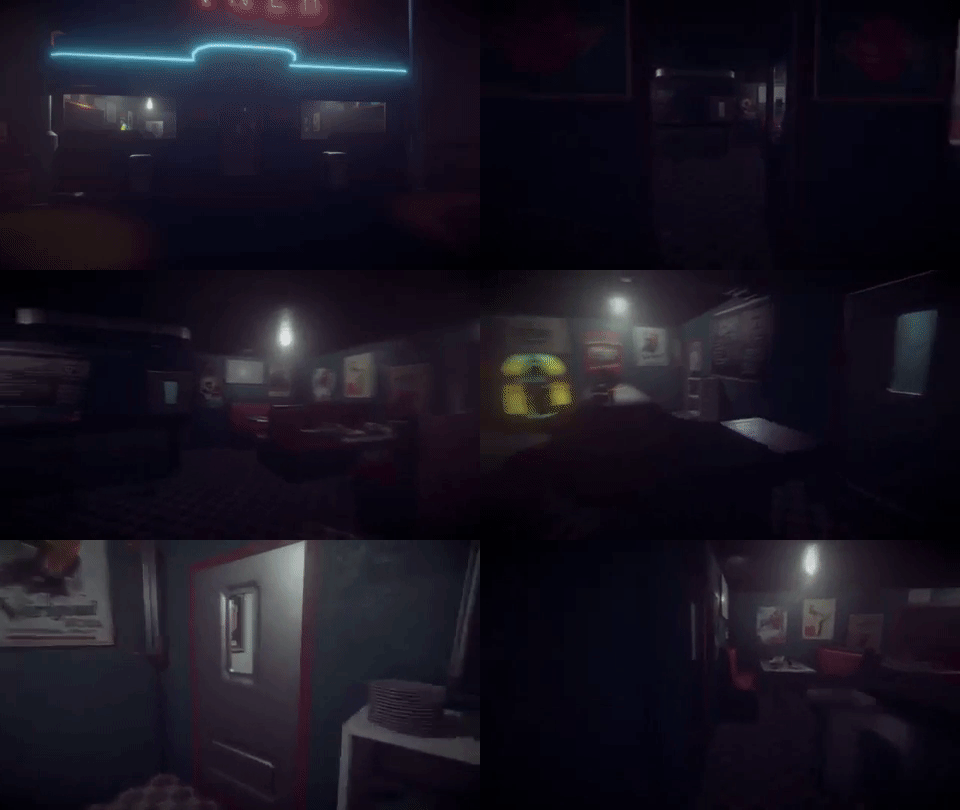
First version was empty and impersonal. Second version is cozy, the lights are warm and the walls have history.
Even further in the game, the player will have to explore Dormont’s post office.
You can see how it looked before:
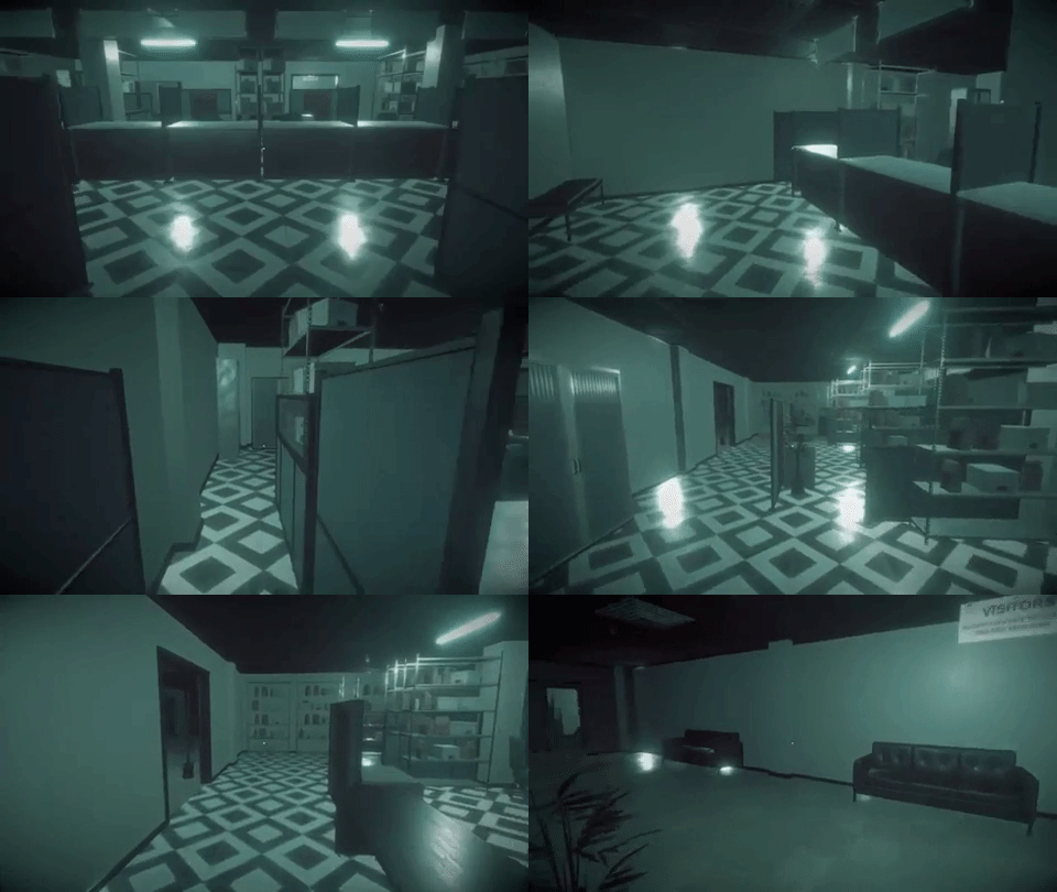
and now:
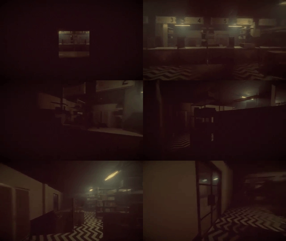
Warmer lights, props and decorations all add up to the scene.
We take great care into building each and every scene.
If it doesn’t look real, like a place where human beings live or work, then it can still be improved.




1 comment