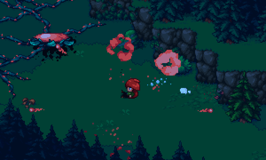
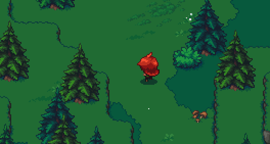
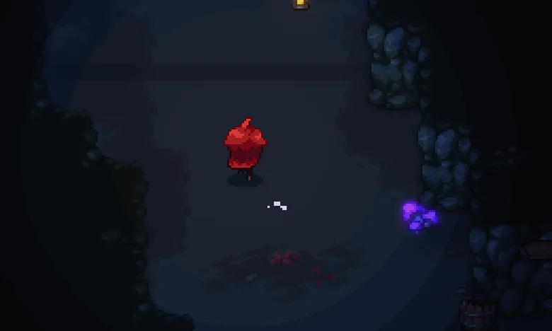
Arietta of Spirits was first developed solely by Samppa (writer, composer, sound designer) in 2016-2018. His original prototype/demo looked like this:
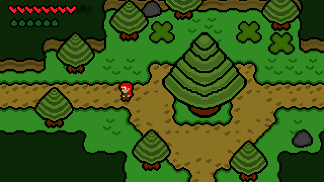
I joined the team in late 2018, and my mission was to come up with a new art style for the game, and recreate all the assets. Basically, I had the freedom to do anything, but I wanted to keep some elements of the original designs.
When it comes to the characters, my goals for the character designs were to:
Keep things as simple as possible
This saves a lot of time time when animating the characters. I didn't want to use a lot of colors, 2-3 shades of each colors at maximum. Also there's barely no anti-aliasing
Easily recognizable strong designs
Keep the original character designs in mind
I wanted to respect/pay tribute to the original character designs
Here's a comparison of the original characters, and my first re-imagination:
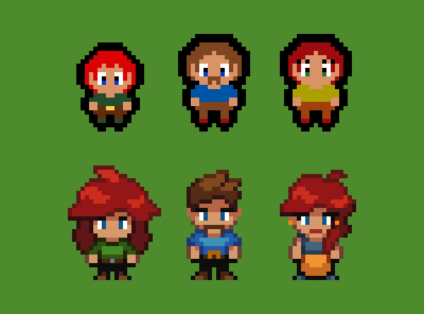
As you can see, I kept a lot of the colors and small details (eye colors for example) the original designs had.
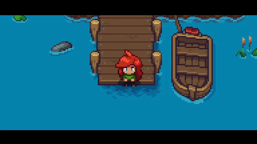
I wanted the main protagonist, Arietta, to have a big puffy hair. This was the first character I designed, and it would later dictate the style of the other characters. I went through a few iterations before settling into a design close to the final version.
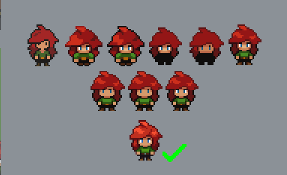
During this process, I also started to create some early tests of the environment art.
With the game's Spirit characters, I wanted them to resemble some animals. Arietta's side-kick Arco's original design looked a lot like a cat, but we wanted something different since cats are starting to be kind of a cliche within the media. This character also went through a lot of trial and error before I settled into the final design, here's a few of the iterations:
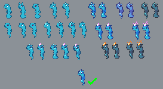
The other spirit character, Midri, I wanted to resemble a deer. Now that I had some material to work with, I basically just edited Arco's sprite.
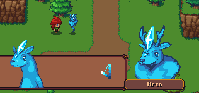
The result ended up way too close to Arco's design, so I continued on iterating. I always imagined this character to be kind of goofy, so I wanted to give him a weird head shape. The head was inspired by Teensies from Rayman-series.
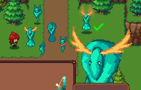
All in all I'm happy how the character designs turned out. They are a huge part of the art style as a whole. They dictated a lot of the environment's style as well, since I couldn't make the environments too detailed. So far, I've found them to be easy and quite fast to animate so I kinda achieved at least one of my original design goals.
Let me know if you're interested in more write-ups like this, I could make one for the environment art as well! Thanks for reading.
- swonqi, Pixel Artist
2 comments