If I were to describe how I decided on the art style for Atticus Complex, I would say… accidentally.
I started by drawing a small pair of glasses, seven pixels wide by two pixels tall. I decided that the main character should wear glasses so that you can’t tell how they’re feeling; if they had the same expression on their face even while being attacked by a monster it would be weird, and I know from past experience that scared expressions are kinda goofy-lookin’ at low resolutions.
I then started drawing a face around the glasses, and roughing out some hair… then, halfway through drawing the hair, I realized that it looked pretty good as-is. Kind of hipster-ie, with a dash of Paul Reiser as he looked in the 80’s. Combined with the squarish shape of the rest of the head, I had stumbled upon a decent-looking, minimalistic character design, a big departure from the “everything must be rounded and have a thick outline” art style I’m known for.
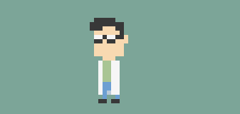
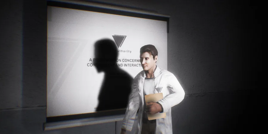
The rest of the design just kinda flowed from there. He looked like a young scientist, so I gave him a lab coat, and that pretty much determined what the setting would be. I was about to draw his arms, trying to figure out how to do it without detracting from his current appearance… and ultimately decided, hey, who needs arms? I Googled “hipster names”, and the second name on the list that came up was Atticus. It’s a cool-sounding name, and I like To Kill a Mockingbird, so why not?
I also wanted the game to have some kind of monster. The idea of being trapped somewhere is pretty scary in real life, but unless there’s danger, it doesn’t translate into a game very well. I thought about what kind of creature scares me personally. Something that looks almost human, but doesn’t quite get there. Something that could’ve been a person once, but is now just a creature. Something with motives that you’re unable to discern. An assortment of bones and flesh that shouldn’t be capable of movement, but is shambling after you nonetheless.
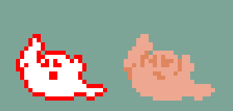
…For whatever reason, what I drew ended up looking like a sad ghost. I really have no idea what happened here. Sad little melty flesh ghosts are not scary.
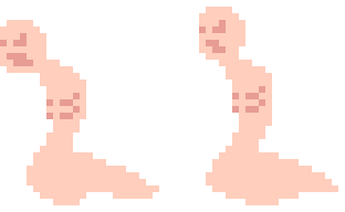
I tried again, this time focusing on giving it a creepy silhouette and worrying about the details later. It came out much better!

I’d decided to make everything in the game as simplistic and square as Atticus, so making the creature more rounded would help it to stand out and feel… wrong, in the environment.
The game’s story unfolded naturally from here. A scientist and a fleshy, somewhat human creature that wants to kill him? Cloning gone wrong, baby!


0 comments