Next up
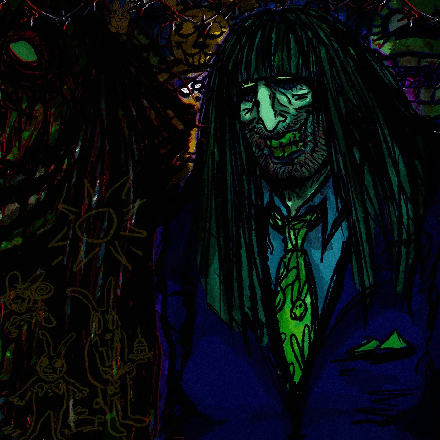
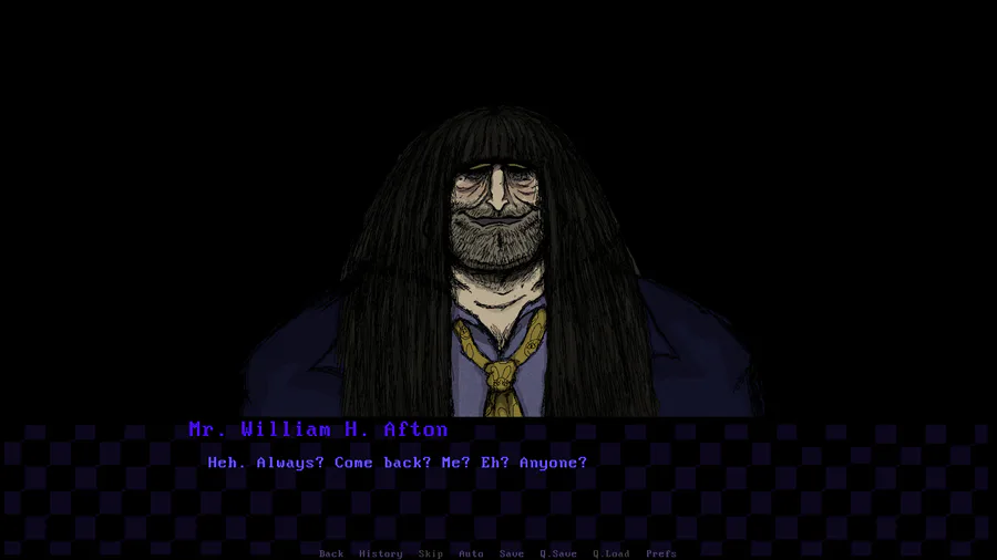
I love you william and vanessa i wish there was a really awesome movie about you where literally anything was serious.
we're so back im fueled by rage
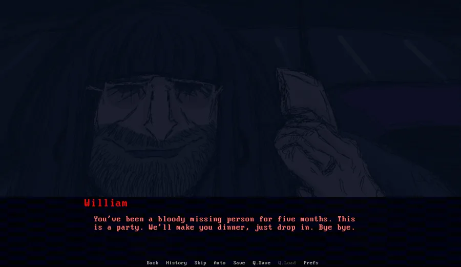
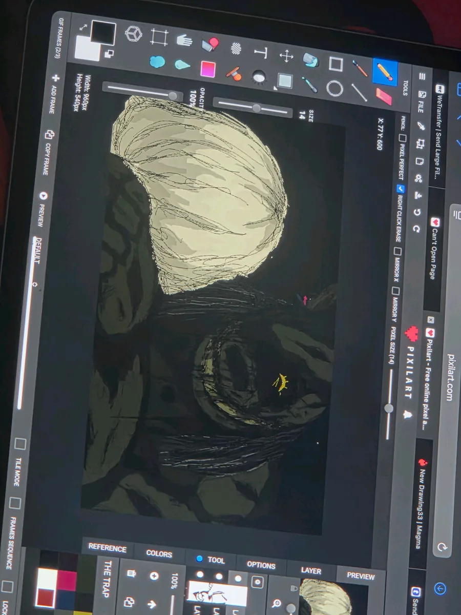
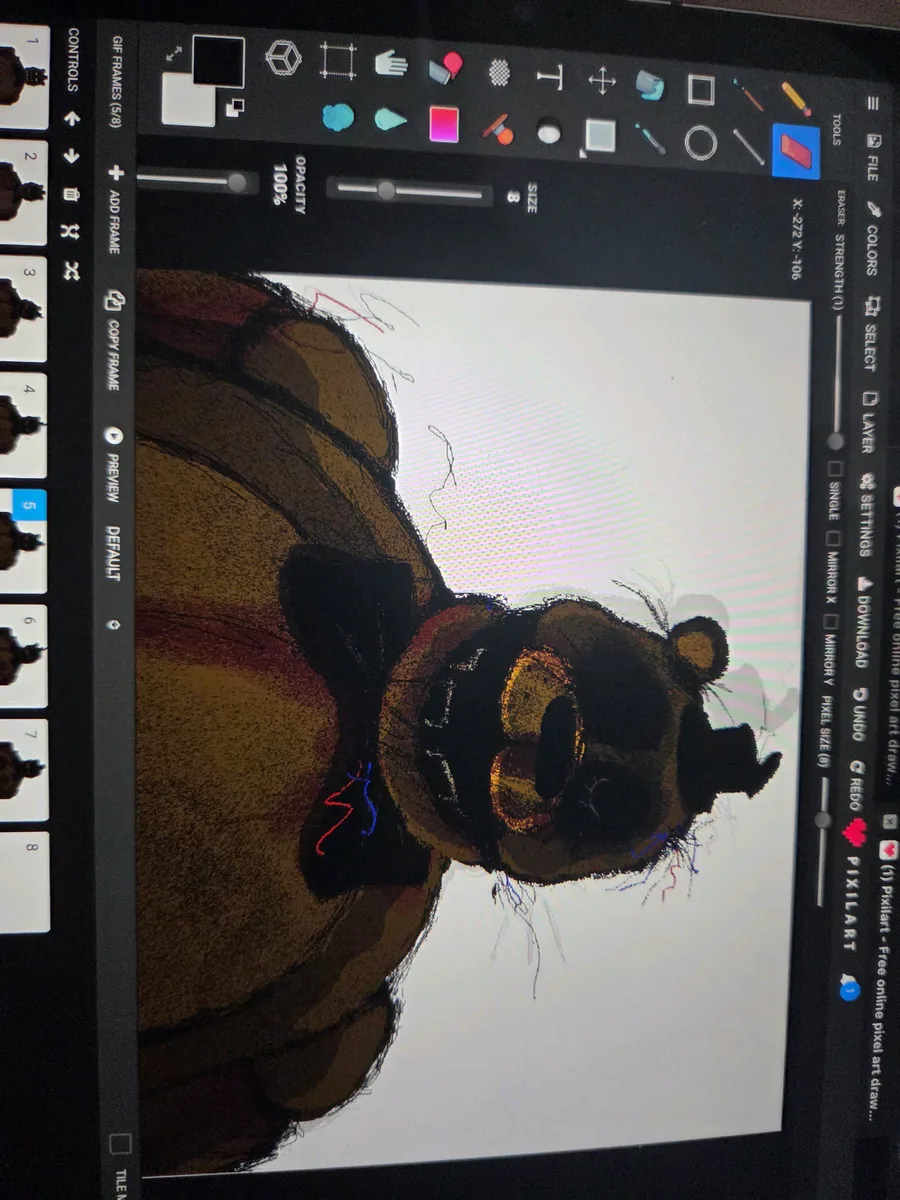
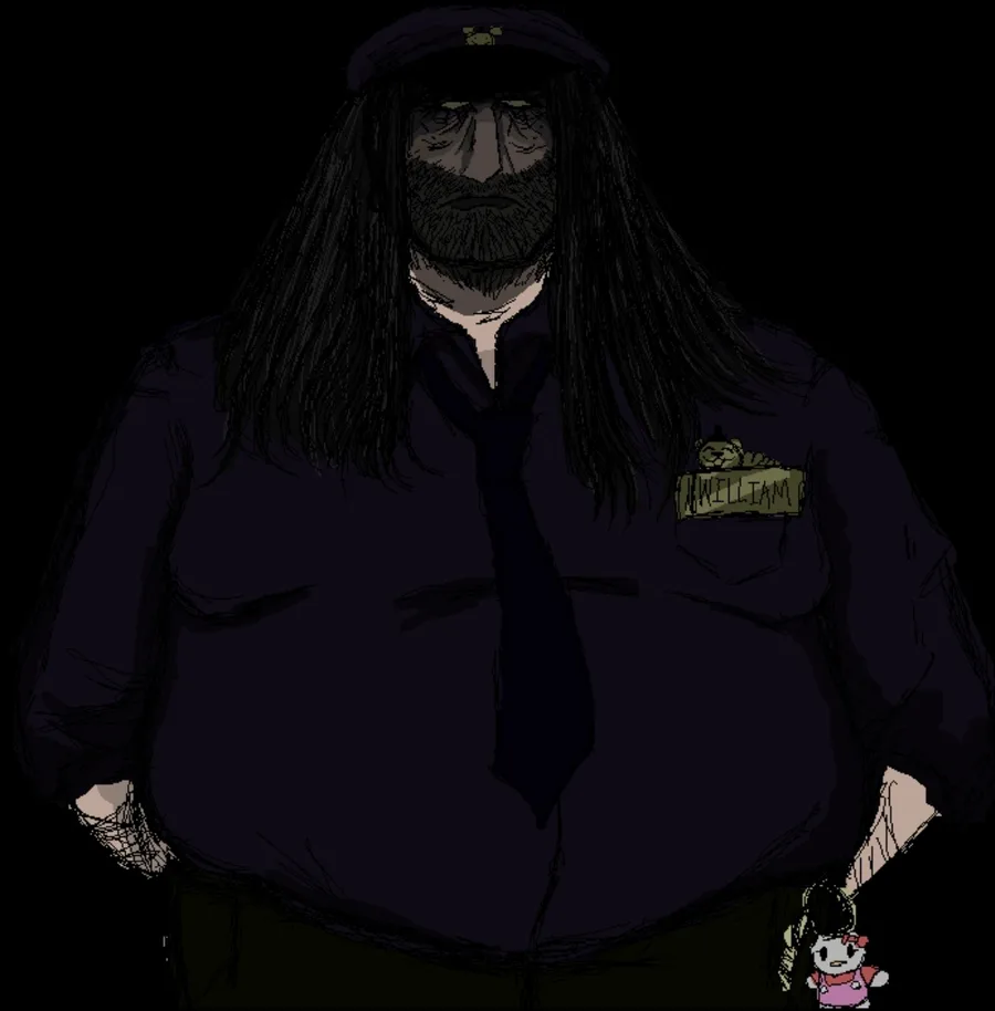
hey so like I did not realize it had been 3 months im sorry im such a fat fucking chud but here's williams ive drawn in said amount of time im sorry help I did some file extraction from my old laptop but..😬been doing.. other things 🙂
forgive me 🥺
things are happening despite it all hello cassidy 🎂 she's been getting a lot of attention in my cutscene files recently ... forgot she was one of my top 4 characters absolute goat i hope she gets everything she wants
Real Fazbear employees never gaf
how do i hit him
frickbear's 3,,,nobody fucking look at me🤚 fr...ic.k.bear..s.3.The. game.Ive been waiting for. On this website. Ohmyjgod
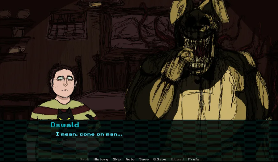
I think remaking the sprite system was still one of the best decisions I ever made old vs new above
I still use those old sprites and Im really glad I made them because it helped me design outfits and important traits of each design but GODDDD
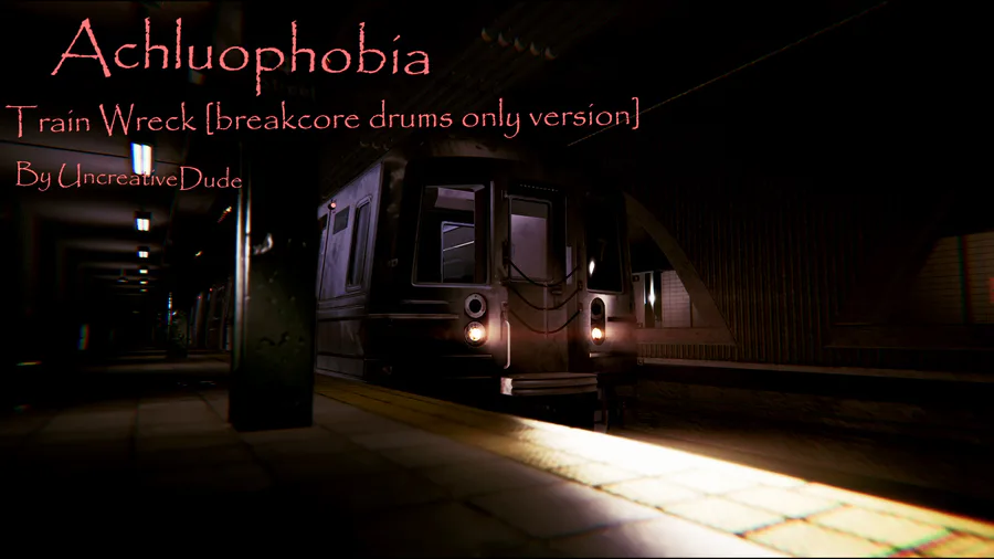
breakcore OST in Achluophobia!  (I’ll show the full version soon!)
I also want to thank @Ella_Manu ![]() from the bottom of my heart for gifting me the new background that you see now! ❤️
from the bottom of my heart for gifting me the new background that you see now! ❤️
Discord:https://discord.gg/tv4YTqmajN
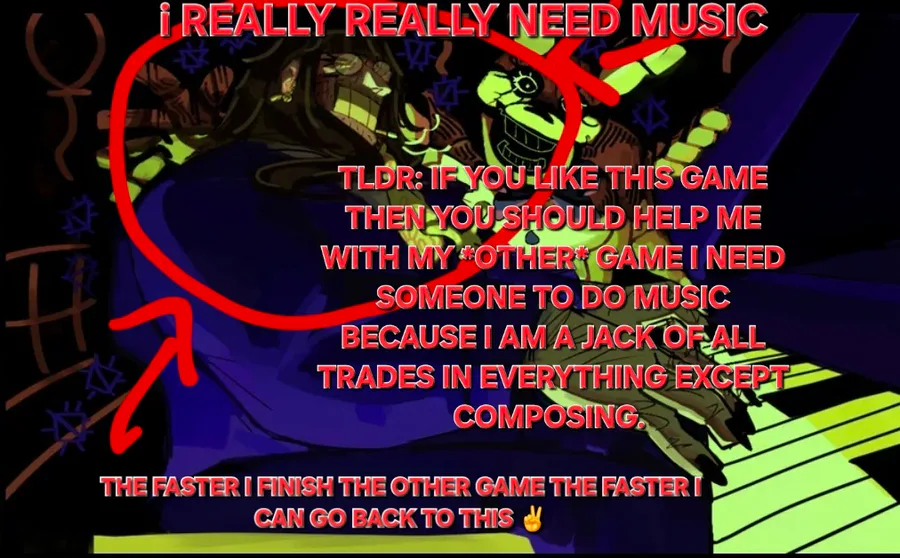
Putting this under this game where way more people follow me but uh once again
kind of looking for someone to possibly do music for a current little side project of mine in the same vain as this game💗 nothing too crazy just a handful of beats but..🐇💭


1 comment