Games feature all kinds of maps, they can be on screen all time, allow you to place markers, reveal themselves as you explore or even don’t exist at all. When designing a game you have all these possible choices and it’s not always easy to figure out which one fits your game the most. We knew that we needed something that felt organic, the whole game has a very minimal interface and we’re always trying to focus on environment and immersion. Needless to say, having a minimap was completely out of question.
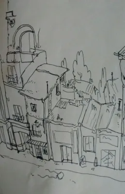
We also considered some more alternative solutions, if you played the Thief series you’ll probably remember that all the maps there are doodles. Most are missing information or aren’t even drawn properly, which adds a lot of personality to how you see that space. At first, we tried to avoid having a detailed map, that’s how we usually approached these design choices in the game. We build a system that isn’t holding your hand or breaking immersion (it tends to be quite opaque) and then we use playtesting to decide how many tips or hints that system needs.
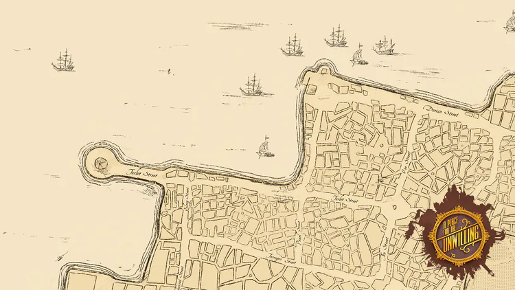
Having no map at all confused everyone. It wasn’t a matter of being afraid to explore the streets or not finding a certain place, they were missing a reference. Being dropped in a virtual place you don’t know is quite overwhelming. You see some water around, but is that a river? the sea? Am I going to the north?
A map would help a lot with that, after all, we’re dropping players into an open city and telling them to find their way and set their own goals. It’s a slow start and needs to a bit softer. So we added the fast travel interface which, as we showed on previous updates, doesn’t just display a list of places to go, it also scrolls around a map as you go through that list. We thought that would help a lot, it didn’t change things that much though. The camera moved around on its own, which didn’t help players picture the whole diagram in their head. Things are much easier when you are in control and can explore that map on your own.
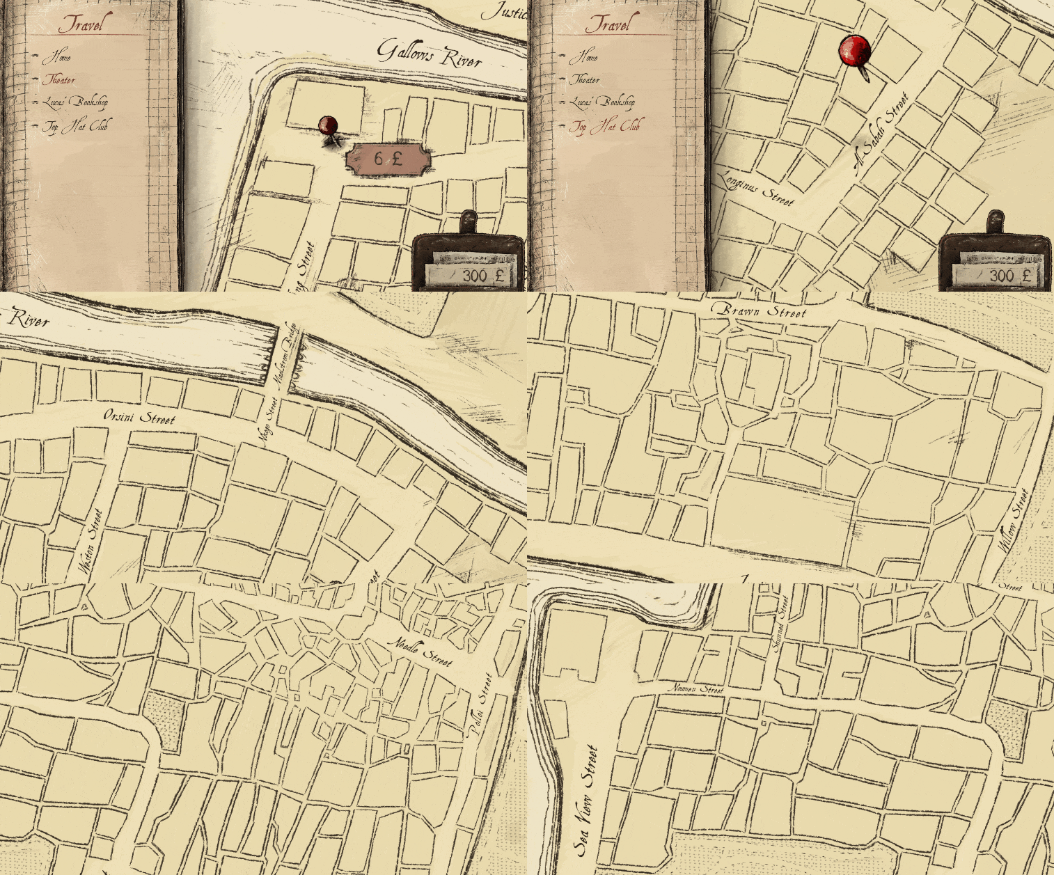
So we added a new mode to the fast travel interface which allows you to scroll around and zoom in/out. It made sense to tie both things together, we are always trying to have as few buttons as possible (it’s mostly four and start) while trying to avoid frustrating situations where you have to make a long combination in order to perform a simple action (this isn’t so easy to balance). The map itself, or the street disposition, was ready long ago. We didn’t share it on any update because we weren’t sure whether some of this information would be hidden. Now that is going to be a basic feature you can access from the very beginning, we can just show everything here.
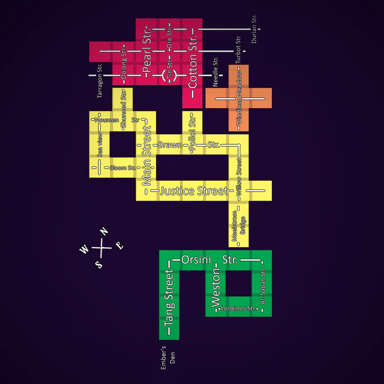
There’s the three quarters, the rich, the central and the poor (from the bottom to the upper part). There are no spoilers on the image, all the shops and important landmarks are not shown here. As you can see, street layouts start quite simple in the rich quarter and then turn into a confusing mess on the poor part.
And that’s all for today. We’ll be back in two weeks with a new update. There’s a small surprise on Discord though, make sure you join us there if you haven’t done so already.
1 comment