Our UI design was a big focus of our visual polish for Perfect Draw, due to the card game genre.
Cards
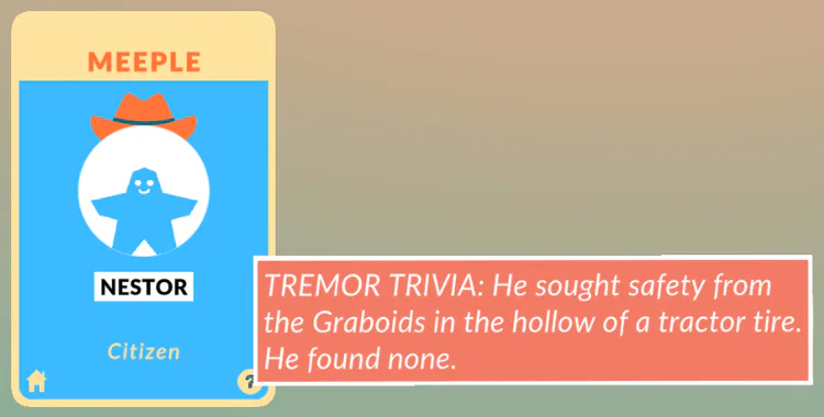
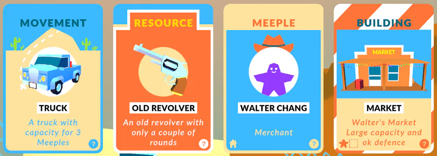
Each card had a title, type, description, trivia, and instructions.
Caspar designed unique backgrounds for each card type, to help easily distinguish between them at a glance;
Meeple, Movement, Resource, Building, Distraction

We think the trivia section adds a lot of humour and heart, as well as helping tie the game into the Tremors movie even more.
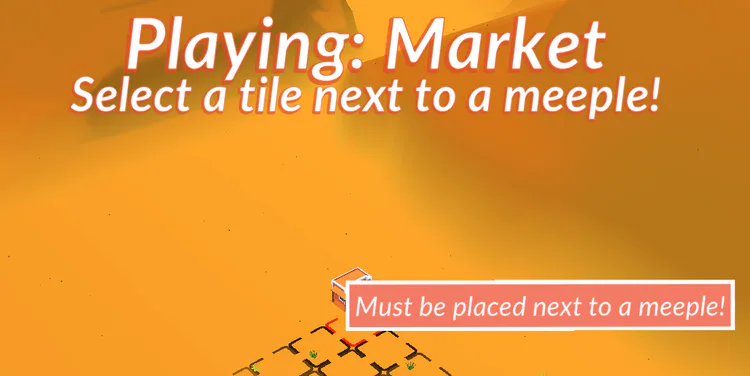
There are a few different instruction icons which can display on cards to indicate; must be played ON a building, must be played ON a meeple, must be placed NEXT to a building, must be placed NEXT to a meeple, etc.
These icons can also be hovered to display a tooltip with more information.

Tooltips
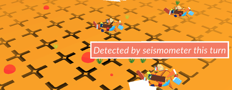
We tried to put tooltips everywhere, while hovering almost anything to give user feedback. We hoped this would help teach new users especially with our lack of tutorial (so far, stay tuned!). Hovering buttons on the main menu, cards in the game, or cells on the grid - all give helpful feedback to the user.
Card instructions
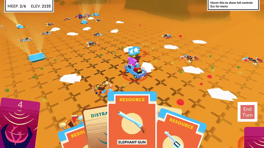
When a card is selected its name and instructions appear at the top of the screen, any valid grid cells highlight in a different colour, and hovering over invalid tiles will give feedback as to why. This was another method we used to teach new players and just give a better user experience.
Popups
Another way we give the users feedback is through popups.
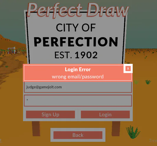
There are a few different types of popup, which can be instantiated at any time from any script; Errors, Messages, Notifications, Unlocks, & Name.
Errors help give feedback to the player when something goes wrong, especially during login (e.g. wrong password)
Messages are hooked into our LootLocker system, they download from our dashboard and alert the player if it was published on the current day - otherwise they are listed and viewed from the main menu "View Messages" button.
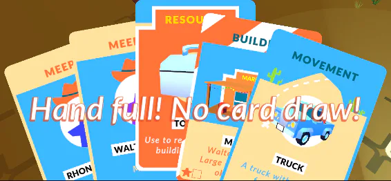
Notifications display in game to help show when things are happening in case the user misses something, e.g. "hand full, no card draw" or "Earl killed a Graboid!"
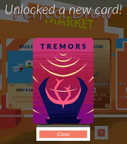
Unlocks popup either when cards are bought, or the user levels up. They basically show the new card and are intended to make the player feel the reward and progression.
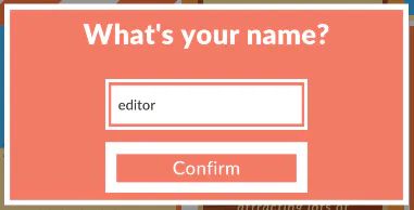
Name popups allow the player to enter their nickname, it shows up on the first login and can be reopened by clicking their nickname display on the main menu.
Menu
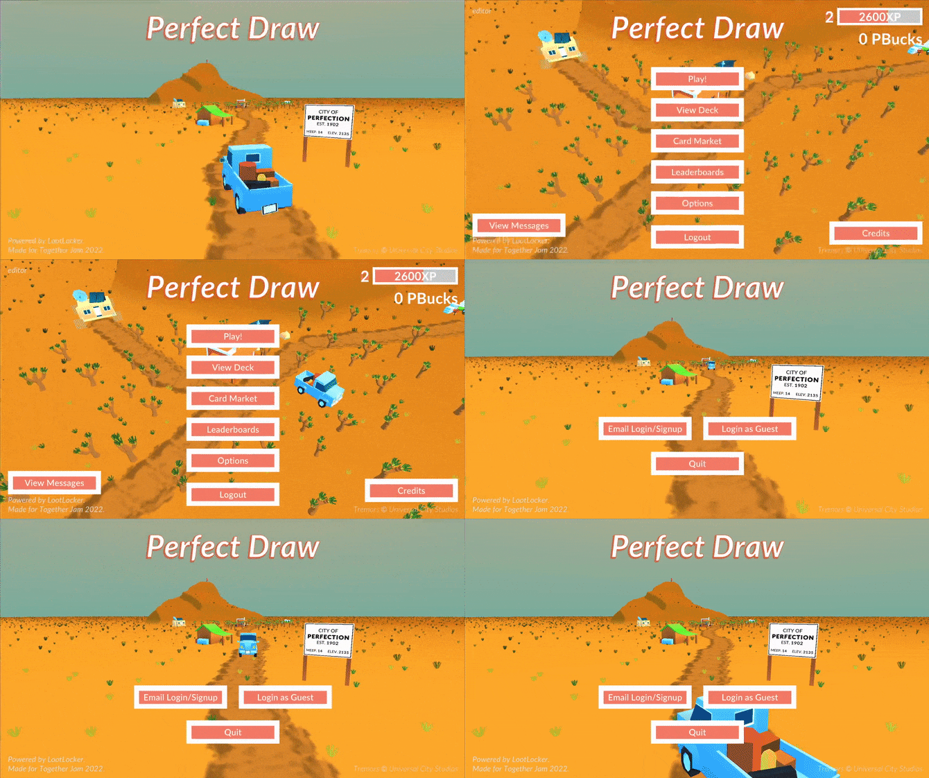
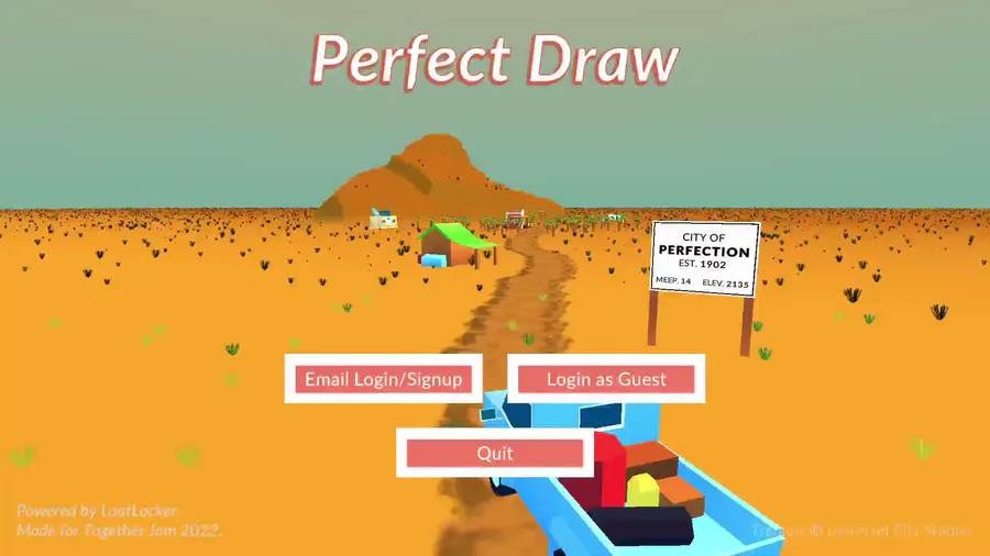
The main menu runs on a state system to handle each different submenu, and the movements between them;
			public enum State
{
        PRE_LOGIN,
        EMAIL_LOGIN,
	WAIT_FOR_TRUCK,
        PRE_PLAY,
	MISSION_SELECT,
        DECK,
        SHOP,
	LEADERBOARD,
	MESSAGES,
	OPTIONS,
	CREDITS
}
Each of those states has a different gameobject in the scene which contains all of its UI. These start disabled and offscreen, then enable and lerp onscreen via code when buttons are pressed.
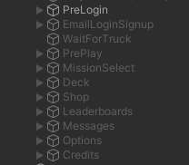
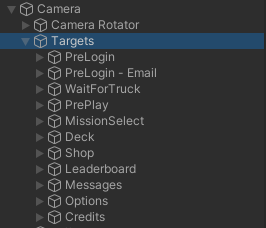
The states are also linked with camera target transforms, so that each state has a different focal point in the scene - this simple lerp really helps give a dynamic feel to moving around the menu.
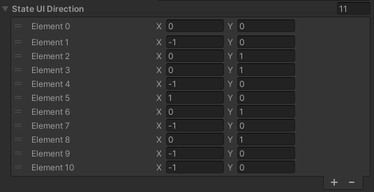
To add to this, the state UI gameobjects also lerp in and out depending on the direction of camera movement (these are manually set in the inspector). When changing to a state, this direction is used to determine which way the new UI lerps in from, and then the old state's UI lerps out in the opposite direction
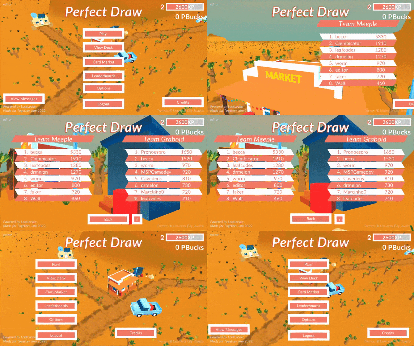
We added the truck driving in and out of town as you log in/out as a cute little extra, using the truck animations and sounds from the main game. It just follows a simple set of target nodes to animate along the road.
UI Elements
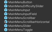
Each type of UI was prefabed to allow easy and fast iteration on style/design/functionality over the whole scope of the project. For example; MainMenuButton, MainMenuInput, etc
ReachForMouse.cs
This simple script is attached to all our buttons, etc to add a nice extra layer of effect - buttons ever so slightly reach out towards your cursor as you approach them. This helps to make the menus feel more dynamic.
			Vector3 mouse = Input.mousePosition - new Vector3( Screen.width, Screen.height ) / 2;
float dist = Vector3.Distance( mouse, StartPos );
if ( dist <= MaxDistance )
{
	var dir = ( mouse - transform.localPosition ).normalized;
	transform.localPosition = Vector3.Lerp( transform.localPosition, StartPos + dir * MaxReach, Time.deltaTime * LerpForthSpeed );
}
else
{
	transform.localPosition = Vector3.Lerp( transform.localPosition, StartPos, Time.deltaTime * LerpBackSpeed );
}
Thanks for reading!
Check out the game for yourself here;






2 comments