Current palette

Variant 1

Variant 2

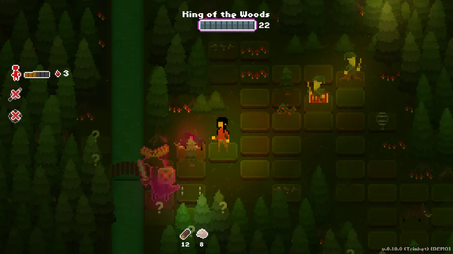
I’ve been playing around with the color palette in the game a bit. When I made the new enemy I tried to use a different style in terms of silhouette and color hue, and I really liked the combination, and want to use it even more.
Even though I’ve tried to make the colors more saturated overall in the game, I still feel that I can take it a step further.
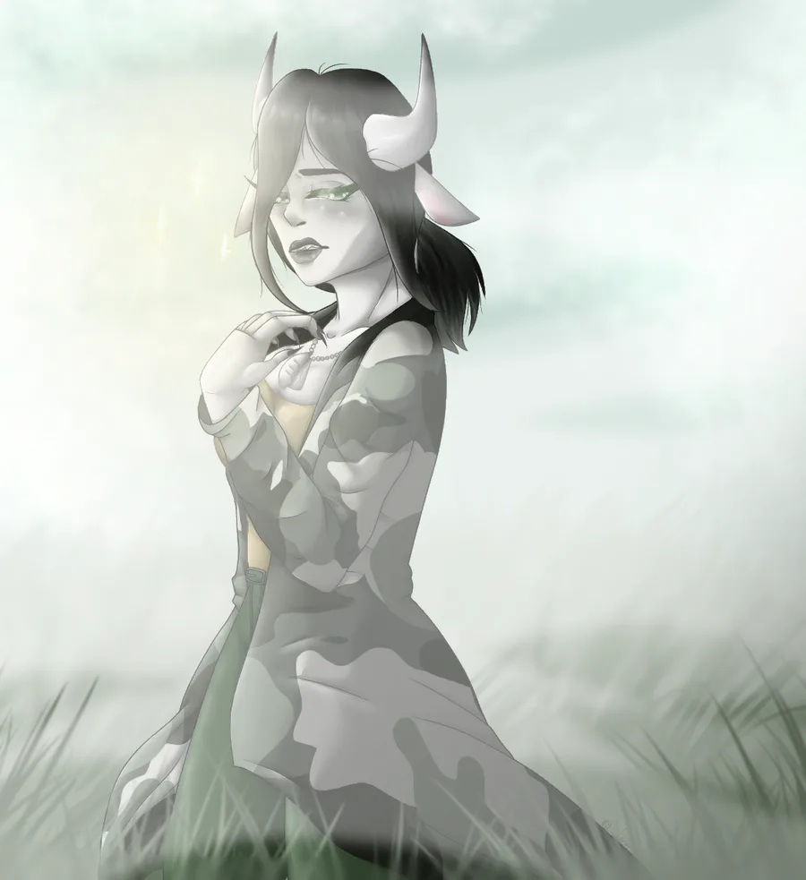
I mean, just look at the colors on the new enemy (currently called Ash maiden by the way (because it’s an Askfru from Swedish “lore”) - they have a better feel to them, a more “deep foresty” look than the current background palette.
Well, opinions from you guys? I’d love the input =)
Love,
J



5 comments