Let’s talk more weapons.
Since last time, I’ve had to work on other parts of the game. Audio, camerashake, damage effects etc.. But there has at least been some work done relating to the weapon system.
Since I want the weapon design process to be simple and enjoyable to encourage the creation process I have started updating the UI for the excel sheet that will be used. Let’s have a look at the one that I have been working on until recently.
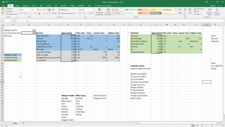
This is more of a loose collection of thoughts than an actual document that one would expect people to work with. And now, the update:
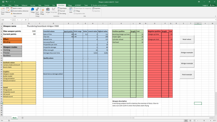
Besides the more user-friendly graphical changes, more functionality has been added and the structure has been revised.
The green and red sections contains qualities, weapon behavior oddities that can be added for a cost or to gain more points to use. Their purpose is to accommodate for the more unusual weapon behaviors that each weapon shouldn’t need to handle.
For example, the user shouldn’t have to define area damage for an explosion when the projectile doesn’t even explode to begin with.
To make a system like this more accessible, I want the user to be able to get an overview without being overwhelmed and still require little explanation. This is accomplished by reducing on-screen information. Several of the values and headline have explanations that can be viewed by hovering the mouse over them. Also, by hiding values that aren’t used by the current configuration.
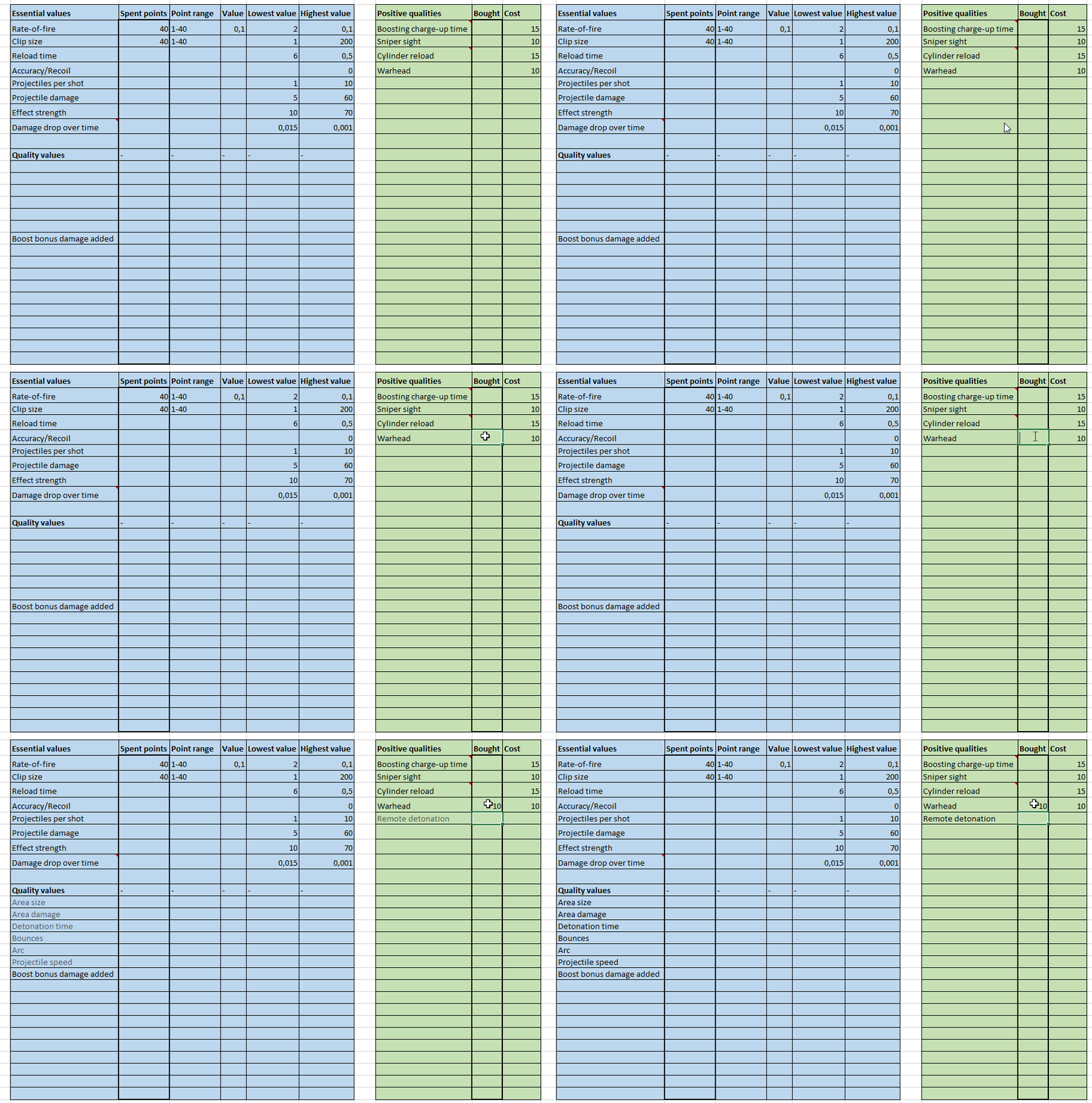
Do note that not only were there quality values added, but also a positive quality that can be added as well. All of those options needs to be considered, but only if the designer is making a warhead-weapon.
The buttons on the right side of the document will affect the values in two ways. By resetting them all to 0, and to get examples or other weapons. If one clicks the minigun-button, the sheet will be filled with the values and qualities of a stereotypical minigun. This can be useful for designers to get an idea of what the sheet should look like after they’re done. It uses common weapons rather than completely new ones so that the designer doesn’t just see a random set of numbers with no context to what they accomplish.
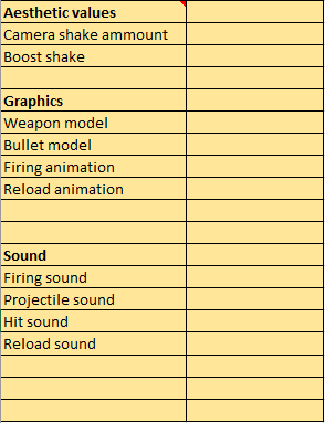
The aesthetics-section was added due to the thoughts in the last blog post. Since it relies a lot more upon the work of graphical artists and sound designers it works more like a checklist of assets that are needed.
As this file is being built, I’ve been trying to balance the amount of time spent to make it accessible while I also do other work on the game. While I do enjoy the challenge of making this excel-file useful, in the end it will be used by people that I sit right next to. I don’t need to make it completely self-explanatory and if it would take time to do that it would be such a waste.
The reason because this is a challenge is that I do like what is happening to this document, and I am putting several old lessons about UI and accessibility into practice.
That’s all for now. Thank you for reading and look forward to new gifs of the game in the near future.



0 comments