Getting Mobility working in a browser has always been a bit of a stretch goal for me. I use Game Maker Studio, but the code the HTML5 compiler generates is really hard to debug, and error messages are really hard to make sense of. Usually it just then boils down to which objects are in the room, removing those until I find the one that causes it to break, and then removing/commenting scripts on that object until things no longer break.
But in my last attempt, I pushed through instead of giving up. The previously game-breaking bug seemed unsolvable during my previous attempts, but it was really just a few lines of script messing it up. So I finally managed to get it to work.
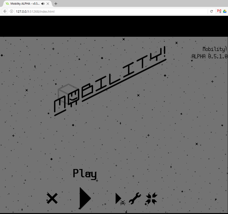
I also think I’ve made the first browser game to feature remap-able keys! (When I was looking at itch to see whether games featuring both already existed, I was reminded that my own game Box Kickers X does. I totally forgot about that…)
In other news, I’ve been updating some UI. Here’s the brand new completion overview:
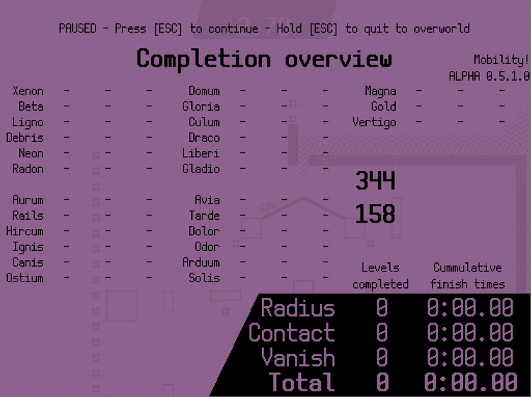
The goal was a completion overview like available in modern Mario games, where you can easily see everything you’ve done up to this point, and anything you might have missed. It shows all level names, sorted by the spaceship you can find them in, as well as a summarized completion time. I also included a debug feature which allows me to randomly populate the highscores to see if this menu can handle it. There are some things I do not yet like about it, like the calculation of the ‘Total’ time, which takes the time from the highest difficulty you beat a level on, and then adds those times of all levels together. So I want to introduce some kind of time penalty for that, but I’m not really sure how that’s going to work yet.
And I’ve also given the minimaps a slight facelift.
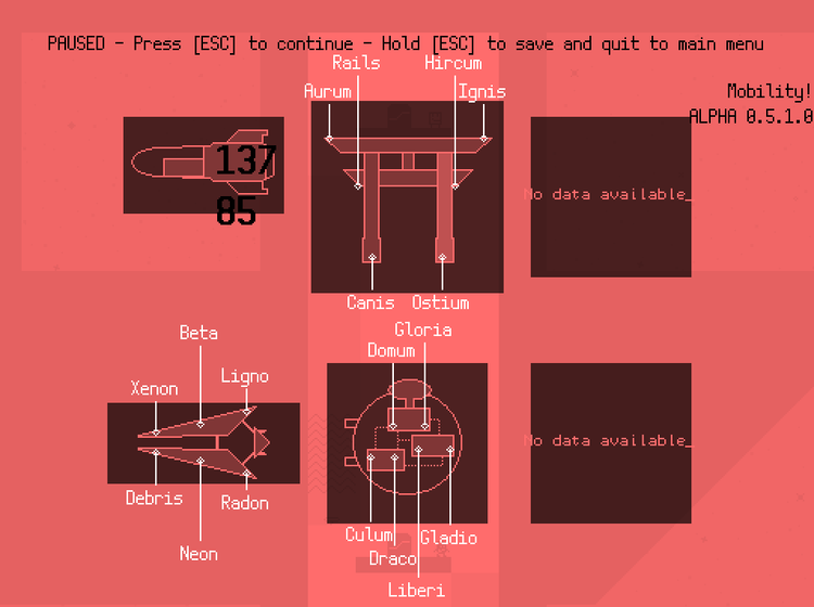
Every map is aligned neatly now. Spacing could still use a bit of work. I’ve removed the time from this overview, but since you can open the score overview with just a single button press from here, you can use that instead. The white colors on the lines and text work better on dark backgrounds, but lesser on white backgrounds, so I’m thinking of making the label white or black depending on how dark the background is.

I’ve also been implementing a feature where players can submit feedback to me while still in the game. I need the feedback, because I want to make this my best freaking game ever. Here it is, really simple, and not really polished, but it’s functionality is sufficient. It also sends a few bits of metadata like the date, version number, which difficulties/modes the player has been playing and his cumulative amount of time. I’m planning to make it pop up after completing the first world in the game in the alpha version of the game I’m sending to testers soon.
Finally, I released a blog post recently about making your UI flow as silky smooth as possible, and I’m using Mobility as an example of how I have done it and why. I’ll likely go more in depth on this in the future.


0 comments