So, whats new?
Remade the menu
So at the start of this week, I came to the conclusion that the menu, well, was kinda trash. Not “Needs some work or polish” trash. More of a “Needs a full redo” sorta trash.
So after some work, I got a new menu.
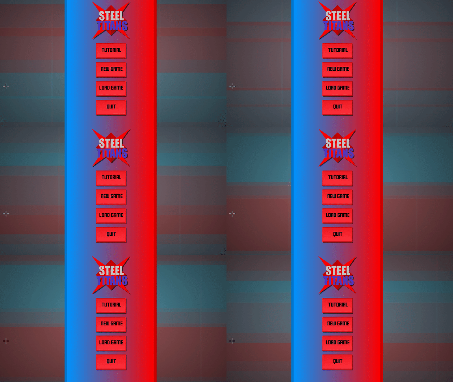
Not only, do you get fancy, gradients and drop shadows, along with a weird graphic in the backround. You also get….
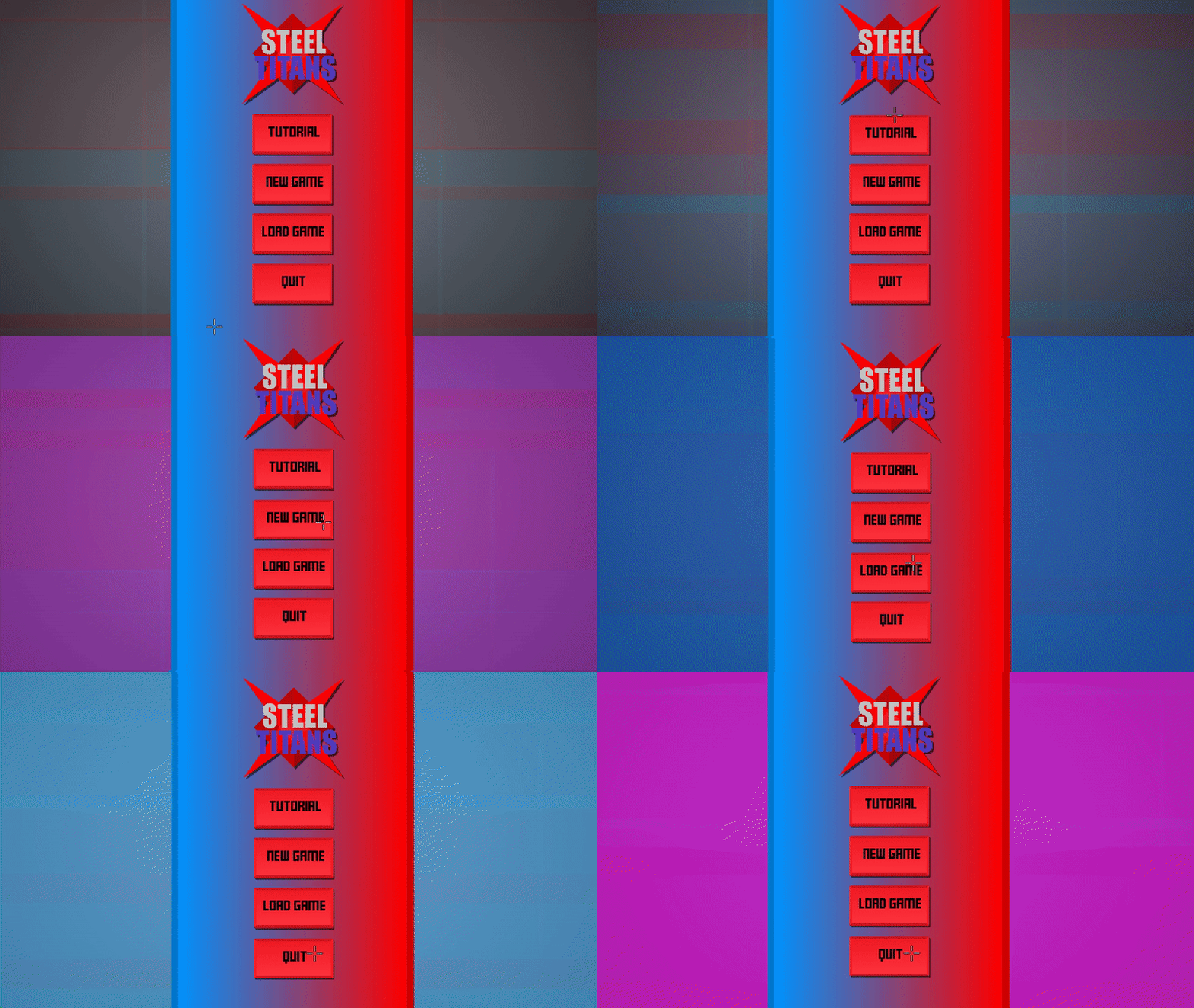
juuuice…
Hovering over the buttons, gives you some lovely screen shake, and changes the colour of the backround. It’s still a work in progess, but its getting there.
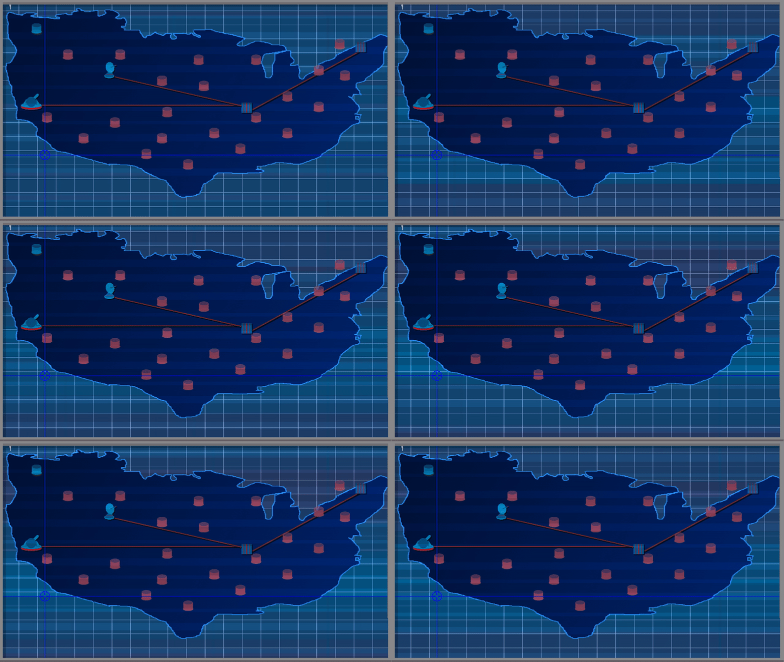
Plus, I’ve added some drop shadows, gradient, and that weird graphic again, to the map screen, which will be my focus next week, probably.
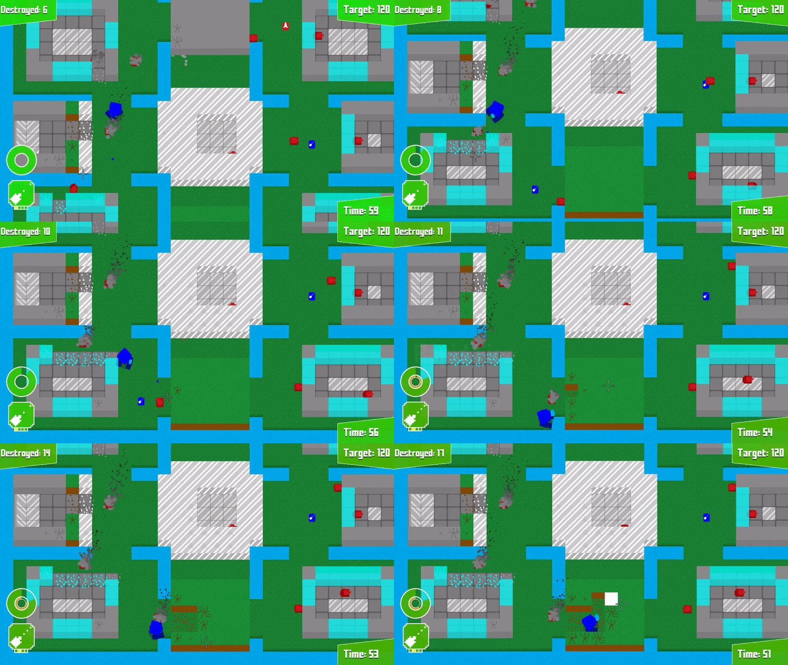
General changes
Water animation varies
Added detail to grass
Changed map border
Fixed map filter
Added colour to cables
Fixed concrete slabs being partially transparent
Fixed returning to menu in tutorial and [REDACTED] leading to dev menu
Thanks for reading!
Itch.io page
Itch.io Devlog

0 comments