User Interface
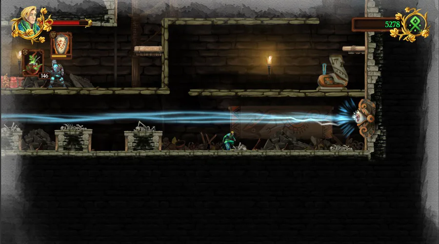
If you follow our social media, namely twitter, you might have seen the two teasers of our brand new UI, earlier this week. This new overhaul is due to the fact that we just got two game focused multimedia designers for a three month internship.
Among other things, they have been tasked with overhauling the entire UI, HUD, drawing game logos and redesigning the company logo. Anyway back to what’s fun, the UI.
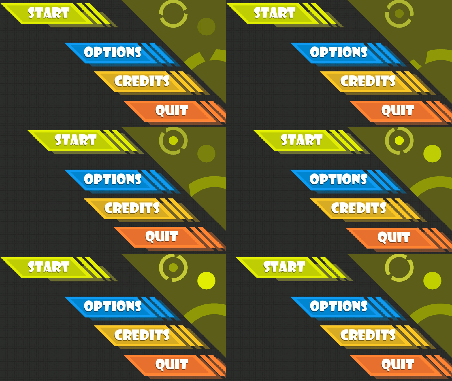
Fig. 1 - Navigating the Main Menu
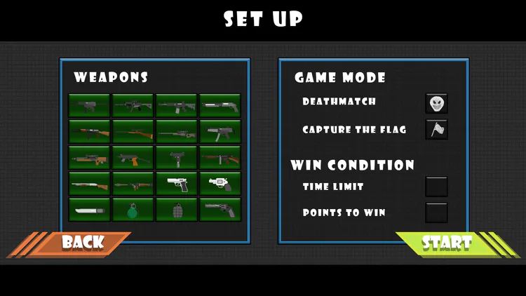
Fig. 2 - Setting up weapons and game rules
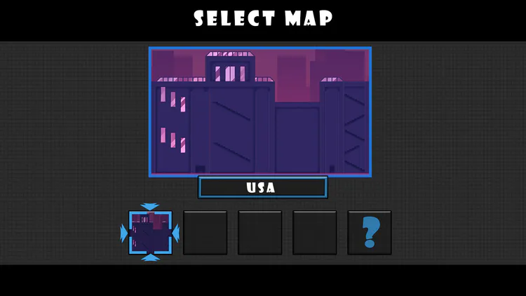
Fig. 3 - Selecting a map for the match
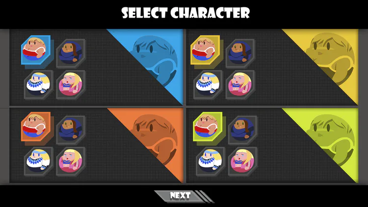
Fig. 4 - Selecting a character and joining the game
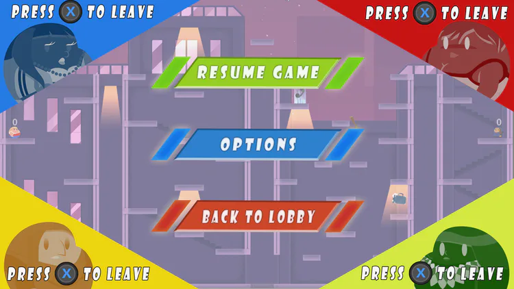
Fig. 5 - The pause menu
Game Logo
Up till this date we still don’t got a proper logo, actually we didn’t really got any logo at all. And of cause we need that, so one of the interns began drawing some concepts and different ideas. First picture shows his different ideas, and the second shows the one we think is best. What do you guys think?
Cast your vote on Facebook or Twitter
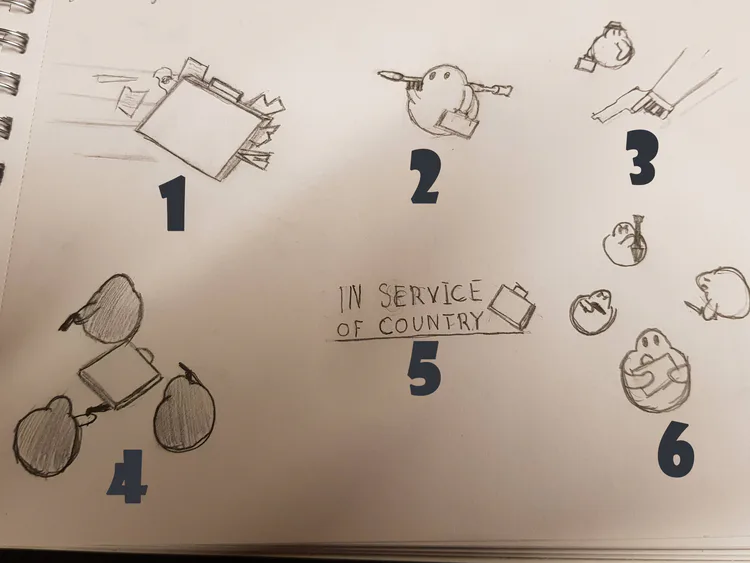
Fig. 6 - The logo ideas.
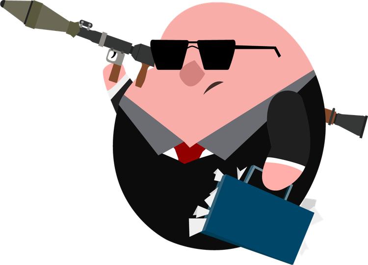
Fig. 7 - The one we think is best.
Original post: https://nervedamagegames.com/blog/in-service-of-country-devlog-4/


0 comments