User testing
A couple of weeks ago we had some users, test our game. The goal of this test was to see the reaction of users who had never played the game before. For the best results, we only provided the most essential information.
A majority of the testers said, to some extend, the same thing. “The gameplay is totally awesome and fun. But the menu navigation is totally not.
And we could see what they meant. Especially navigation in the character selection menu was complicated and not very intuitive. The opposite of what it is supposed to be.
Navigation in the Character selection
The design of the character selection menu actually didn’t change much. We are really satisfied with the design, but what we did was to change the way users cycle characters, ready/unready and go to the next screen. We added ‘X’ button icon below the ready button. And we added D-pad and left stick icon instead of the arrow above and below the characters. This will all be explained in a bit.
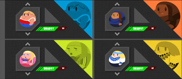
Fig. 1 - Character Selection.
Before you had to select upper or lower arrow and then press ‘A’ (on Xbox controller) to cycle characters. Furthermore you had to select the ready button and press ‘A’ to ready up. The problem being that the highlighted color had priority over the green color so it was, nearly impossible to see if you had joined or not.
Now you cycle character by pressing up/down on the D-pad or left stick on a controller removing the ‘A’ button press. Furthermore we changed the ready part of the menu, so players ready up/leave by pressing ‘X’, removing the part where they had to select the ready button first.
Note: We wrote a button fetcher script that checks if the controller is Xbox or Playstation and then displays the proper image. For now it doesn’t show anything if the there are no controllers connected.
New weapons
Another thing we got feedback on are the weapons, and more specifically the fact the weapons are too different from the character. The users really loved the design of the characters, but also thought that the weapons have same chubby style as the characters. I can’t show any in-game footage with the new weapons, since only a few has been done, and they are still being optimized so we can put them in the game. Below is the newly design M4, with a bit more rounded edges than the previous M4.
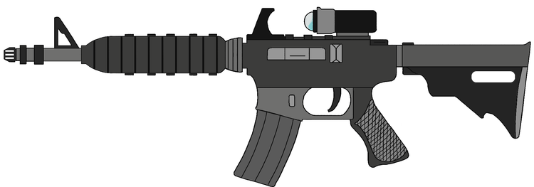
Fig. 2 - Newly designed M4 rifle.
A great new idea
One of our programmers got a new idea, involving the guns. The summed up version that we make 5-10 prefixes, both buffs and debuffs, and every spawned weapon has a chance to get one of these prefixes to spice up the game, and make it more re-playable. A prefix could be exploding bullets, enlarged guns or inverted fire rate.
Game header and logo
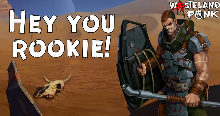
In the last devlog, I showed you an image telling you that this was supposed to be the the game header. We changed it up making the header image to the game logo, and then making a new header.
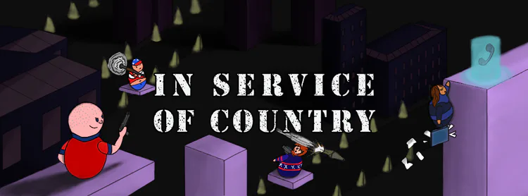
Fig. 3 - New logo for In Service of Country.

Fig. 4 - New header for In Service of Country.
We would love to hear what you think about the weapon prefix idea and game logo, in the comments below.
Original post: https://nervedamagegames.com/blog/devlog-6-redesigning-character-selection




0 comments