A New Look
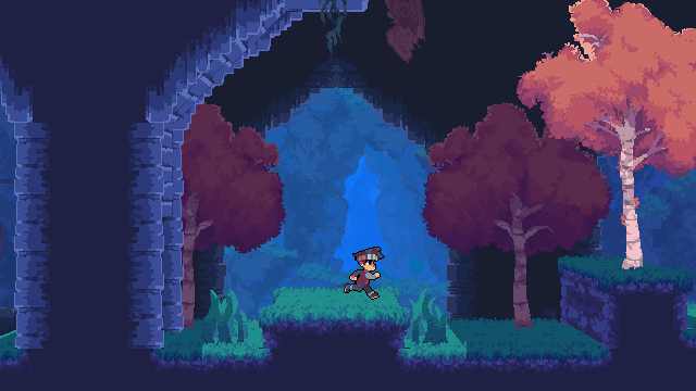
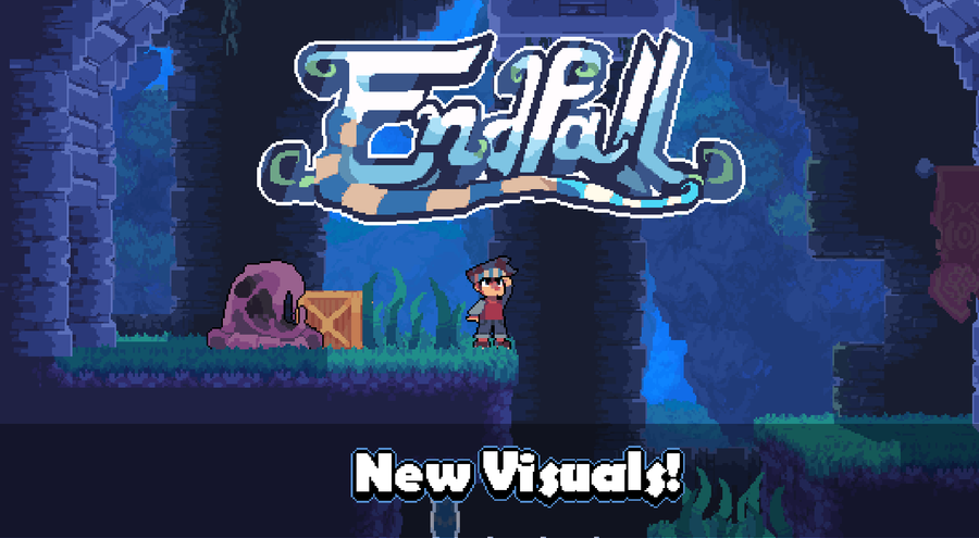
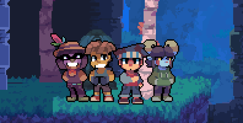
Endfall has changed a lot throughout the years, but now, I think I'm finally satisfied with the game's visuals.
The idea of making this game 2.5D has been on my mind since the very beginning, but I thought I would never be able to do it right.
I could never explain what I wanted to do with the visuals, so I just stuck with 2D because I never actually tried it, but in the background I was looking at different ways to achieve this look. I was even planning to change engines, but I ended up staying with the same one.
But I've finally done it, after years of learning, Endfall finally looks just like I pictured it in my head from the very beginning.
Inspiration
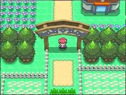
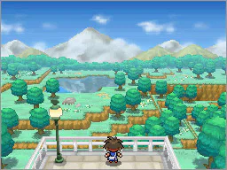
The style is mostly inspired by the Pokémon Games on Nintendo DS. There's something about that style that I just absolutely love. It's a combination of 3D and 2D but there's something about it that makes it so special. Part of that is thanks to the low resolution, which makes the 3D effect feel natural and not too off-putting
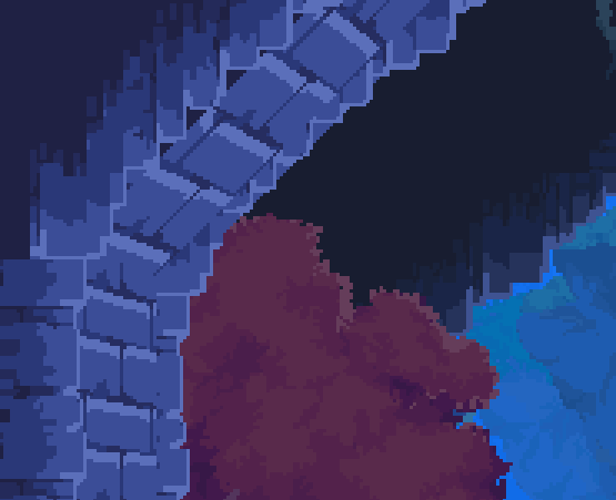
This is why I decided to maintain Endfall's low resolution, as it helps the pixel art blend in with the 3D textures.
Feedback
Yesterday I showed the world for the first time, a video showcasing gameplay with the new updated visuals, and everyone seems to love it.
I showed some early versions here on Gamejolt but in other places like Twitter/Instagram I haven't shown anything yet until yesterday.
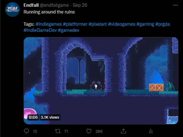
And it went pretty damn well on Twitter, that's for sure 😳 It's now my most liked post on there!
I'm super pumped to show more of this game, so stay tuned, I'm gonna start posting more gameplay stuff soon!



8 comments