Good evening! It’s already 11 P.M. here in Finland as I’m writing this, but we’re still on Friday’s side.
Me and the creative director, Tuukka Kuusisto, talked about doing a series of blog posts showcasing the games that’ve inspired us to create Kalaban. We thought this would give the readers a great insight into our minds, and also into gaming history.
The first game on our list is System Shock (1994). The reason I picked this one up first, was that I just recently finished the whole game for the first time in my life. And it’s been one of my favorite games for almost ten years! It’s amazing that I’ve never gotten into beating the game, although I’ve had such an admiration for it.
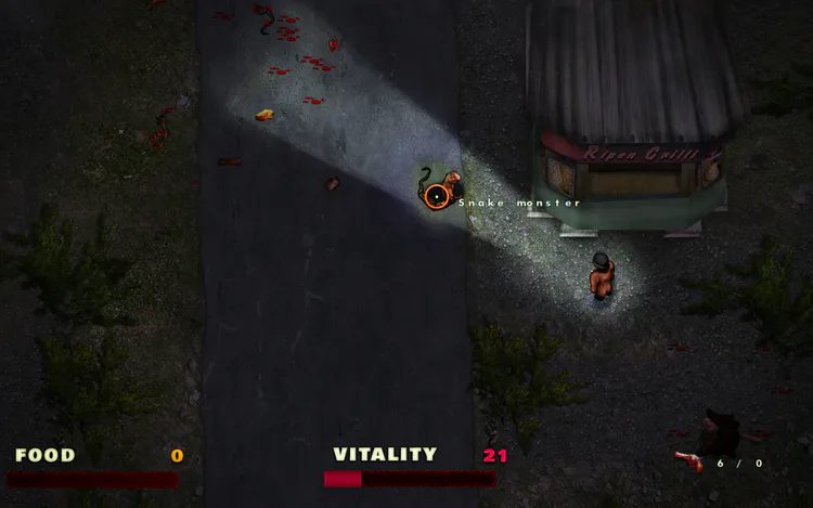
The game was developed by the now-defunct Looking Glass Studios, which is famous for its groundbreaking and immersive story simulator games. They were so much ahead of their time with so many concepts, that I could talk about it for hours. But our subject of the night is this one game in particular.
System Shock begins with a relatively simple premise. You’re a hacker, who’s on a space station. You’ve been given military-grade neural implants in change of removing the ethical restraints of a powerful artificial intelligence. All has gone to hell on the as you wake up after the surgery, and pretty much everybody on the station has been turned into bloodthirsty mutants or cyborgs. Now it’s your task to foil the AI’s plans and make it out of this station alive.
The thing that you’re immediately greeted with is the UI. The detailed user interface and the sheer amount of data on display may overwhelm you at first. Well, actually, most likely it will. I did my playthrough on the excellent Enhanced edition of the game, done by Nightdive Studios. It adds a mouselook to the game, which helps the experience immensely.
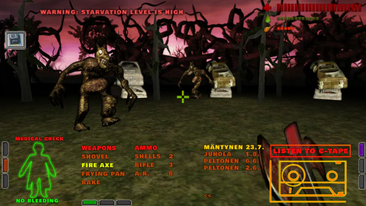
Of course, with Kalaban we wanted the UI to feel as intuitive as possible, but also to have enough depth that it doesn’t feel to arcade-like. Initially, we had the idea that you could touch everything and move every object around. There are a lot of “useless” items in System Shock, like paper tissues, soda cans and skulls. They have absolutely no value from the point of the gameplay, but add flavor and atmosphere to the game world. This is something that is still lacking from our game, which we want to fix.
The cyberpunk feeling and presence of technology is heavily felt with every step in the world of System Shock. As the developers have said, the game is closer to Star Trek than it is to Star Wars. The experience feels very nerdy and techy, from the UI to the way the people speak in the audio logs. The theme is consistent and the solid, which makes this design decision work. Although the UI and controls in Shock are complicated, the core gameplay loop doesn’t change once you’ve gotten into the game.
The most direct correlation with System Shock and Kalaban is the way we want to handle the story. In Shock there are no alive humans on board Citadel Station, but in Kalaban’s small town there are. What is similar though, is that you have to piece the story together from smaller bits in our game. At first, you are given almost no information about yourself or the world. Just the basic premise, but without heavy exposition or lengthy cinematics.
At first we wanted to follow the steps of Shock and do the game without any NPCs. This would have lead us to having things like journals, c-tapes or video cassettes which you could browse though. The audio logs already feel a bit cumbersome in Shock, so we didn’t want to go in this direction. In System Shock 2 the audio logs are made easier to handle, when you can just push a button and the game will automatically play the newest log that you have.
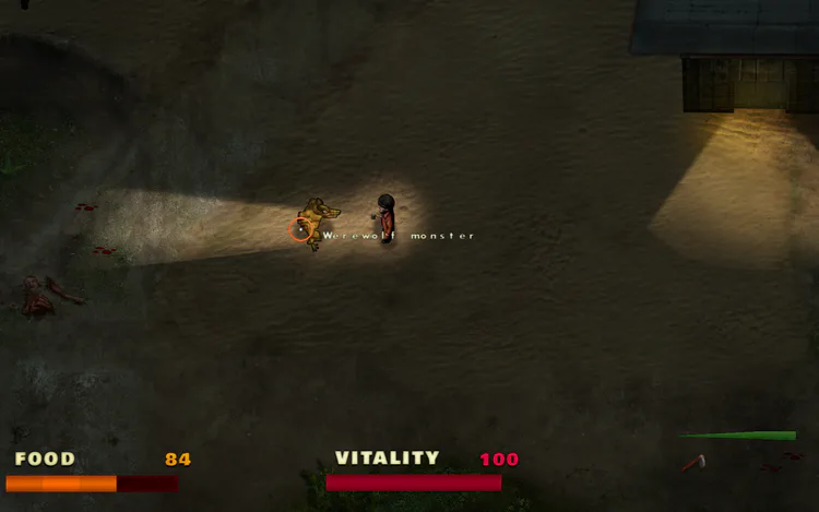
One of the things in System Shock, which is still current today, is its story and the impressive simulations it handles. The story simulator games includes various different systems, like physics and AI, which may not be that complicated in themselves, but as they all work together it amounts to some really unique and memorable gameplay moments. The AI behavior in Shock inspired us to create the system where the werewolf monsters seek for food, if they’re not busy trying to claw you to death.
And speaking of death, there’s the combat. Amazingly enough, the fighting in System Shock never loses its tension and terrifying nature, not even at the game’s finale. It’s a survival horror game, and this is reflected on the resource management and scarcity of ammunition on the space station. Although the combat is real-time, it always feels tactical, because of your clumsy weapons handling and reloading. You try to carefully edge around to corner to have a peek at a robot. It sees you however, and now it starts to tear you to shreds with its machine gun. Hopefully you activated the respawning station, otherwise you’re greeted with the familiar death cinematic and are thrown back to the main menu.
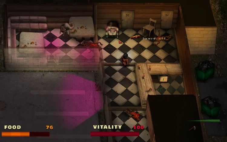
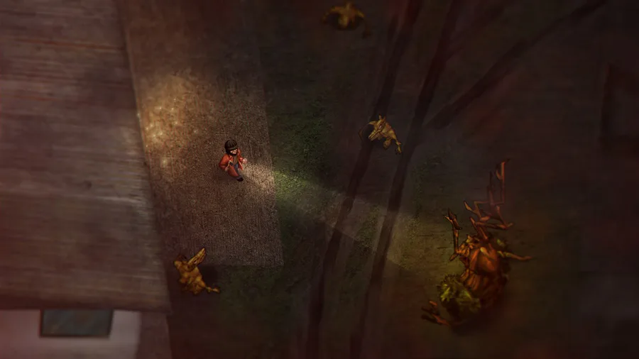
The familiar pub scene in our upcoming shooter-like demo for the game.
The sheer horror of facing against a horde of Autobombs in a tight corridor is one of the highlights in System Shock. I thought of our very own Blow-up mutants as I played through that bit. I feel that games should throw you in uncomfortable places, which are not fair at all. But once you get to know the rules of this world you can exploit them. If you’re just advancing through one corridor after another, with tougher and tougher enemies, it’s just not the same as exploring this hostile, alien world, where you start to feel like home, despite all of its horrors.
All in all, System Shock is a hugely atmospheric and tense experience, which is something that I especially want to replicate. Making games is a bit like film making: if your story loses its tension, it also loses the player’s attention.


0 comments