This was fun to make, so I'd like to explain you guys some techniques I experimented with to achieve a more "pixelated" version of the Giavapps logo animation with the brand new GameMaker Studio 2.3 feature: Sequences!
Optimizing Memory Usage
GameMaker Studio 2.3 is very good at this stuff and already performs several optimizations: one of them is creating Texture Groups (or Atlases if you prefer) for the sprites we create. However, Giavapps logo is BIG and usually drawing a big picture is much slower than drawing a bunch of little sprites. Even drawing a completely transparent pixel requires some processing and that's why the first thing I did was analyze all the letters that make up the logo:

G I A V A P P S: 8 letters (8 sprites), right?
So the first thing someone might think is yes, you can separate all 8 letters and animate them individually!
But, if you look deeply, I can still perform some further optimization of memory usage!
The only letters I really need are:
G I A P S: 5 letters (5 sprites)!
Since I can just reuse the P and the A (for the second ones) and I can then rotate the A for making the V.
Sounds cool right? But since the logo has different colors I would still have to use:
G I A V A P S: 7 letters (7 sprites).
Since:
G I P P S : have the same exact black color so I could just reuse the P.
but...
A V A : have red, green and blue color respectively.
So how can I manage to reduce the whole thing to 5 letters (5 sprites)?
I'll tell you in a minute...
Indexed Color Shader
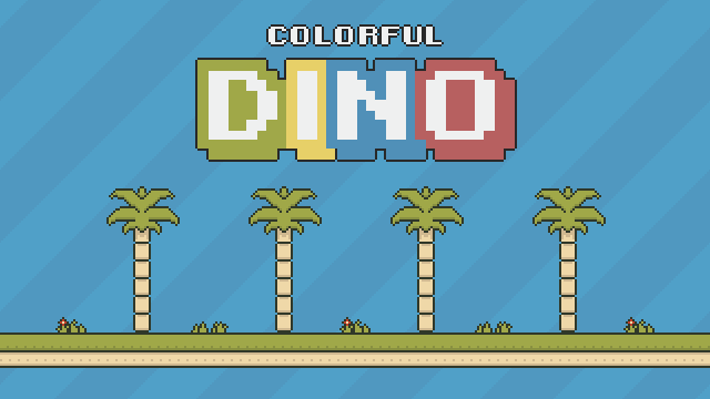
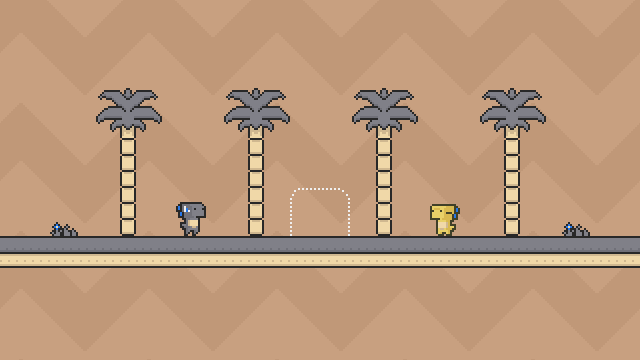
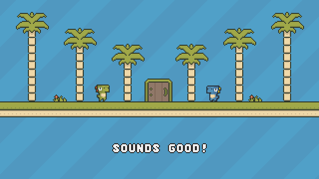
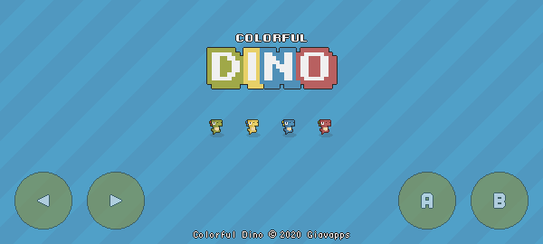
One of the feature I implemented in Colorful Dino game is an Indexed Color Shader basically the idea behind this is to just have a reference to a color in the image and not the real color: that's why you see the logo completely grey in the Sequence Editor but that is not the final color! By using this technique I can easily swap the colors of the letters later with the help of some GML (Game Maker Language) code and that is how I reduced the whole thing to only 5 letters (5 sprites)!
Further Optimizations
One further optimization could be to just use a specific Texture Group for storing the letters of the logo since I plan to use them in one Room only!
This would save some extra space in the main Texture Group that I'm using for drawing other stuff.
The Downside
The experiment was a lot of fun, but not all that glitters is gold: the downside of using an Indexed Color Shader is that the palette of colors you can use is limited to a max of 256 colors, that means it's great for Pixel Art Style but maybe not the best thing in the world for a logo or text since those usually make heavy use of anti-aliasing to really shine.
Since that was not exactly the final result I was looking for I've re-worked the animation by opting for the 7 letters (7 sprites) version.
I'm not using the Indexed Color Shader, so the letters have their own color already and I'm now also using anti-aliasing.
Sometimes you have to sacrifice memory for better results!
Conclusion
The tool you use does not make you a master, it is the experience you have gained with the tool you use that really makes the difference.
I hope you guys enjoyed the reading...
Greetings, Luigi.



3 comments