
Next up
better comparation
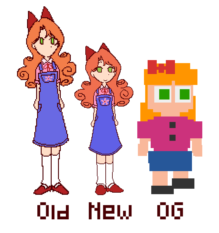
the og one is not sized based on the other ones
design used by fried_manto in twitter
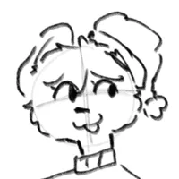
elizabeth almost finished
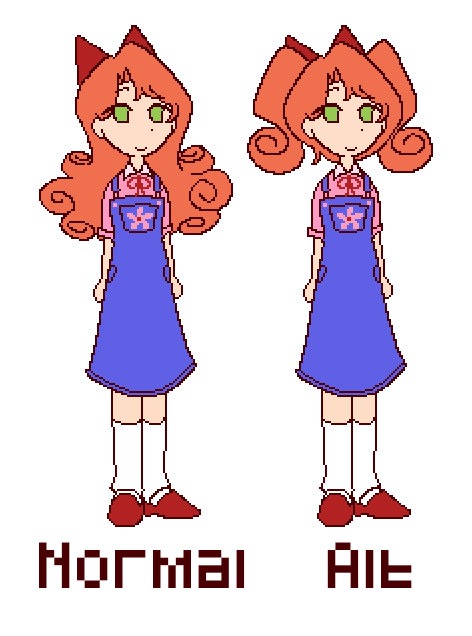
need to do shading but ill do it when i finish the others (everyone has the normal and alt ver)
design used by fried_manto on twitter
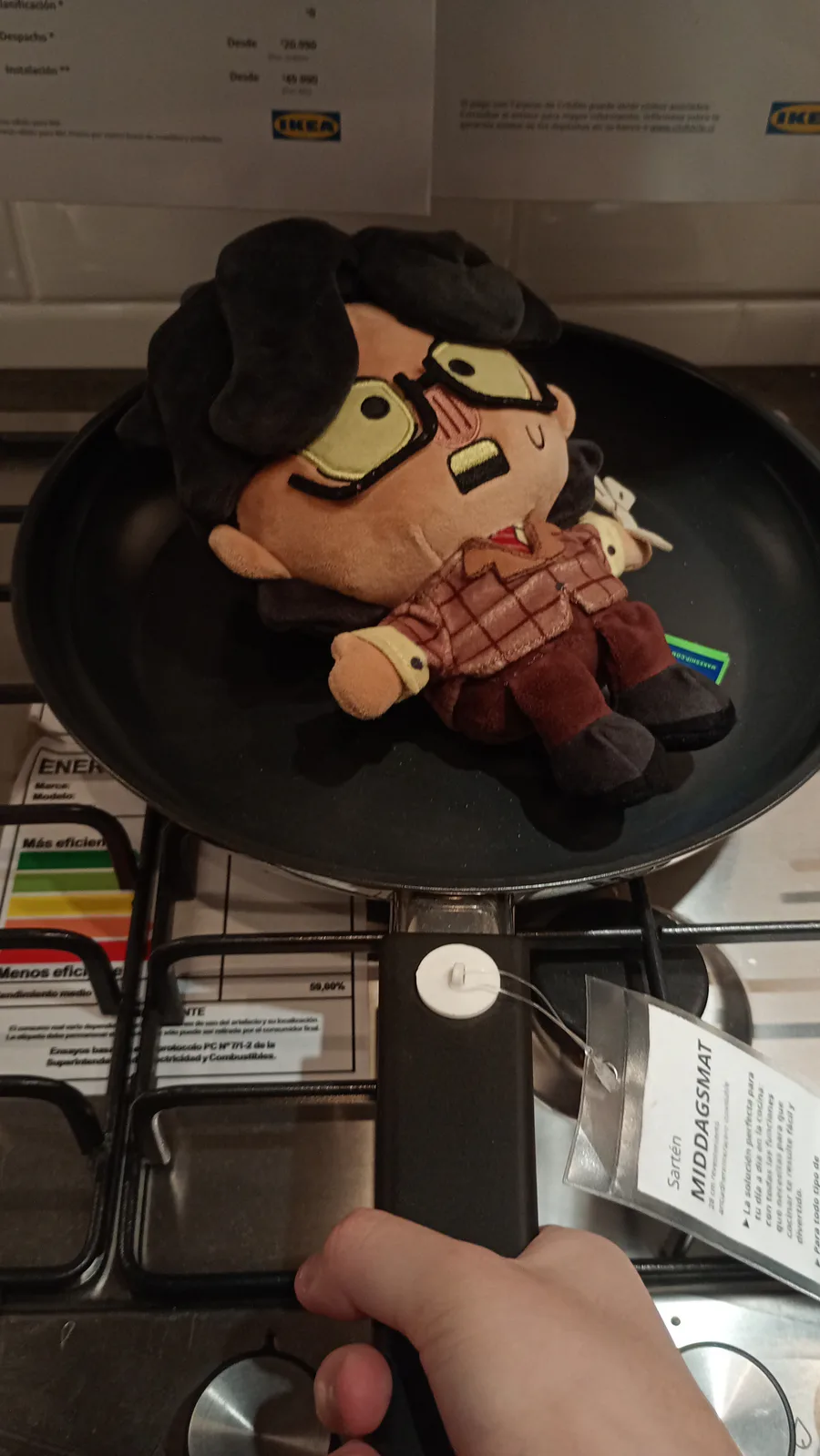
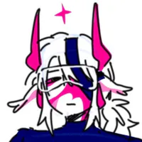
cooked (literally)

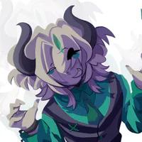
Another ugly i dont like him
I forgot communities btw
ill accept more friend requests later (they were and are a lot)
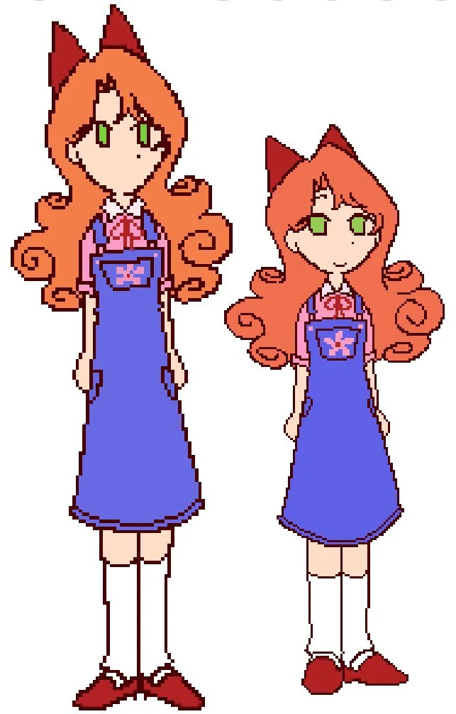
comparation between the two pixel arts i made
the older one is the left one , decided to make it less detailed and more smaller , changed from 3 pixels to 2 pixels and added an actual face
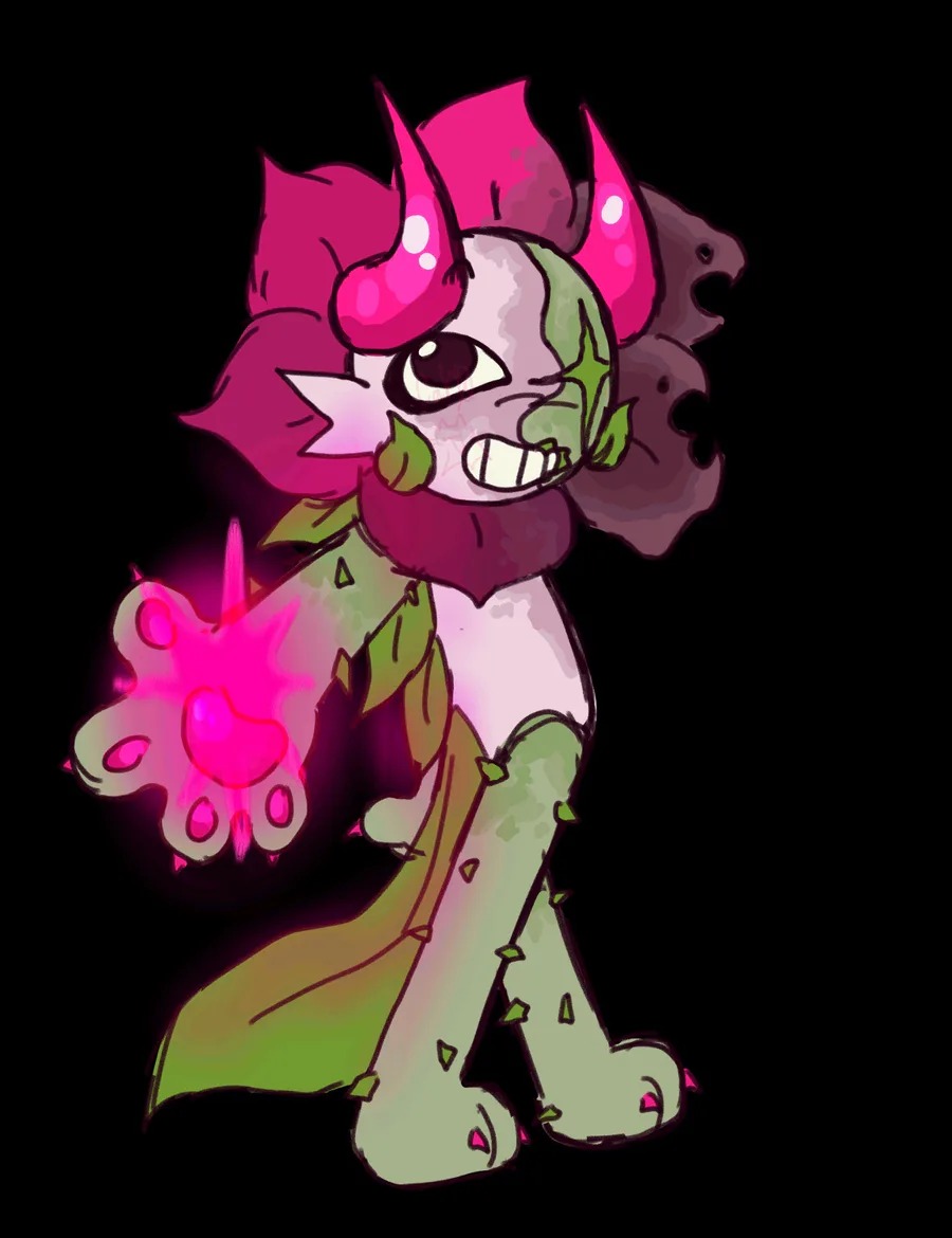
An ugly
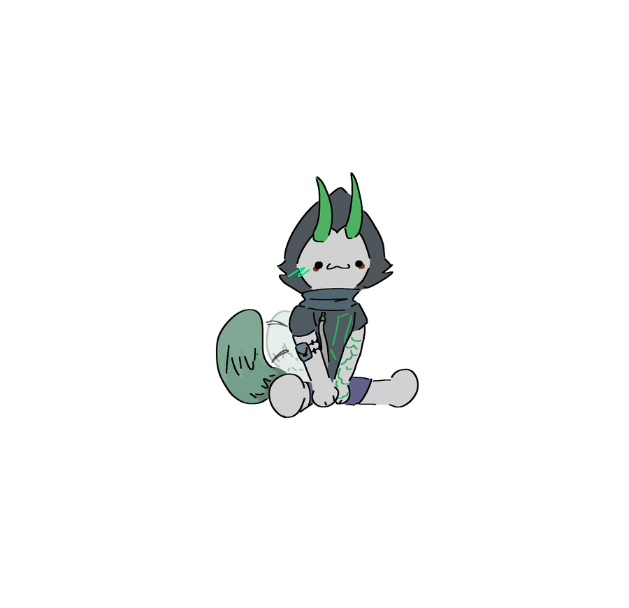
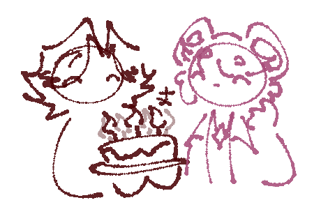
hes having fun
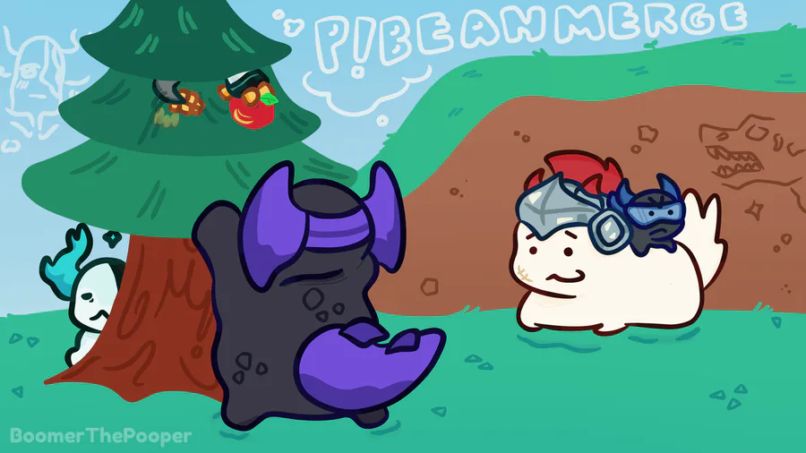
pbm banner submission i must hype myself up for because theres 2000 robux on the line and im scared

putisimo protag
10 comments