Loading...
222
5 months ago

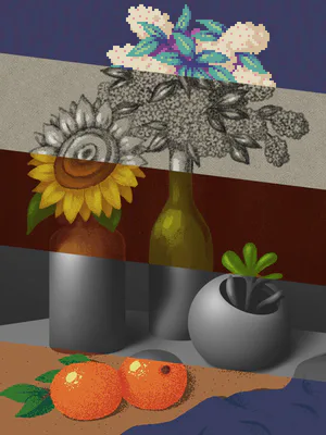
hey @Alexutbrainisfire this is what your post reminded me of. To finally make the GameJolt logo i've been thinking of but constantly forgetting (and also some other stuff too)


The model is very simple, i tried making it a little unique since i don't know how to make pixel styled textures yet.
Used the color ramp as best as i could and gradient to give it that nice dimmed out color at the top
And then gave it a metallic frame cuz why not :)



9 comments

Loading...

Next up

Thanks @Forbidden2 Cool dude

Oh yeah i forgot to share this a while back Was just kinda lazy But i was learning how to make smart textures...yeah i know it still needs work

Same goes for the poor quality, i feel i need to dail down the depth of field

Now tell me....does it look normal? Cuz the dude that said i should make it, told me it didn't look good (mainly cuz it was supposed to look exactly like a product with soo much fluff that i could kill my laptop

Pokédoodle 104 - Cubone

: https://gamejolt.com/p/i-went-ahead-and-made-a-palette-with-all-…

Reminder: The colour selection and palette are both based on the Pokemon Yellow sprites.

: Clip Studio Paint

I mean...it looks kinda good... I just wish i could make realistic water (low-rez though)

And yes the umbrella render in the last pic was made to look boring alright (UuU)

5.0v3 PNM

And a funny icon mockup

Ayy let's gooooo!!!!

Made an edit a long time ago A shame i deleted my tiktok account How good is it?

Testing my game engine and the work in progress renderer (Opal rendering, a rewrite of eevee)

don- don't ask why he's here.

This is good Still hard to make stylized objects but i'll give it a try