So starting from where i left off on the other image.
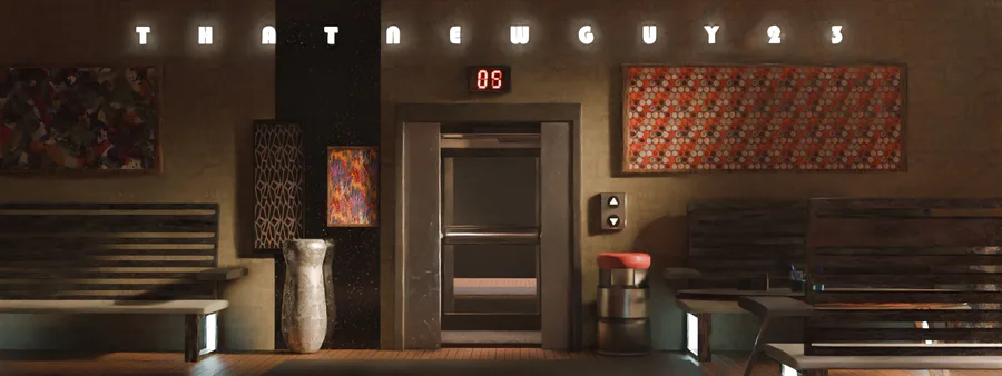
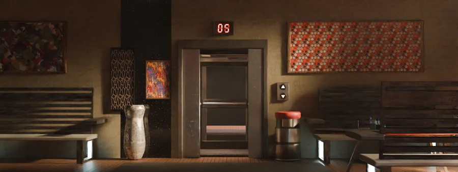
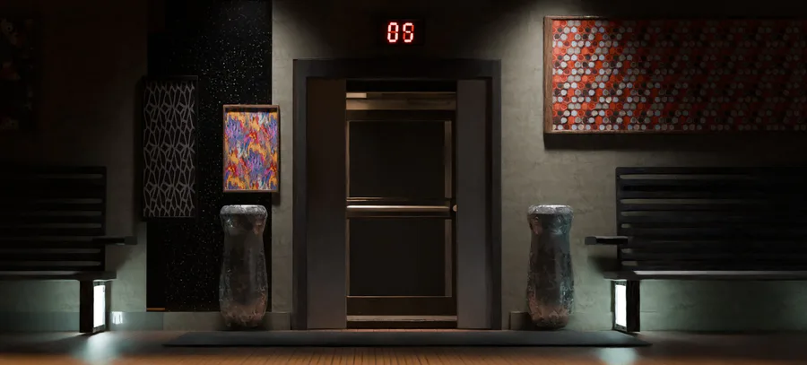
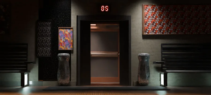
I added a few new objects (You may not notice it at all)
Added the call button for the elevator and a trash can.
But the main thing that changed was the light composure. Really tried making it look realistic with the light rays. Then repeatedly went back to change a few things like for 30 minutes or so. Really annoying.
But anyways tell me what you think of the render.
note: Scene will be available soon!
Next up
I want to create a game (I know it's weird coming from me) but the idea IS solid ✋👀🤚 but I need help.
I can't guarantee that the game will be a success but it's better to at least get it up and running.
Progress report
Huge!!! Problem
I can't make the dark any darker 😐
No I'm not dead just asleep...half the time 🫠
Game dev-ving is hard
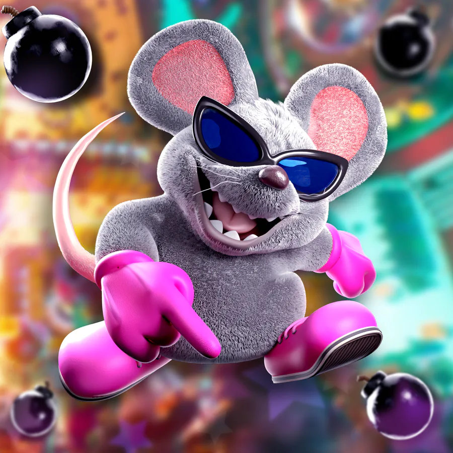
Mouser for the 2.5th and final time but in his Movie design
I literally was working on right for "Male" character and then my battery died.
Shucks
I'm too tired to explain who is this rn so just check out the art itself
Alright I guess I'm going to be busy for a while.
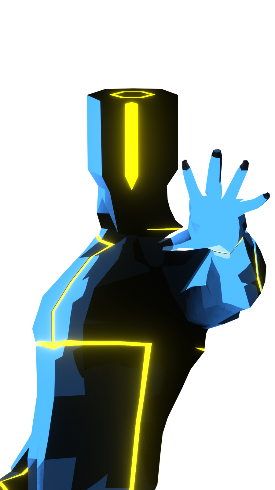
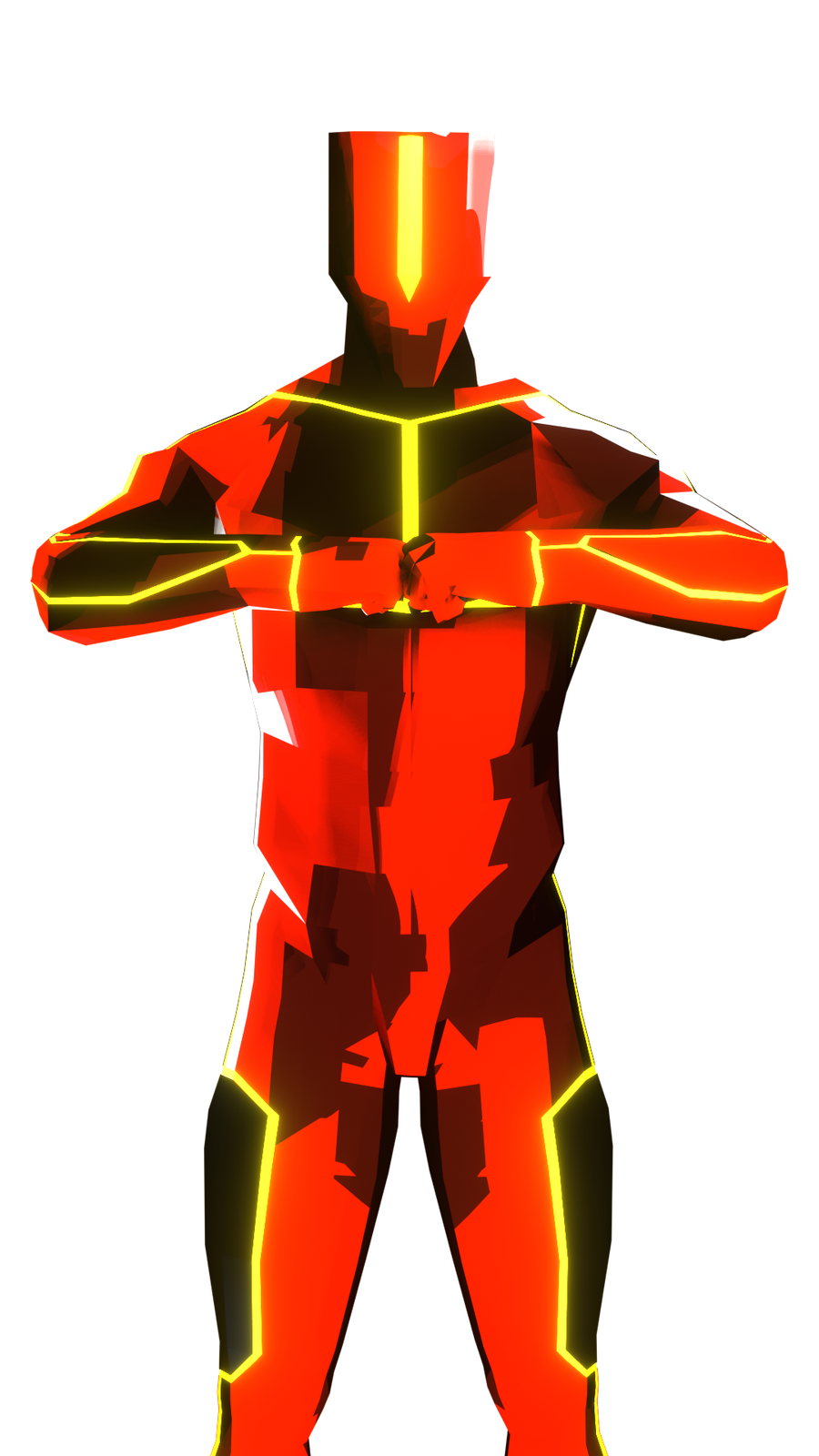
I'll just share the red version of the dude (-n-)
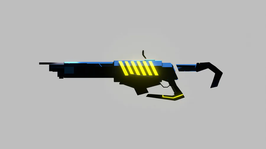
Gun!!!
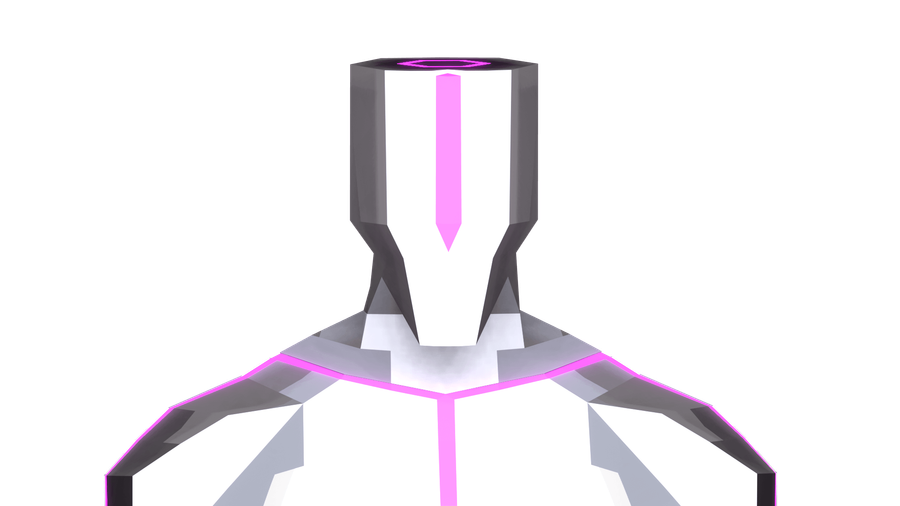
Concept art/model for THE game. It's not 100% perfect but it's close to the idea I have.
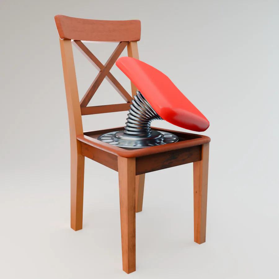
Here's another Bandit Trap inspired model I made in #Blender... Don't sit on this chair!! 
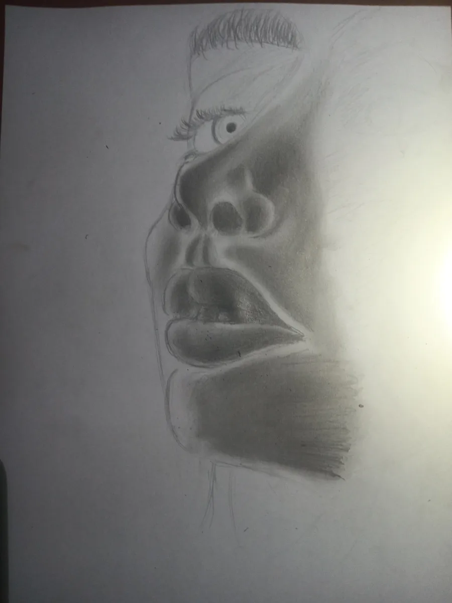
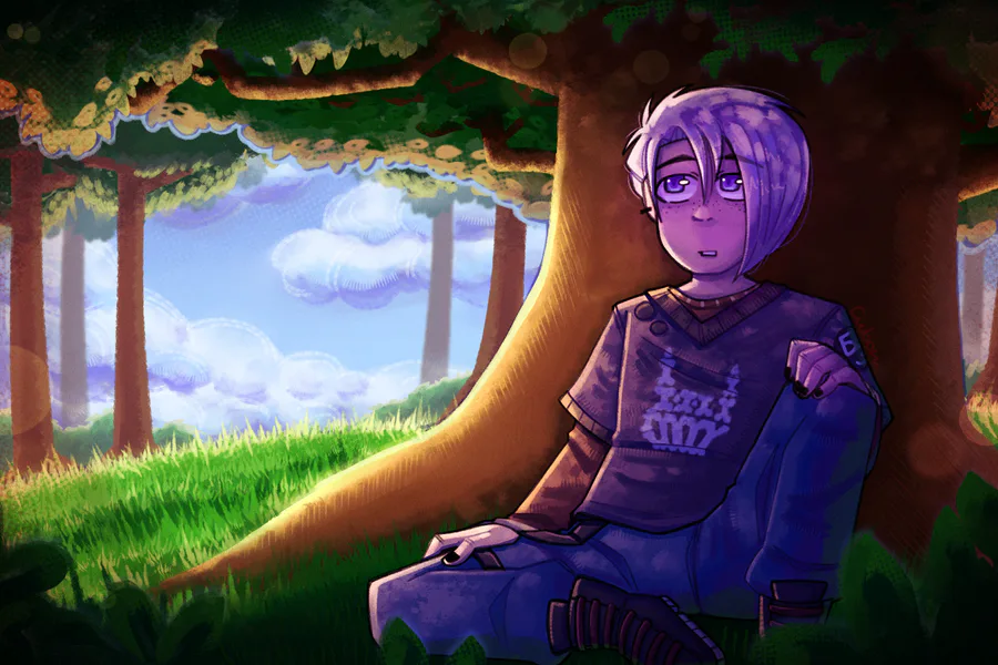
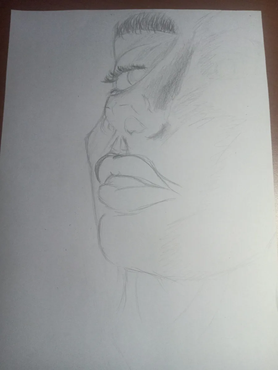
Haven't drawn in a REAAALLY long time.
Hope it comes out nice






5 comments