More info:
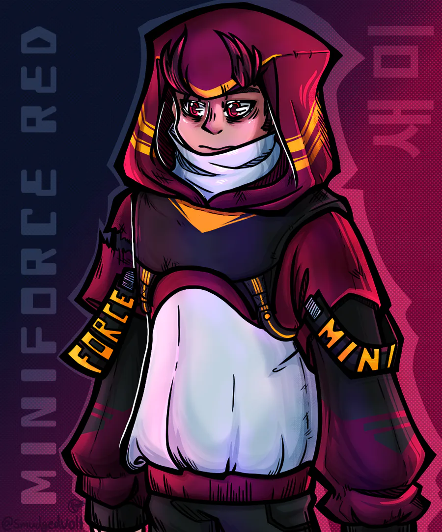
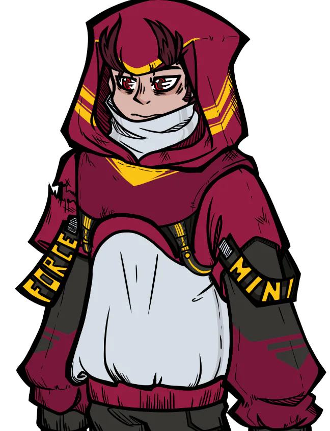
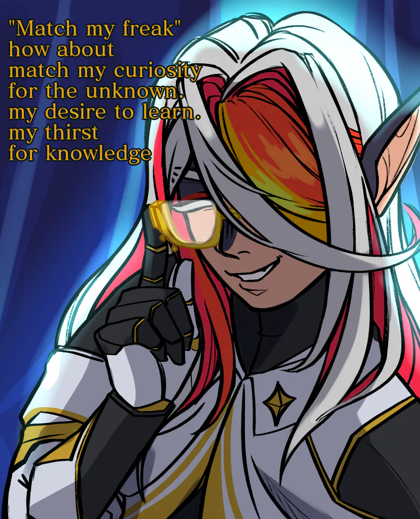
I honestly found that colouring this piece was the most fun and the hardest. From placing the colours to getting the shading and lighting to look right, it was frickin tough. But I'm here now! Not completely satisfied but IT'S an IMPROVEMENT!!
I took multiple elements from my past few experimental works and mashed them into this. Slowly but surely my evolved art style is forming... I kinda feel like I went too soft with the shading here tho. I wanna bring back the hard lines just a bit more.
---------------------------------------------------------
Outfit design:
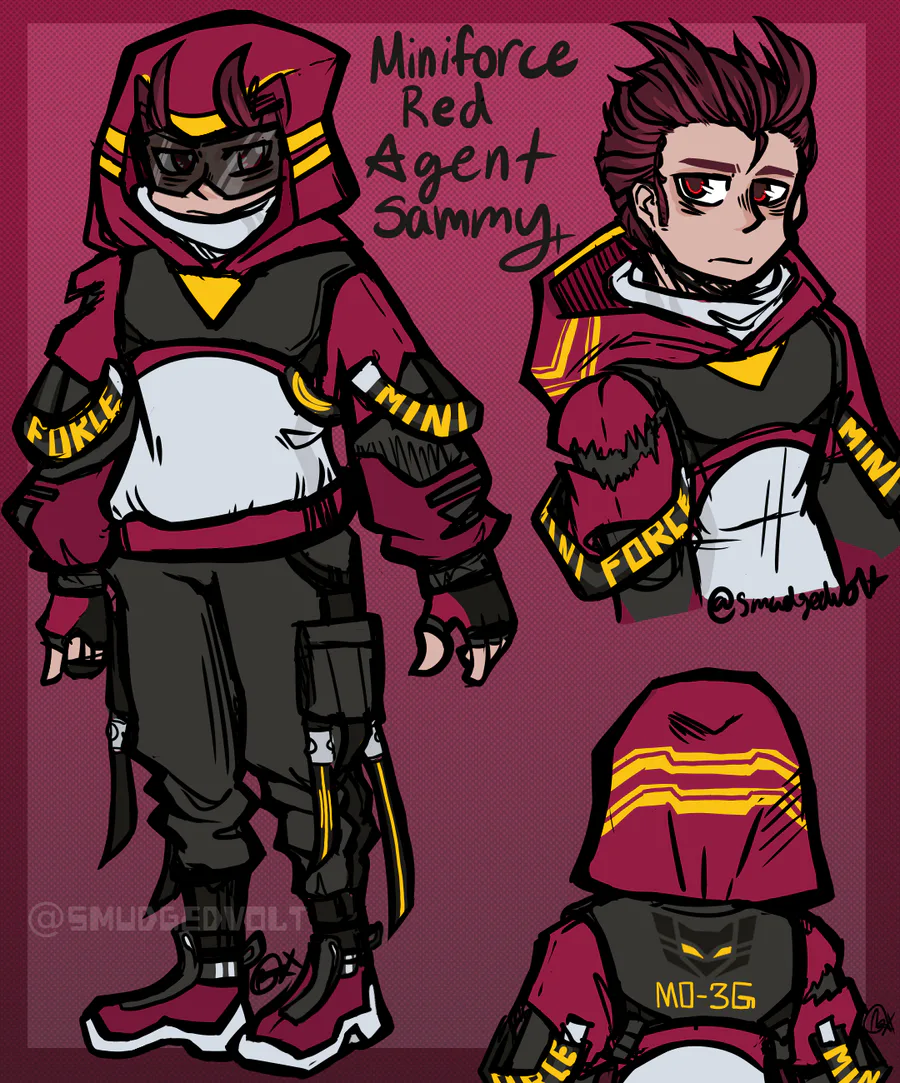
The outfit is Streetwear/Techwear-inspired, and the colors were taken from Sammy's OG form and his season 1 ranger outfit:
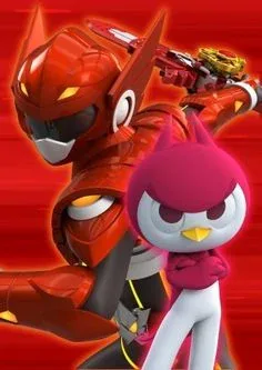
Initially, I was just pulling from the OG design, but I found that the colours were far too simple for what I was attempting, so I added some colours from his ranger outfit into the design. The biggest example of this is when I added brown to the sleeves and chest plate thing-
The clothing is sort of meant to look like him? But not really at the same time. I wanted it to look like a cool outfit even if you didn't know Miniforce but still recognized as inspired by one of the characters (if that makes sense).
ALSO, I JUST WANTED TO POINT OUT that the rip on the right sleeve isn't just there to look edgy. I thought it would be cool to represent his scar as a rip on the fabric. It's a neat thing that I thought would help tie the design back to its inspiration (and people who know abt that info can pick up on it rlly quick 👀).
--------------------------------------------------
Thanks to those who read this! The info dump is mostly for me to reflect on my work.
Shoutout to @Mellobee ![]() for enduring the endless pain that is my WIP bombardment (also helping with color placement) and @REAL_SKYFIRE
for enduring the endless pain that is my WIP bombardment (also helping with color placement) and @REAL_SKYFIRE ![]() for some advice on cool BG stuff!! I took some inspiration from ur art ngl-
for some advice on cool BG stuff!! I took some inspiration from ur art ngl-









10 comments