4 years ago

I just finished my zoom class. My professor gave a lesson on line weight and it seems he is pushing me to mimic an Archie style. He gave a lecture on line weight, tapered line, drop shadows. (continued)


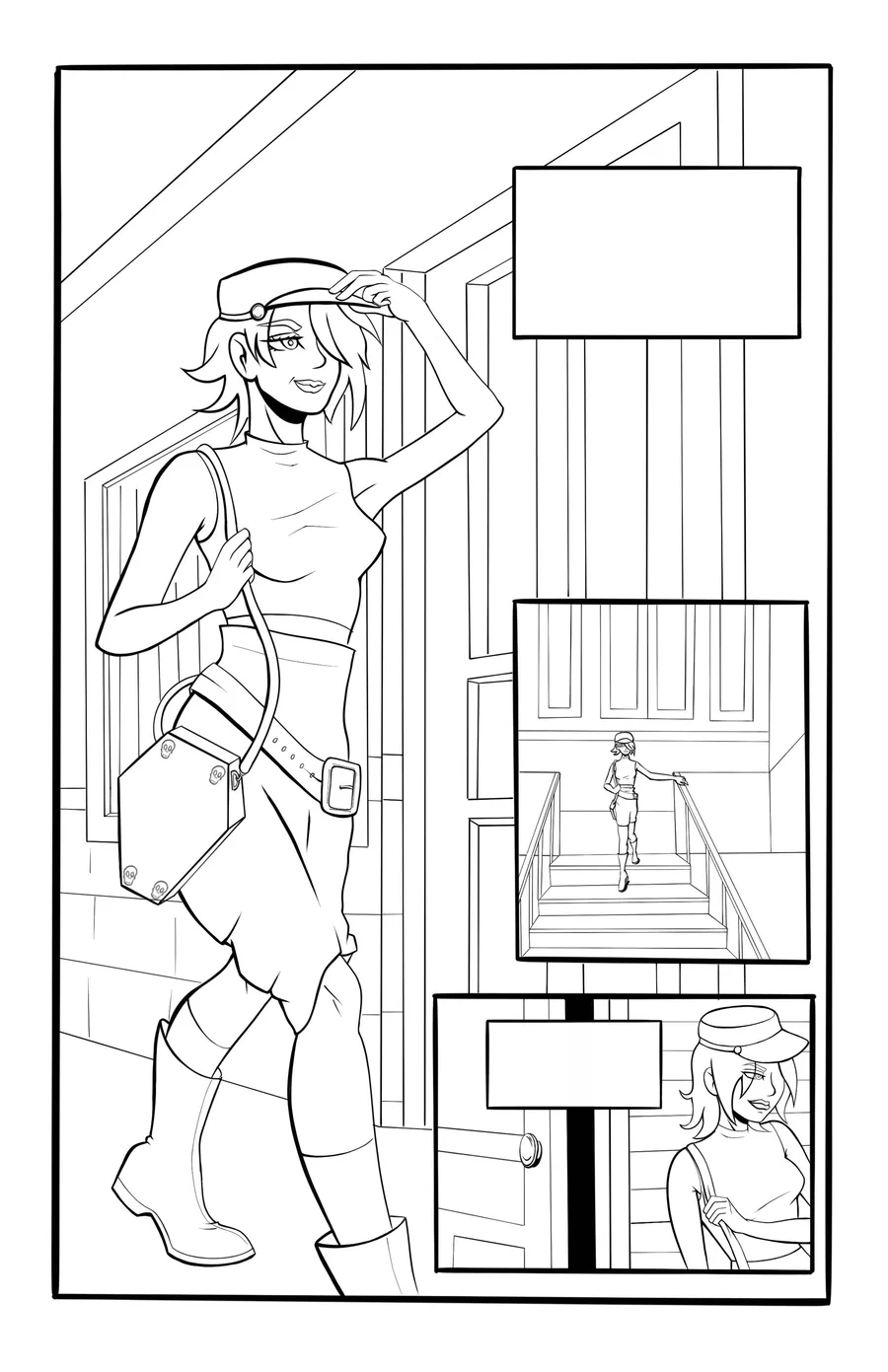
However, he proceeded to show off a comic that had a uniform line weight. The characters didn't really stand out against the background and lines didn't taper, but it did include values, silhouette, and color. I almost wanted to ask his thoughts on that but wasn't sure if I should.

I've seen lines done differently. Whether the artist does some initial inking and then goes back in to define line weight or it is done from the get-go. My professor believes if an artist has to work in two steps for line weight, then it is essentially a poor or dead drawing. I find myself doing both sometimes. What are your thoughts on this? What would you say about line weight in general and what your process is?

I've included a sample page from my comic project.

Any helpful advice is welcome! ^_^


4 comments

Loading...

Next up

Looking back on the very first game streamed on BattyNSaNe Gaming 09/05/23! Ft. @EL1M_

Haven’t done this since I was a kid. 🪱

To those that celebrate, have a Happy Thanksgiving Batty Bats!

WELCOME TO THE '26! 1926 THAT IS but seriosuly, happy new year everyone, i got back from my hiatus :3

Getting a feel for Multiversus. ^_^

Nartonne getting affection

platonicly

Merry Christmas to those that celebrate and Happy Holidays Batty Bats! 🦇🎄

Some photography today.

I did make this the right day I promise, I feel like posting it now tho since I don't wanna leave my page looking dead

Bats in the summer be like 🦇☀️