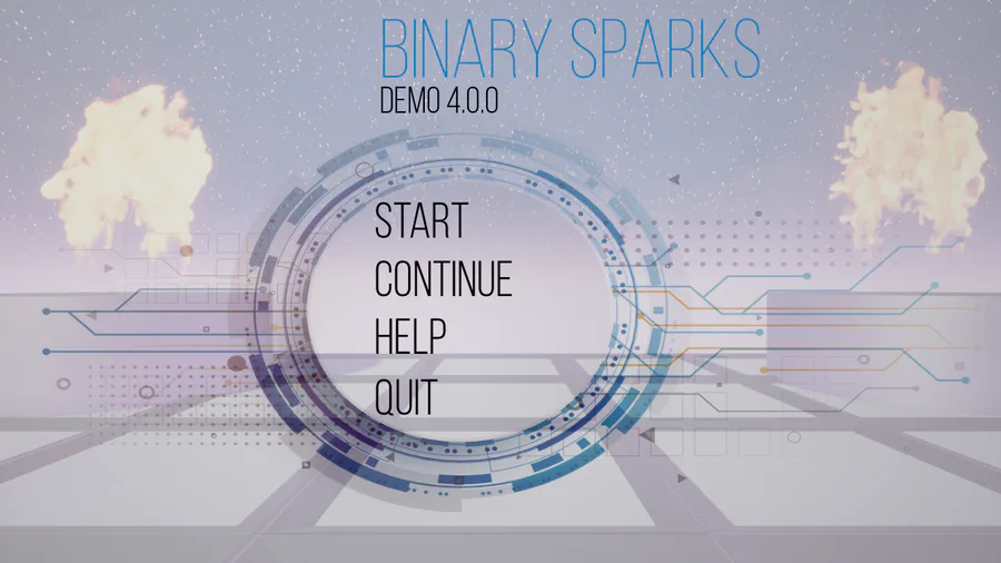
Today I visited the game company MidnightHub and got invaluable feedback from their very experienced art director, regarding Binary Sparks. As already stated we’ve just started to redo the mechanics and design to focus the game’s direction more, and when it comes to my art style he had alot of ideas how to break them down color, style and coherency whise, so not to distract the player from the actual interactive puzzle objects and elements.
It was really informative and inspiring how color theory, context and style does matter and how you can use it. What is still a challenge for us, which already discovered in the beginning of the design boost demo (which we also started to redo style and mechanics), many of the art and gameplay style and layout was very incoherent and distracting, something that stemed from the experiment this game started out as.
There is still a long way to go for us since we never believed Binary Sparks would become such a big project, and therefore the break of the teamwork - based stuff in this project that I talked about has very good timing.
Before I start working with eventual level designers and programmers I will have the time to fix up and foucs the direction and coherency of the game even more. Everything to make the puzzle elements have the biggest focus and to make the player understand directly what to do or with what.
I will plan some external testing for anyone interested to understand the overall user experience and understanding of the puzzles of the game.
Thanks again for your awesome help!
I will do a video talking about more of this in the weekend as well as talking about more of the planned break.
Thanks for reading


0 comments