Hello!
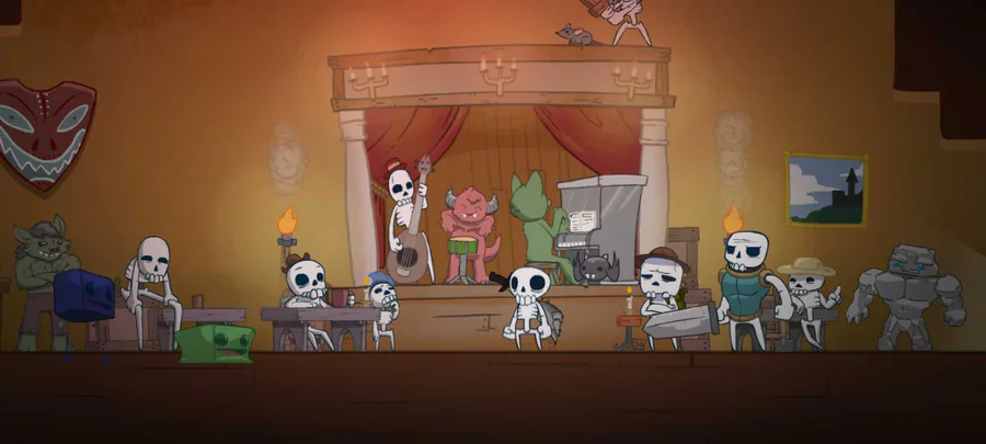
Today we’ll be looking at my process for designing a brand new character for Skelattack! You can never have too many dungeon-dwellers lurking around. Well maybe you can, but I haven’t run out of ideas yet so let’s go!
But first…
Did you know Skelattack has a Thunderclap page? This is a FREE way for fans to help spread the word about our upcoming Kickstarter. We’d love to see you there! OK, on with the tutorial!
===
For me, every good character begins as a question: what overall trait do I want this character to embody, and how can I make them visually different from other characters I’ve already designed? For this blog, I decided to create a large, jolly demon. In Skelattack, demons can be jolly, ok? So let’s start by sketching out the general shape. At this point I don’t care about props, expression or any other details. This is just building a foundation. I stick to simple shapes to build up the form. We don’t need more than this right now.
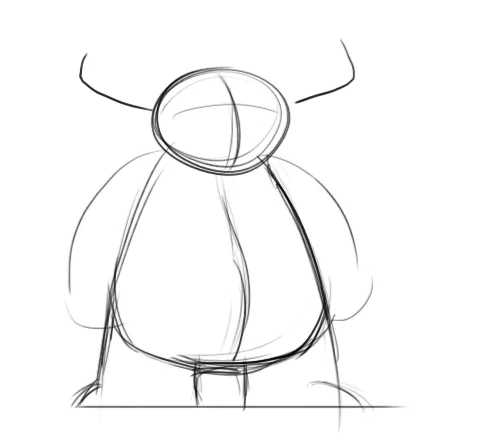
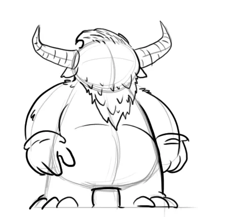
He’s about as wide as he is tall, has some plump arms and legs, and some wide horns. Nice! I’m happy with this. Next I clarify some of his design, such as what his feet look like, what sort of hair he will have, and even went for a full beard! He is wearing gloves too…maybe in the world of Skelattack he works with this hands, or gets cold easily. Not sure yet.
Next I focus on the face. Kind, jolly, peaceful: these are his keywords. So I go for the gentle smile, kind eyes and some nice thick eyebrows. I do the face on a separate layer, so that I am under no pressure. If I mess it up, I can just erase it all and try again.
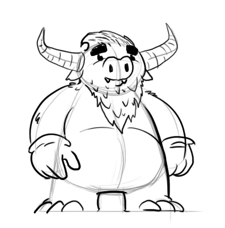
I’m digging the progress so far, but we can improve! I create a new layer and drop the opacity of everything that I’ve done so far. It’s time to ‘lock in’ his features and make the final lines. You can see here, my reference sketch is just barely visible underneath. If anything was ambiguous before, this is the step where I have to make some real decisions. This is why my first sketch was so important—you don’t want to get to this point and realize that you’ve led yourself into bad territory and need to start over. Still, even the best of us must start over sometimes. One of the changes I made as I worked on the final art was his beard texture. The original sketch had a very spiky beard, and my new version makes it rounder and fluffy. It fits his character better.
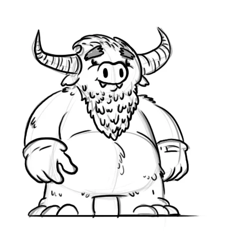
Here’s our demon when I hide the reference sketch. Looking good!
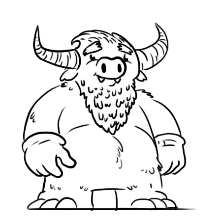
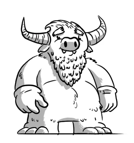
On a new layer, I quickly lay down some shadow. It gives the character mass and helps tether them to your scene. A character with no shadow can seem to be detached from the world around them, depending on how your scene is lit. That’s not a rule or anything, just what works for my game.
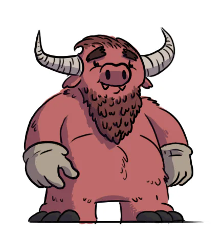
Time for color! I keep it fast and simple here. This is not the final character that will be used in the game, so I can afford to not be perfect. He still needs to be redrawn in Flash and broken apart for animation. That’s a story for another day.
To finish him off, I drop the opacity of his line art so that it captures some of his skin tone (fur tone, I mean). It looks way more inviting to me, and more closely represents how he would look in the actual game.
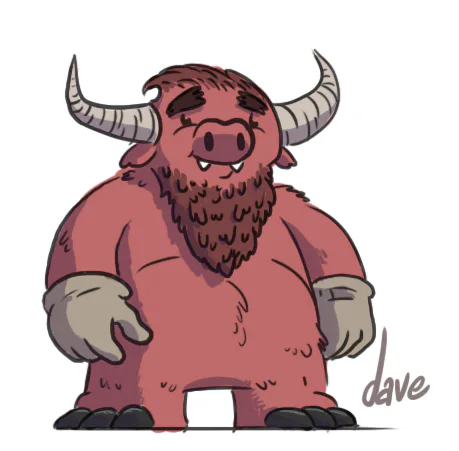
Cool, that wasn’t so hard! Now I have a fully-formed character that can add even more life to my game. Depending on the complexity of an illustration, you may want to repeat the sketch/refine cycle a few times. For the purpose of this tutorial, once was enough to get where I needed to go.
Thanks for joining me for another Skelattack devlog!
~David Stanley
Want to help spread the word about this game? Hit the Thunderclap page, which is 100% free and only takes a few seconds to support. Thanks, Dungeon Crew!

10 comments