Hello! Time for an update!
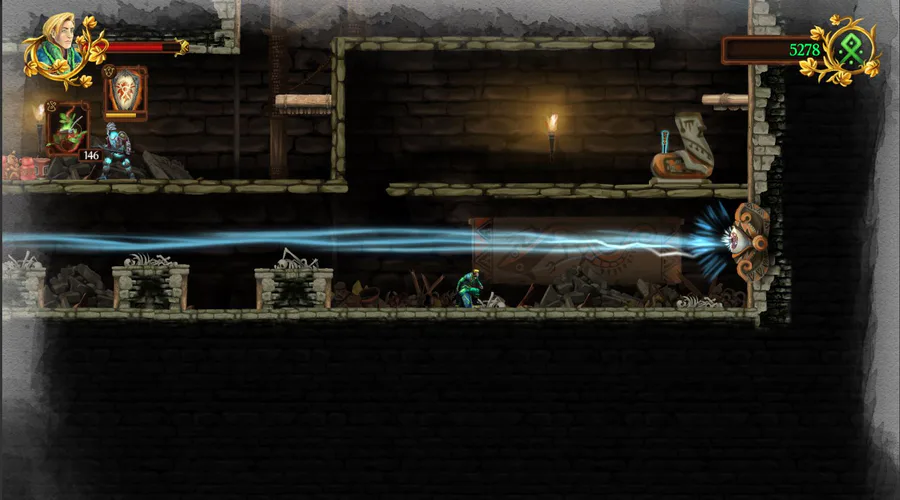
We spent most of the Christmas break recoiling for 2018 and planning for the new year (waves fist at Steam bureaucracy), but we also worked on something new to show you: a preview of our shiny new UI!
It’s SO EXTRA. WE ARE VERY EXCITED.
Let us ramble a bit about the design process before the big reveal.
UI TROUBLES
Our old UI had been cobbled together by Giada and embellished by Tobias Cook from Failbetter Games, who helped Giada a little when she was incubating at the studio. The result wasn’t bad, but it was a single pretty window we recycled everywhere: we had no clear design principles in mind to help us design the rest. We’re comic artists, after all, not graphic designers.

The old, wonky message window.*
Tobias is the artist in charge of Sunless Skies‘UI, by the way, and he wrote a great Gamasutra blog about his creative process! The guy knows what he’s doing.
But since kidnapping him proved to be unfeasible, we had to think of another solution.
THE HELPER
After many failed experiments, we decided to hire Kathaeris to redo the whole UI from scratch.
Bringing a new person on a project is always a delicate affair. To get a good result, it’s essential to write design documents to make sure everyone is on the same line.
That’s when Giada’s experience in comics writing finally paid off. Writing a design document, she realized, is not so different from writing a comics script: in both cases, you are trying to convey through words how an image should look and feel. It requires you to be very practical and very abstract at the same time, to sketch storyboards and to gather visual references.
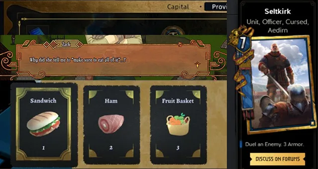
Some of the references we included in our design documents. Can you recognize all those games?*
The concept we wanted to convey through the UI, we decided, was a mirror framed with gold. Mirrors are important in the lore of Selling Sunlight, and blue message windows would help the text stand out in our warmly-colored maps. We also asked our UI artist to add circular elements, both to represent the Sun and as a callback to classical Art Nouveau posters.
After studying the design documents, Kathaeris sent us some sketches:
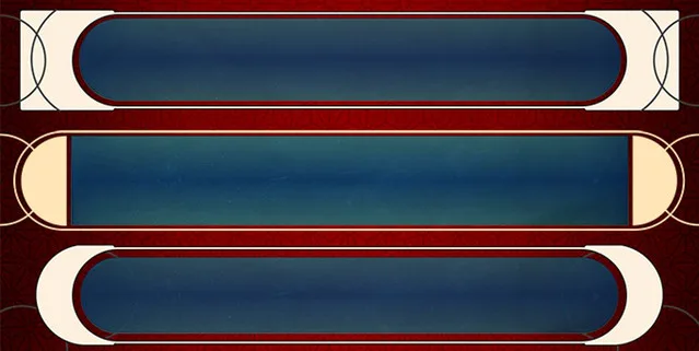
We had to make sure the new window was roughly as big as the old one, or else all the line breaks in the dialogues would get broken! After testing everything in-game, we opted for option 1 and let Kathaeris do their magic.
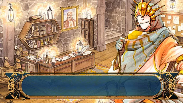
We hope you like the final result!
We can’t wait to get the rest of the UI, take new pretty screens and finally open our Steam page.
Have a shiny and luminous day!

0 comments