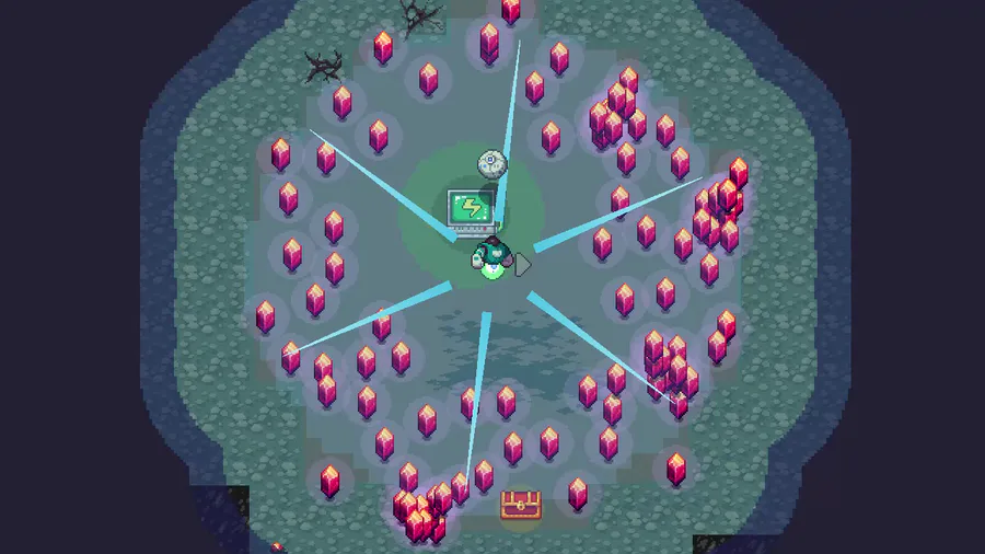
After spending a lot of time implementing the new stuff for this release, and after getting feedback from my testers (big thank you by the way), I ended up spending the rest of the time reworking the background instead.
The new background system covers the level even more, the atmosphere is waaay better (still not perfect though) and it just looks more like you are in the middle of a big forest. The lighting thingie is also focused on the player instead of the camera, which adds a small dynamic feeling to it. I hope.
Plans for the backgrounds in the future, includes even more icons, maybe some combination of icons, and “rare” icons such as rune stone or a stone troll or something silly. And maybe an elk? Or a fox perhaps.
Next up is what my fellow testers pointed out, that I’ve avoided for some time now:
Resources, difficulty and challenges.
To everyone that wants to help (including active testers) with v11:
Please try to analyse and “break” the backgrounds as much as possible - is there a way to make them even greater? Is there something that’s shit? General thoughts?
Either send me a message here on Gamejolt, or send your feedback to [email protected]
To the active testers of v10: I’ve added you in the credits section, so everyone will know that you helped out =)




1 comment