This week we’re not going to talk about the city or the many characters that live there. Instead, we’re gonna discuss interfaces, because even if it doesn’t sound that exciting, they’re a key part of the final experience, plus they’re also pretty. Those of you who have been with us for a while have seen many iterations, every time you’re doing something new there’s a lot of hit and miss happening while you learn what works best for the game.
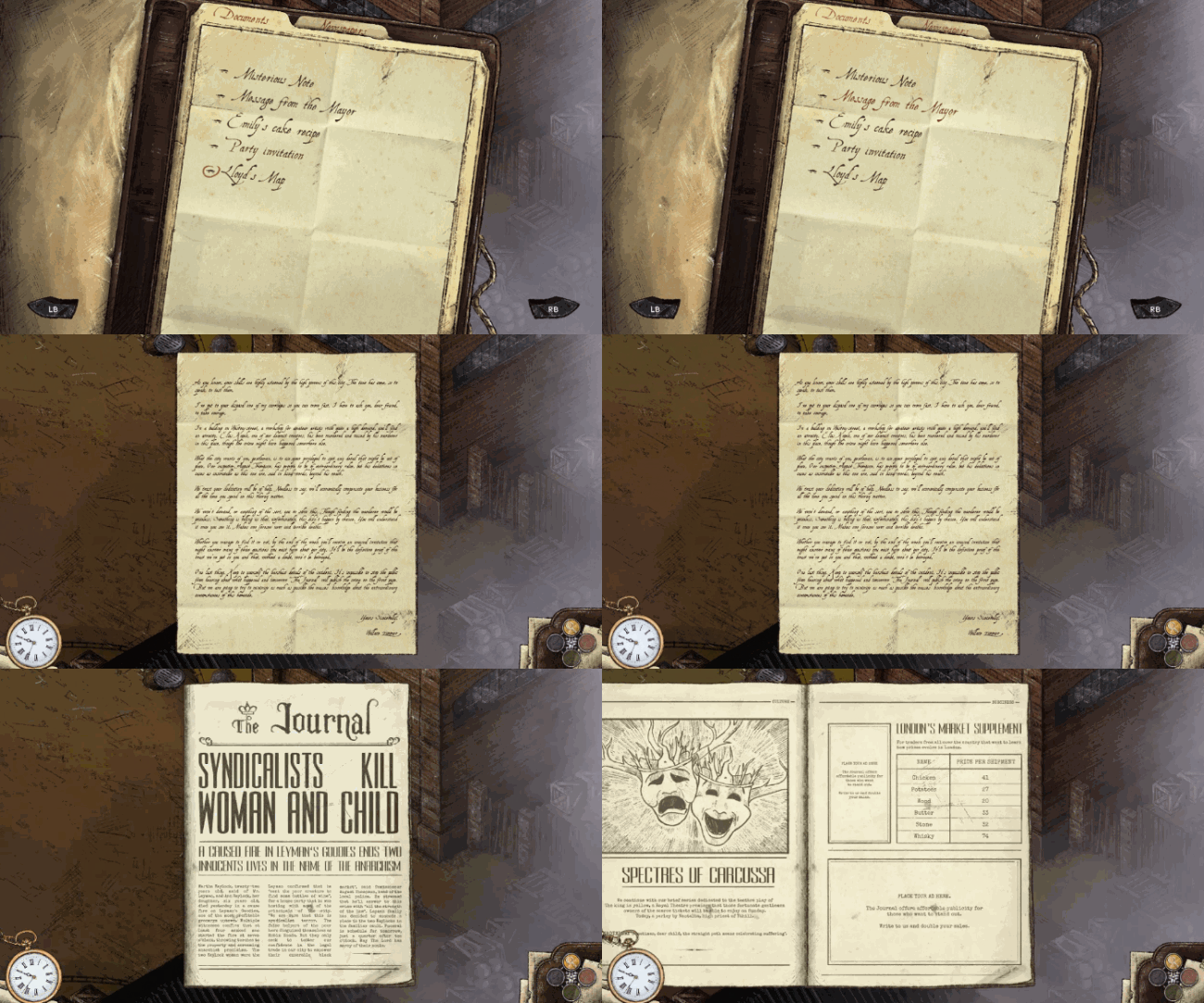
Now that we are slowly getting close to content complete, the current interfaces are pretty much final. There might be a few tweaks and some minor improvements, but no major changes.
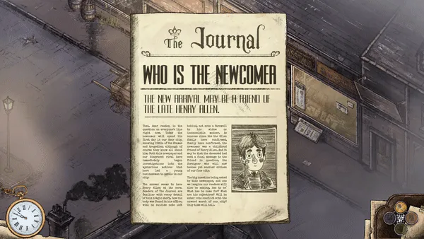
This is the document interface, it stores every newspaper, card, letter and note you find in the game. We used to keep them in the inventory but there are so many of those that they got in the way of using other quest-related items. You can also notice some fancy animations that appear when you’re turning the page (plus the not-new interface that makes everything easier to read).
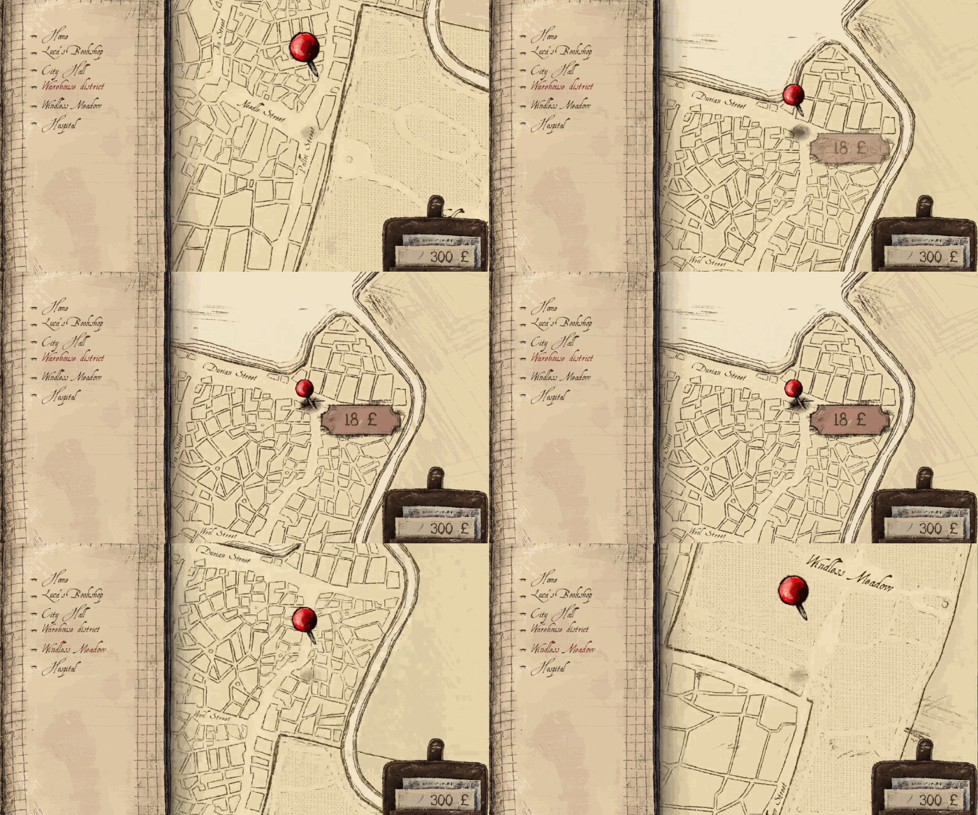
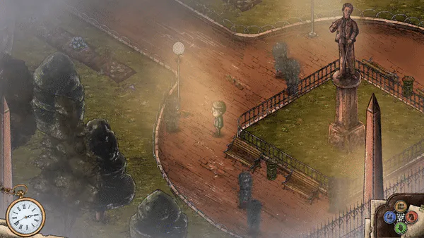
This one is the fast-travel interface. Moving around the city was always a bit slow. We increased walking speed as much as we could (without breaking the immersion) but running errands still felt too heavy. That’s why we’ve added this new feature that, for a small price, lets you move faster to places you’ve already visited.
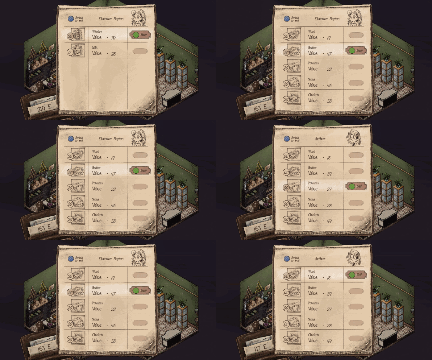
And this is the trading interface, the last one we’re showing you today. You might remember earlier versions of it, we decided that the old ones had way too much information on the screen and were too daunting. This new interface keeps all the features from the previous one but it’s quite friendly.
And that’s all for today, we’ll be back in two weeks with yet a new update. Don’t forget to join our Discord, meet the development team and ask us anything you want to know about “A Place for the Unwilling”.


2 comments